The Making of Master Koi, Part 2

General / 03 December 2021
This is part 2 of a two part blog series. Read part 1 here.

I'd be lying if I said that I looked forward to the process of retopology with anything resembling joy. However, I do like the fact that I've gotten a bit better at it than I was in the beginning. With Master Koi, I was aiming for a 100,000 triangle count and I wanted to see if I could land somewhere in that ballpark while maintaining silhouette and crucial details.

An early lesson in retopology was to always beware of straps/ropes/anything cylindrical that curves. This kind of geometry will eat up your poly budget SO fast. A sticking point ended up being the handles of the swords. As they wrap quite tightly around the handles, the wraps could have easily been baked down as normal map textures onto a single cylindrical mesh. But... I knew it just wouldn't look nearly as good in close up shots. I wanted the detail of the fabric knots forming that mass at the bottom as well. In the end, I paid heavily for both swords (together they ended up being about 38k tris). However, they looked so much better in the final renders! I think something like this really just depends on priorities. He's a sword master, so the swords are a top priority.

Following retopology, I did my UV maps. This process was fairly straightforward and I gave myself a goal of being as efficient with my texture sets as possible. I managed to get it down to four: Head, Upper Clothing, Pants/Belt/Sword, and Body/Miscellaneous. This is less than half of what I've done with previous projects, so it was cool to see just how much I could trim down and optimize while still maintaining AAA level quality.

And, my favorite part: texturing! I think texturing is what keeps me coming back to real-time models again and again. Seeing those normals bake down, it's just magic, every time. And of course, painting in base colors really starts to make the character feel real and pushes it beyond the work that's already been made. As a character artist I've learned to savor this moment because it takes so much work just to get here!

As with the other phases of the project, the face once again takes center stage for all my attention. After baking, I start the texturing process with base colors taken from a source photograph. In this case, a family member actually ended up being the perfect model. I used a polarized lighting setup to capture his skin tone, then projected the image onto the head mesh in Mari.

Here is an work in progress image from Unreal when I was near the end stage of developing the face. I ended up using a skin shader developed by Saurabh Jethani which greatly affected my final results. He had a .uasset file available but it didn't work for me out of the box. I ended up writing the shader by hand following his instructions and this worked perfectly well, and I also understood better how it worked. The technique involves combining the base normals with a micro tiling texture that really gives the skin lively, organic detail, especially in closeup shots. Interestingly, he does not even really use a roughness map, but instead uses roughness zones - three regions where he has roughness levels that are created procedurally. I stuck with my good old fashioned roughness map and I was happy with how it came out.

Something I've learned about rendering in Unreal is that the shader in the engine has almost as much influence as your texture maps. A few twists of the knobs in Unreal and the skin looks totally different, which goes to show how important it is to look-develop your work in engine during the texturing process.

For those who want to see under the hood, I uploaded a full resolution screencap of my modified version of Saurabh's skin shader here.

Texturing the sword was an interesting challenge. Because I decided to do the handle wraps as a separate mesh, I had to decide how to treat the fabric weave that narrows towards the point where the straps cinch together. I ended up drawing the weave pattern by hand, which was painstaking, but I only did it once. All the wraps are copies, which means they share the same UV space: very efficient! And a whole lot less work.

Another fun fact: the wakizashi (short sword) is simply built out of pieces of the katana (long sword). So again, they share the same UV space :)

I also had fun texturing the feet and sandals. The bottom of his feet even got some TLC with dirt spatters and grime that would naturally splash on them when he spends a whole day clogging around in wooden shoes.

Ah, we finally come to hair. I've fought a battle with hair cards for so long that I've finally come to terms with just how fussy this part of the project always is for me. Luckily, after struggling for many days, I've come up with a pretty good workflow that makes the process manageable. Since everyone does hair differently, here's a basic breakdown:

  1. Create hair textures in Maya using strands generated by XGen. Go from thick to thin, creating variety with each section. For Master Koi, I set aside an area just for beard hair (the left side) since I knew this would be important for him.
  2. Bake hair textures in XNormal.
  3. Build hair cards in Blender using Hair Tool for Blender by bartoszstyperek .
  4. Finish hair with final look development in Unreal. 

I know this is a pitifully short summary of what is an incredibly elaborate process. I'm considering doing a tutorial just on my specific hair workflow because I've gotten a number of questions about it.

The baking process with the maps for height, root and ID is specifically for the Unreal hair shader. I picked up this technique from Johan Lithvall through a class available at the Vertex School.

I've said it before and I'll say it again: Hair Tool for Blender is the best tool I've found yet for building hair cards. It uses curves, which are so much more flexible than meshes, and connects them to UVs that you set up beforehand in conjunction with your hair textures. Curve resolution is adjustable on the fly. For what can be a nightmarish process, Hair Tool introduces some must-have workflow improvements, and I know of artists that have switched from Maya to Blender just for this.

Normally, after finishing hair I give myself a big pat on the back and move to the fun part of final rendering. However, in the case of Master Koi I decided to jump into something even harder (for me, at least): rigging!

I did a lot of research to get a handle on where I should start. I knew that Maya would be necessary for this one as it's the undisputed master of animation workflows. I settled on AntCGI's tutorial series on Youtube , which is an incredibly in depth piece of education for zero cost. AntCGI was great because he starts with the basics and moves slowly into more and more complex systems.

After doing a ton of study from AntCGI, I decided to plunge into a really ambitious project: making Master Koi walk. I used some motion capture data to guided my work as I'm not a pro animator by any stretch. I got the hands and the feet working OK. But a big stumbling block came up in regards to the long drapery of his coat. You can see the trouble here: it's such a loose garment that it's very difficult to control. I know there are systems that can do this sort of thing but I wasn't equipped to manage that level of complexity.

In the end I settled on a idle pose for him, just subtle movements of him flexing his fingers, subtly moving back and forth and blinking his eyes. That's really the thing you notice in the end: the eyes. Such a small thing from weeks of work! I think this is one really important lesson in that it's important to allow yourself to fail when learning new skills. There were many times when I was ready to throw in the towel and abandon rigging altogether. I learned a tremendous amount though and that's what I can take into my next project: all the ways NOT to approach rigging.

Following my rigging travails, I was finally ready to put it all together in a scene in Unreal. I knew I wanted Master Koi to be in an exterior environment and after doing more research I settled on entrance to a Shinto temple. 

I liked the compositional idea of him standing beneath a sweeping gateway and I found a photo I really liked of a gateway in front and another in the back, past a staircase in a grove of trees. It had the right feeling and I imagined he was waiting here for an old student, someone who has lost their way. The two have agreed to meet at the entrance to the temple at midnight - to settle the score, perhaps?

I had a lot of fun building out this environment. Instead of a simple backdrop, I opted for something I could orbit around and keep the immersive feeling going. It took more work but it was worth it because it made my final animation much easier to shoot. This is a throwaway shot I didn't even use and even it looks pretty cool.

There were a lot of random things I threw around just to get organic noise into the scene. I placed scatterings of rocks, loose leaves, tufts of grass, etc., all to create some junk to make it look less clean. The trees and shrubs are sourced from the Medieval Game Environment project and most of the other shrubs, rocks, grasses and the stairways are from the Quixel Megascan library. I modeled the gateways and lanterns because I had more specific needs for those assets.

This was my first time using Unreal's Cine Camera Actors and their associated Cine Rig Rails for panning shots. These tools are so much fun! I spent way too much time tweaking the exact arc of each Cine Rig Rail vector path. Add to that the complexity of having the camera track the subject and you can spend hours getting just the right shot. Unreal continues to leave me flabbergasted with its sheer depth of realism and the associated functionality built into the engine.

In this shot from the final animation, you can see much of the environmental detail ls completely obscured by depth of field, motion blur and grain. But it comes through nonetheless as breakup that helps things look less digital. My hope is that you don't notice at all, but are instead immersed in the experience :)

After setting up all my cameras and rails in Unreal, I exported the raw footage from the Sequencer, imported it into Premiere and did final post processing and color correction. I wanted a cinematic look with lots of atmosphere, so I aimed for that look, using the effect controls in Premiere to add fractal noise, grain, motion blur and chromatic aberration. This kind of work starts to stray into VFX territory, so I looked at a lot of artists in that field for inspiration on how they prepare final cuts. So much tweaking and adjustments had to happen, even after all the work I'd already done!

There is always an odd feeling of emptiness at the end of big projects like these. I simultaneously feel elated to finally have this thing off my chest and at the same time, a little disappointed to being saying goodbye. I remember thinking at the beginning, "this guy is all about the face, all I have to do is nail that and we're good." That was true to some degree; however, I wasn't considering all of the other unforeseen challenges and some new things I decided to jump into. It comes back to the old truism that it's better to reach outside your comfort zone and fail spectacularly than stay inside your limits and achieve modest success. If you don't push your boundaries, you won't know where they are!

The Making of Master Koi, Part 1

Making Of / 03 December 2021

This is a two part series about the making of my real time character Master Koi - check out the project here.

Like many others, I have this problem where I have about a hundred ideas in my head at any given time. Whenever I'm starting a new personal project, the hardest part is choosing. I go through an agonizing process of sifting through many potential concepts until I finally arrive at what I want to do.

For some time I'd been toying with the idea of an elderly character. I don't see it done so often and there is so much interest in the wear and wrinkles on an aged face. Some time ago, I came across this concept work by Silviu Sadoschi and it just stuck in my mind. Eventually, it found it's way to the number one spot for my next personal piece.

Moments after I settled on Silviu's concept, I discovered it had already been sculpted by Maria Panfilova. At first, I was dismayed; she'd already done such an incredible job! But then I realized there was some real discoveries to be made here. I loved the gestural, flowing nature of her sculpts and the way she'd characterized the Old Master. And I wanted to understand the forms she was creating with such elegance, so why not make it a master study? Besides, as Maria had only done a bust, there was still plenty of room to iterate with a complete head to toe sculpt with full PBR texturing, optimized for real-time. So with two parallel concepts in hand, my journey began.

There aren't a lot of "old man" base meshes out there so I found it easier to start sculpting him from scratch. I also find I make more deliberate choices when working this way. One tricky thing I needed to resolve was how much fat he should have. I wanted him to have a belly but still look like he was physically capable. In other words, he's a fighter that's past his prime, but can still school the young ones!

I look at a ton of references when I'm starting out so I can nail the right feeling. At first, I was studying anatomy references of the endomorph body archetype, but they were much too flabby and weak looking. Eventually I came across images of judo fighters and this one in particular, Shorin-ryu Seibukan. He had the right look: aged, but still very fit. He has some fat but you can tell the strength is just underneath the surface.

After establishing his body type I move to getting all my elements blocked in as soon as possible. This rough stage is really important for me to get a basic idea of silhouette before jumping into any fine detail. Rough cloth sculpting is always somewhat embarrassing for me to show, but I recognize its value in planning out a workflow. When it comes to super intricate fold work, I typically carve out those problems for Marvelous Designer. For example, the area where the coat drapes around the sword hilts would have taken much to long todo by hand. But the rough block in gives me a road map for what I want to achieve. The importance in having this can't be overstated!

Here is the first pass with cloth meshes imported from Marvelous Designer. He had a karate style gi underneath his coat, so I decided to build that out first, treating it as a kind of vest. The cloth simulation from MD showing how the diagonal cut of the garment would affect the compression folds going around the back of the torso and under the belt was pure gold! There are some things you just can't imagine, regardless how much reference you have to work with. The pants came out very bell-bottom hippie style, so they needed some tweaking but already, things are looking pretty cool :) I also tweaked his anatomy a bit further, broadening the shoulders to create a stronger stance.

Finally I get the coat in and I realize this character is about 90% cloth. I did not realize those sleeves were so darn long! I double checked pattern templates for haori coats and they indeed have this incredibly long drape to them, so long that I had to raise his arms for a more appropriate A-pose. I knew I wanted to rig and pose him later and didn't want a bunch of issues caused by deep compression folds baked into those areas.

While I am working on the body and clothes, I am periodically returning to the face. It goes without saying that this character is primarily driven by the face. Before getting started in that critical area, I did some quick studies to understand his facial proportions. From looking at Maria's sculpts, I knew that this character's eyes were placed unusually high in his head. But how high? All the renders of him in front view have his head tilted slightly back, which made it more difficult to understand. So, I made a frontal study, using a tracing of her profile view as a guide.

This was crucial because it allowed me to know that those eyes are REALLY high. There is an old joke amongst artists in drawing groups that when a model with unusual proportions walks in the door, all the artists ask, "What's wrong with you? Didn't you read the anatomy book?". It turns out that all the old rules, eyes in the middle of the head, five eyes wide, etc., come from idealization, not reality. We all know this intuitively, but the real world offers a much wider array of proportional variety than what you see in books that all use the same formulas that go back to Michelangelo's David.

Studying Maria's sculpt while I worked on the face also made me realize that there was a lot of asymmetry contributing to his overall character. Skin folds droop on one side farther than the other, wrinkles spiderweb in slightly different directions with lots of organic variation.

Leaving the safe zone of symmetry can be frightening! There is a natural tendency to want to hold onto it for the obvious efficiency benefits. But traditional sculptors never use symmetry and look what they manage to achieve. I always remind myself that one of my favorite sculptors of the 19th century, Jean-Baptiste Carpeaux never worked with symmetry. And his work has a timeless feeling of beauty that I am always seeking to emulate!

You'd be forgiven for not spotting the difference between these two in-progress shots. But there are a lot of small changes that together make some big improvements. Some small proportional tweaks were needed and the shape of the eyes and their surrounding sockets was initially too flat. The face was also lacking volume. Anytime I felt like I was losing focus, I checked Maria's sculpt to see how I measured up. This was always a startling experience! There is something very clarifying about putting your work next to someone that you admire and spotting the differences. But hey, that's what master studies are all about :)

After I'm feeling happier with the face, it is really just a matter of overall refinement on the other elements. Using the MD meshes as a base, I work the cloth folds further, accentuating certain areas and smoothing out others. Even if I'm relatively happy with what MD puts out, I always give them a pass in ZBrush to make sure the clothing feels organic and not too sharp and stiff the ways it comes out originally. I also added hem details and additional wrinkles in areas that get a lot of wear, such as the bottom portion of the tunic that has a lot of memory folds from being cinched by the belt and bent by the pelvis. 

The hands and feet get special attention. I decided to give him wooden geta sandals instead of the two-toed socks he's wearing in the original concept. As a result, I needed to sculpt the feet - but that's OK, feet are so weird and wonderful to sculpt!

The swords were another major focal point. In my interpretation of this character, I imagined him to be the head teacher at an elite sword fighting school. As such, the katana (long sword) and wakizashi (short sword) on his belt would need to be approached very carefully. If guns are the focal point in an FPS game, then what is the focal point in a sword fighting game? The swords, of course.

I built out the swords in Blender, using features like the Array Modifier hooked up to a Curve to get the handle wraps to flow just right. One detail that's often overlooked in katana models is the weave of the handle wraps. Most of the other art I've seen of katanas have the wraps simply duplicated, without a weave. This is wrong because in real life, that weave is what gives the wraps their strength, creating a tight grip around the handle that will not fall apart if one of the wraps is damaged during battle.

This is a tiny detail no one will ever notice but me, I know. However, I thought about my mission in the same way a weapon artist might. If you are modeling an AK-47, then every darn screw and bolt better be in the right place or the AK-47 community will devour you. So I attempted the same approach with the samurai swords.

The koi fish motifs were one of my favorite parts about detailing the sword. Sculpting these was trickier than I thought, especially the curving scales. I couldn't easily create them procedurally because they change in shape quite drastically along the form. I ended up building an array of scales in Blender, then using a deform modifier to curve them in the approximate shape I wanted. I took this into ZBrush for further refinement and tweaking and with some dynameshing, I glued it all together.

Again, tons of research are going on with every step. My pureref board continues to accrue images until it is rather monstrous.

By the time I've arrived at the end of the high poly stage, I have gone over all the assets with a final pass. The face gets skin detailing (using everyone's favorite, Texturing.xyz), and the clothing has memory folds added. Once I get to this point, the changes are so small and all the major decisions have been made so I am working somewhat on autopilot. Having done a lot of baking in the past, I have a pretty good feel for what will details will get passed down into the low poly and what the audience will actually see in the final.

In some ways the end of high poly work is also the end of big discoveries and it makes me sad. But the texturing/coloring I get to do later on is always worth it, that phase is just the best!!

Join me for more in The Making of Master Koi, Part 2.

The Making of Nissa Revane, Part 2

General / 19 July 2021

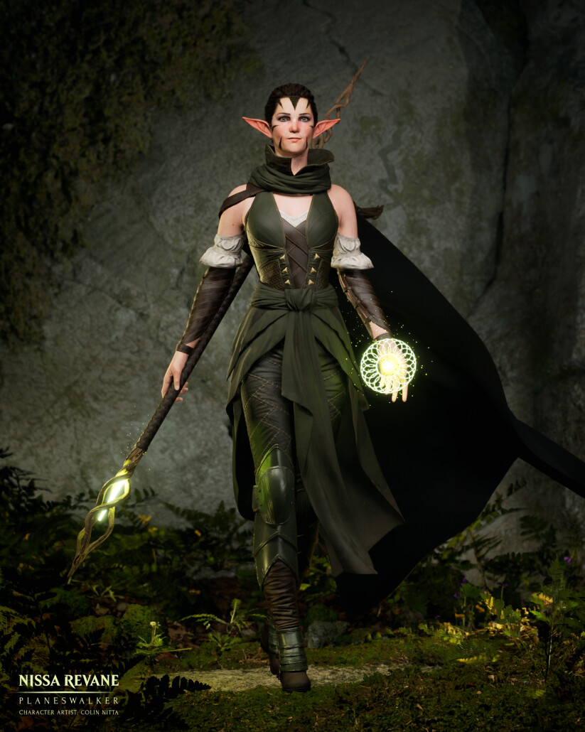
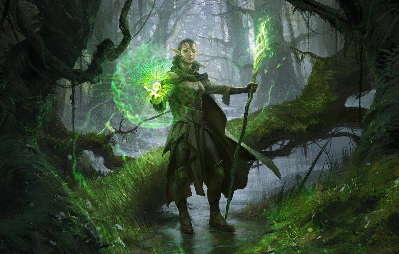
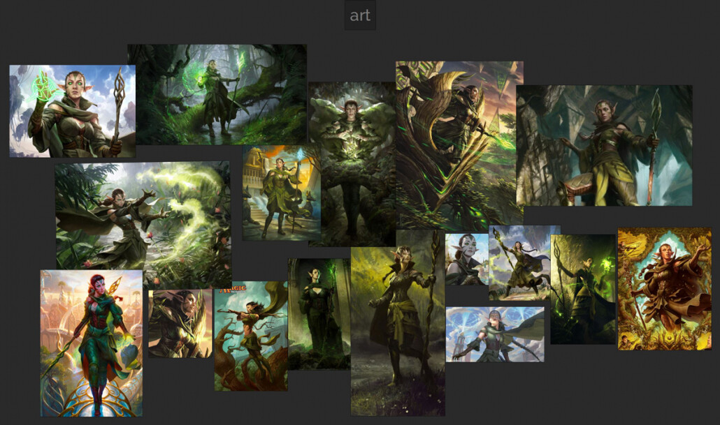
This is Part 2/2 of a breakdown on my project Nissa Revane: Planeswalker. You can read Part 1 here. Check out the project on ArtStation here.

Screenshot from “Lumen in the Land of Nanite,” promotional by Epic Games for Unreal Engine 5


Right around the time that I was completing the high poly model for Nissa Revane, the developer release of Unreal Engine 5 became available for download from Epic Games. I actually hadn’t been paying close attention until I started seeing all the talk on social media and manic articles starting with titles like “THE END OF LOW POLY?”. Then I started to really tune in.

With every new technological advancement in 3D, it’s important to take a deep breath. While nanite and lumen promise incredible leaps in realism and potential for game developers, they don’t spell the demise of high poly to low poly pipelines and baking techniques. These tools are so well developed it just doesn’t make sense to drop them. And best practices for animation remain the same: clean, consistent loops that can be easily deformed are still crucial. In any case, nanite is does not support deforming meshes: its key usage is in backgrounds.

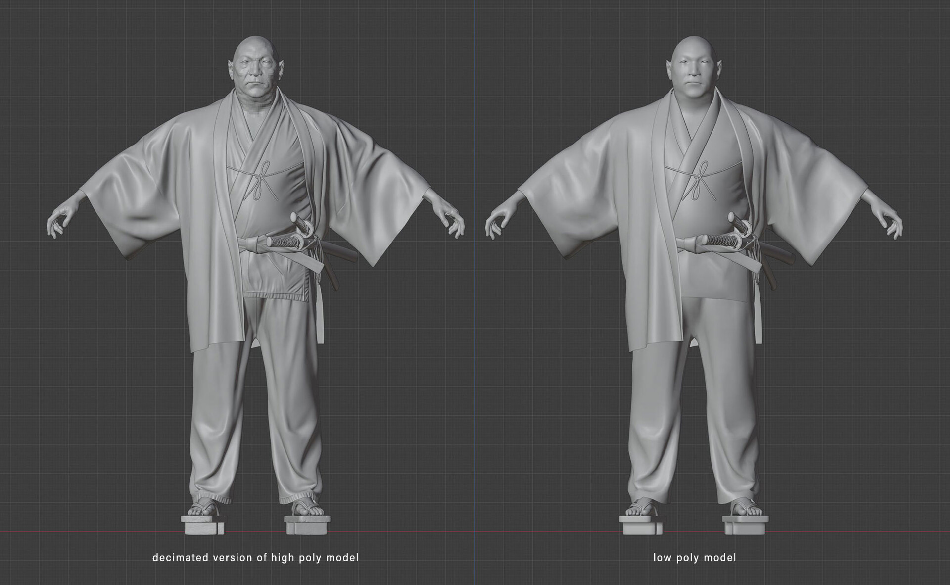
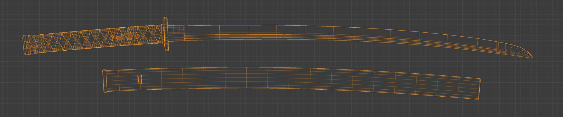
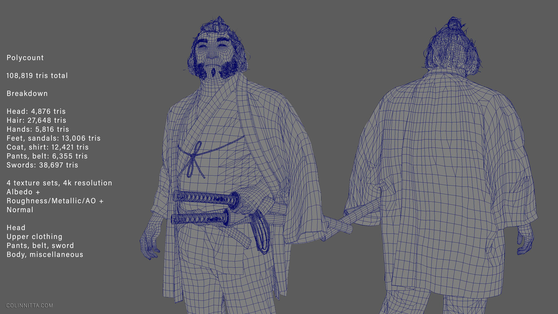
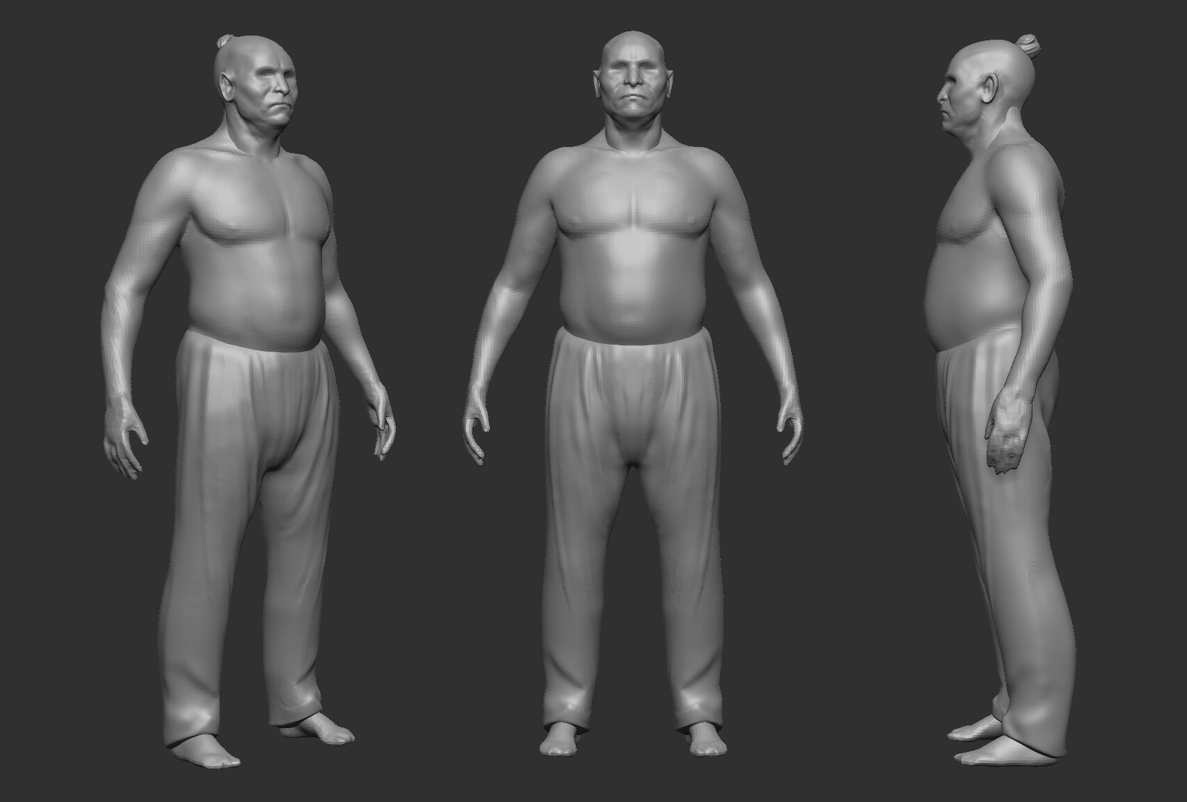
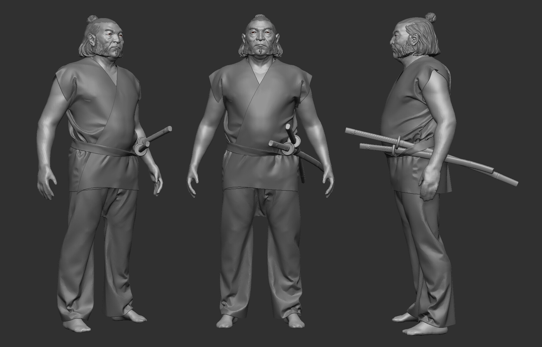
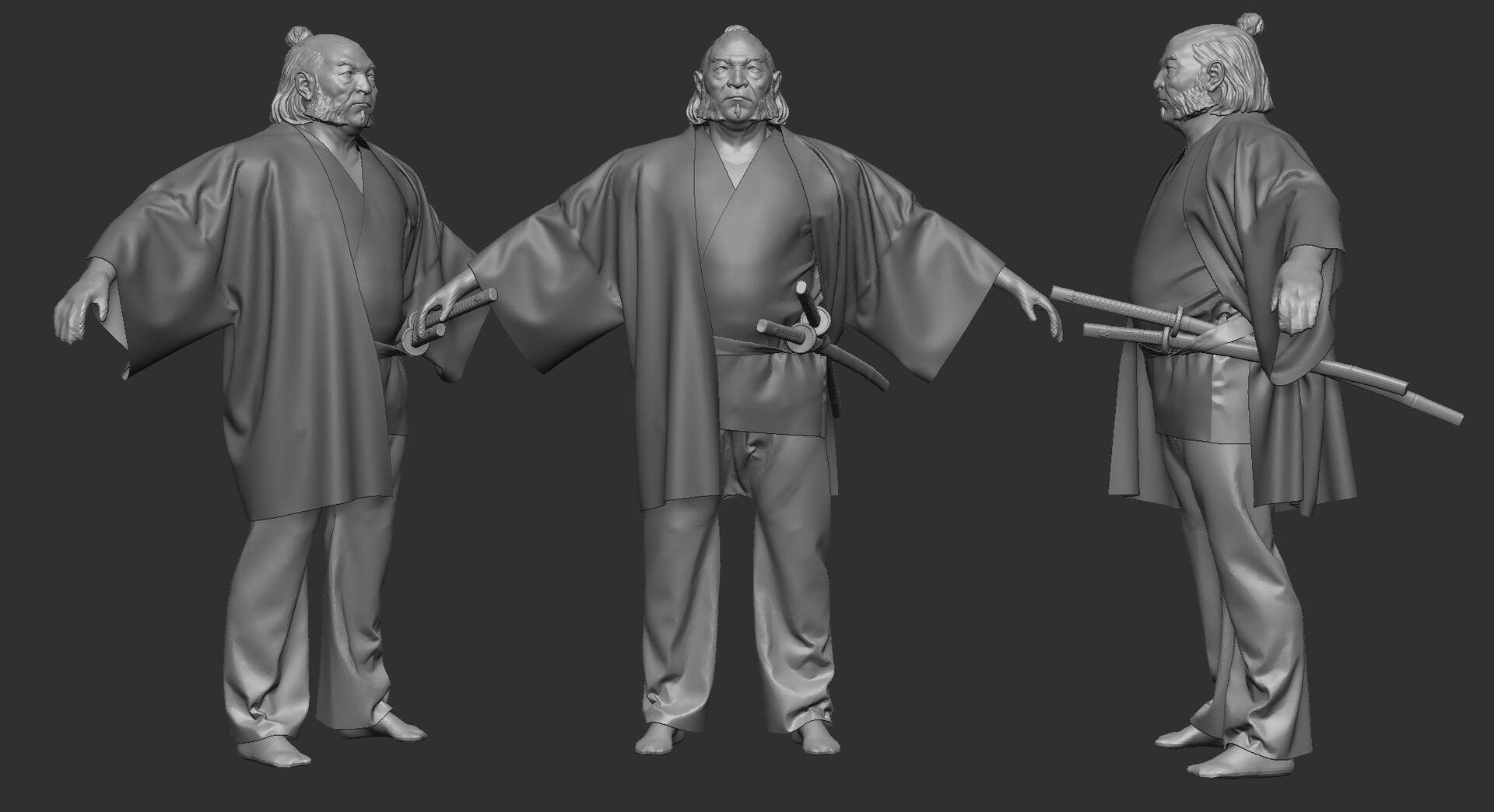
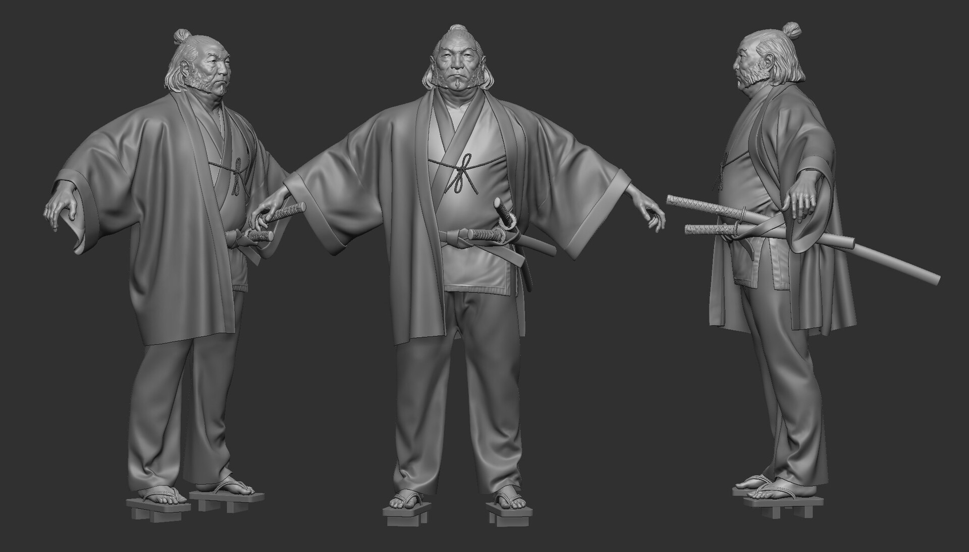
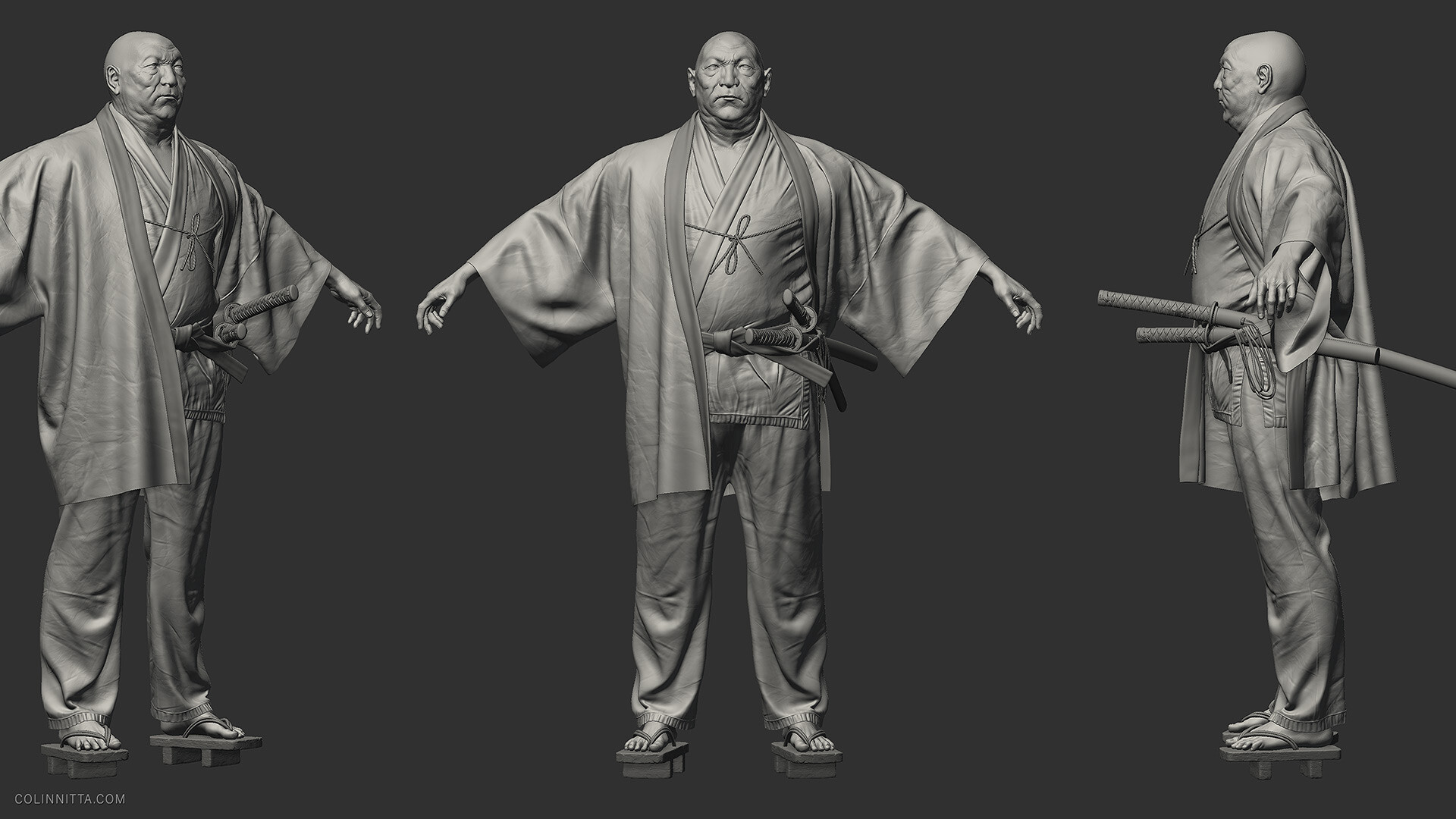
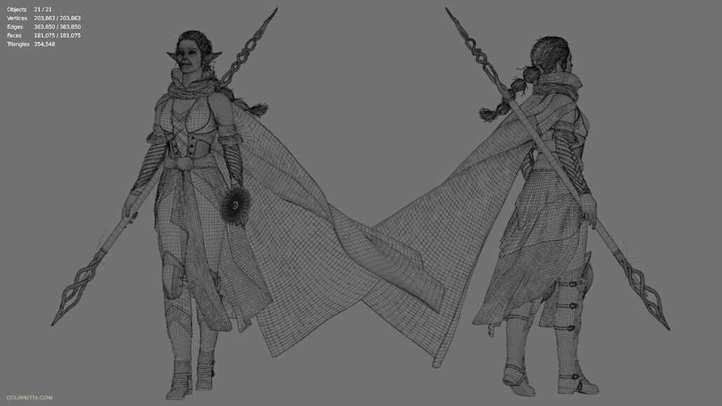
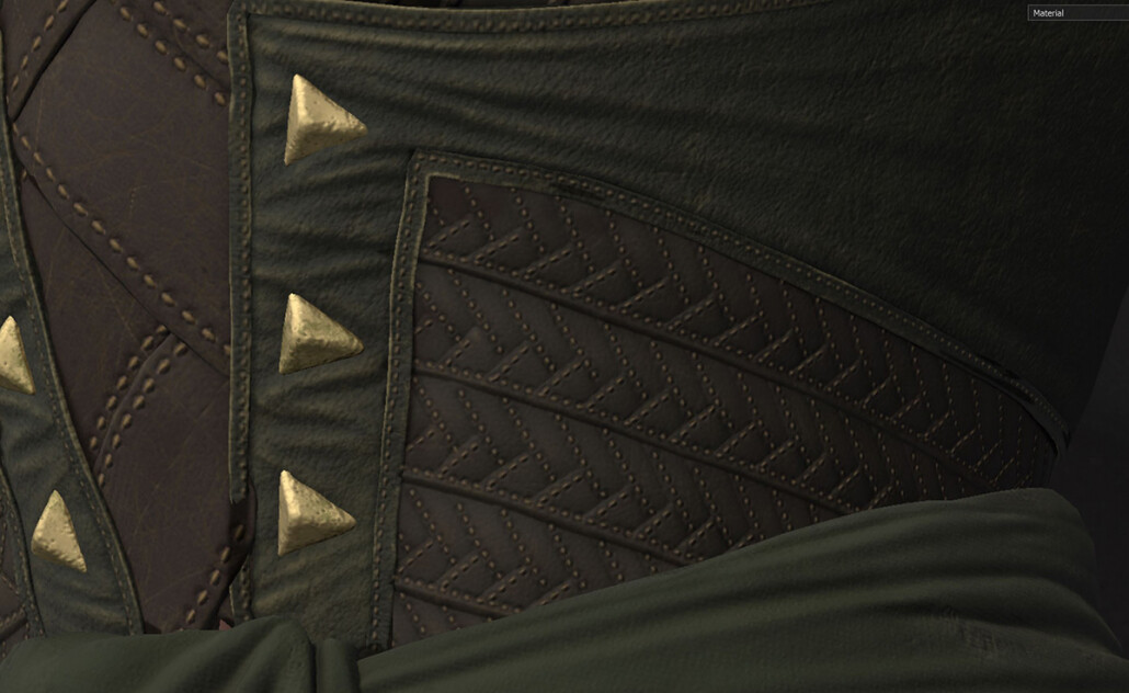
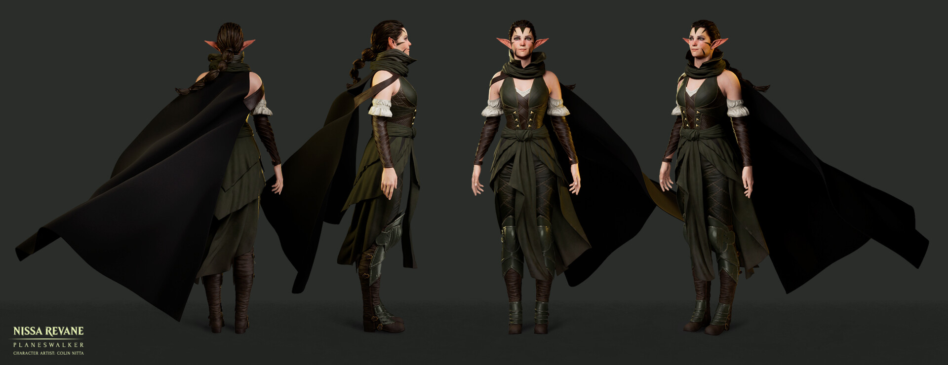
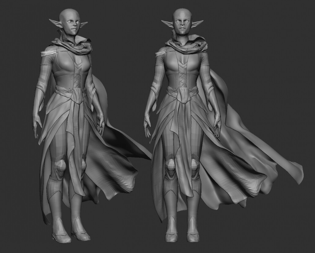
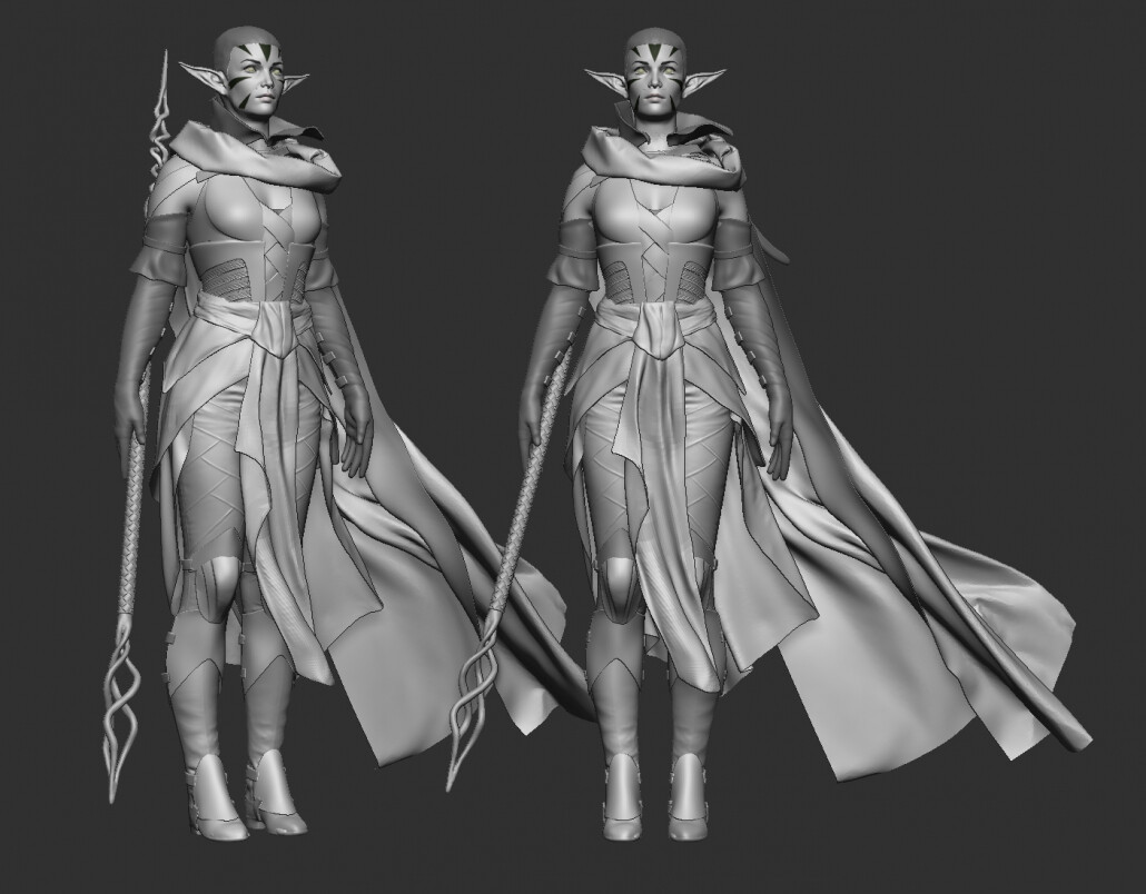
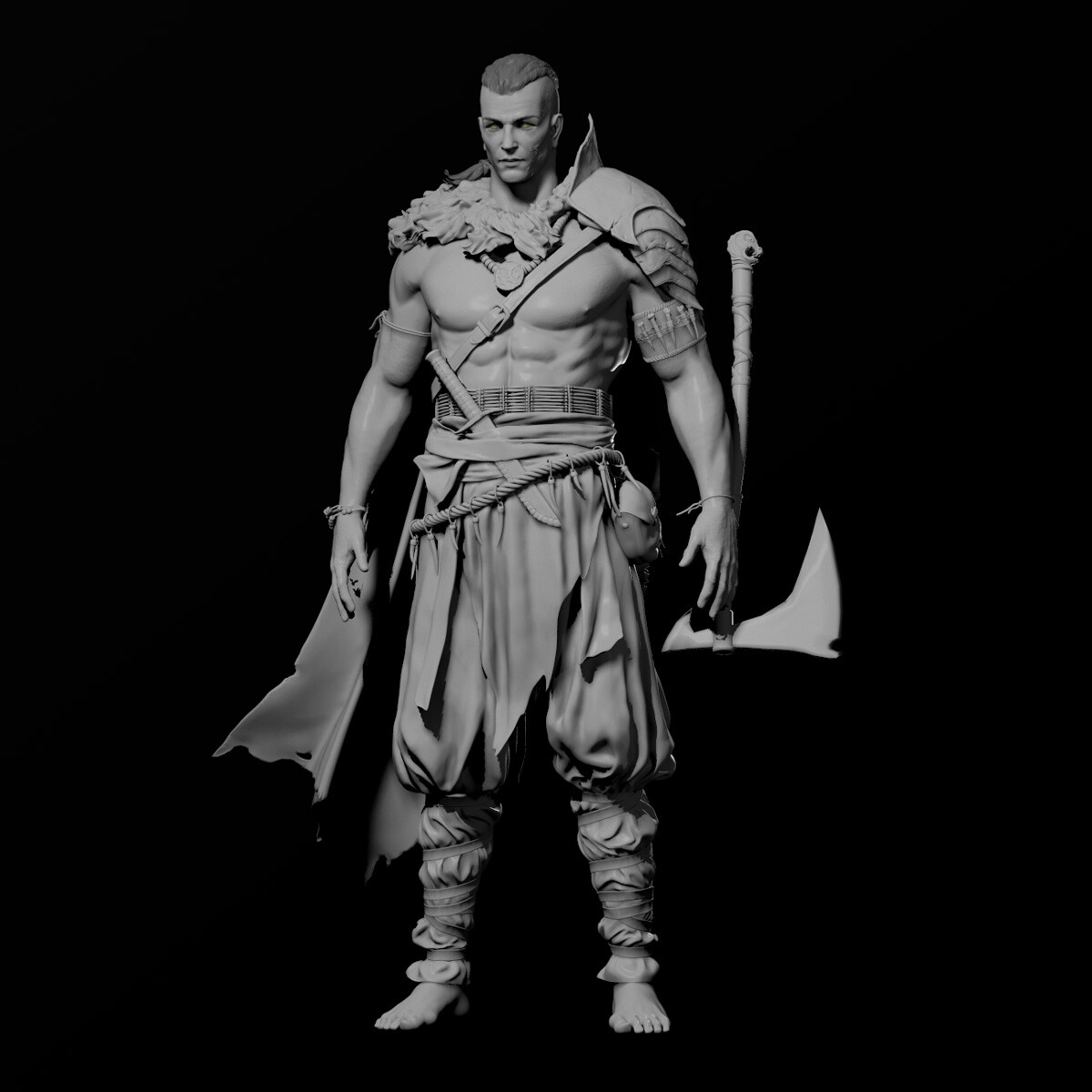
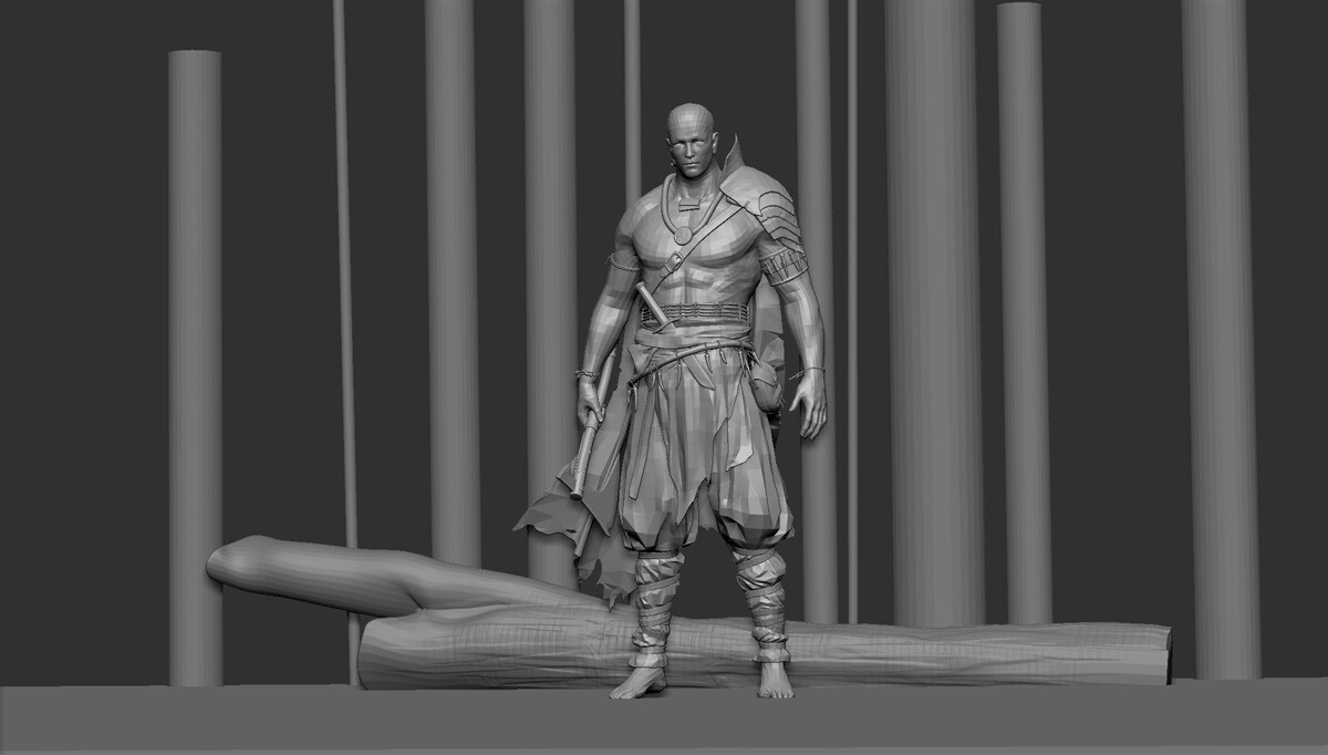
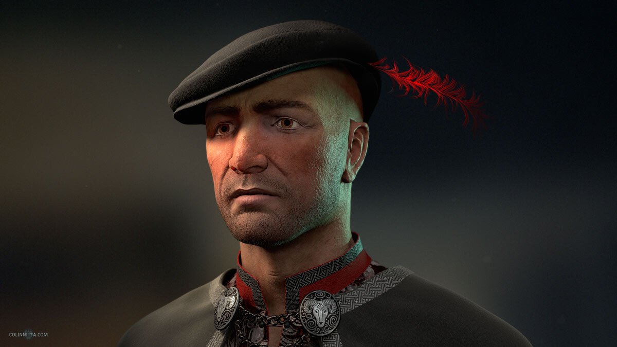
With all this in mind, I decided to look at a “mid-poly” approach for retopologizing Nissa. Why not push it since she is a next generation character anyway?

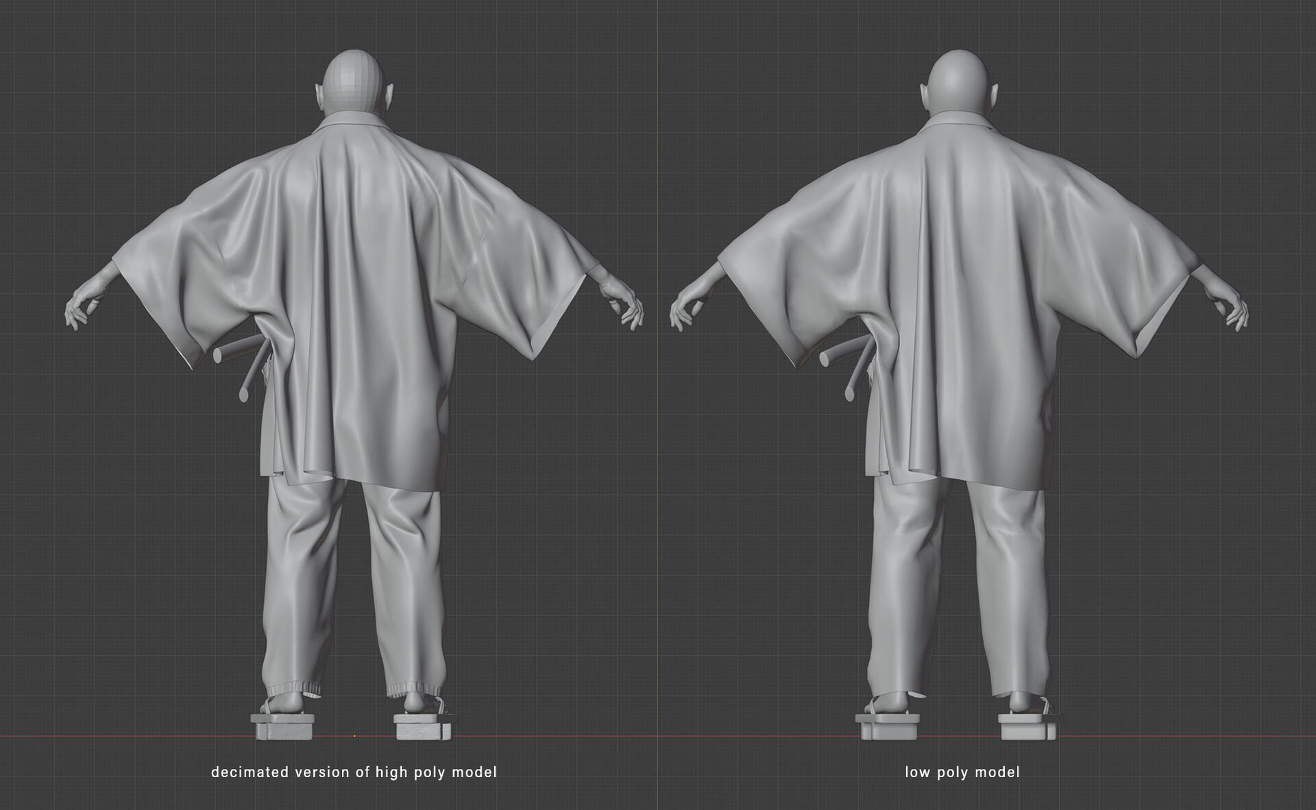
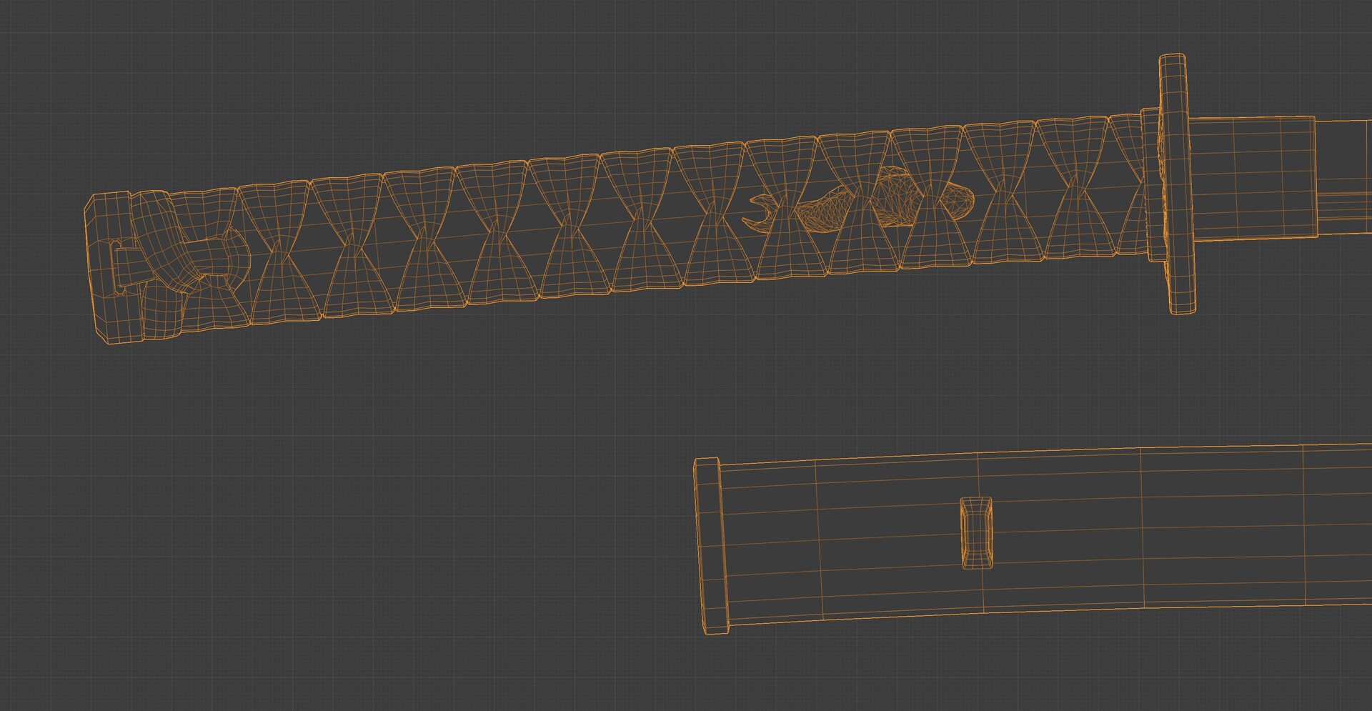
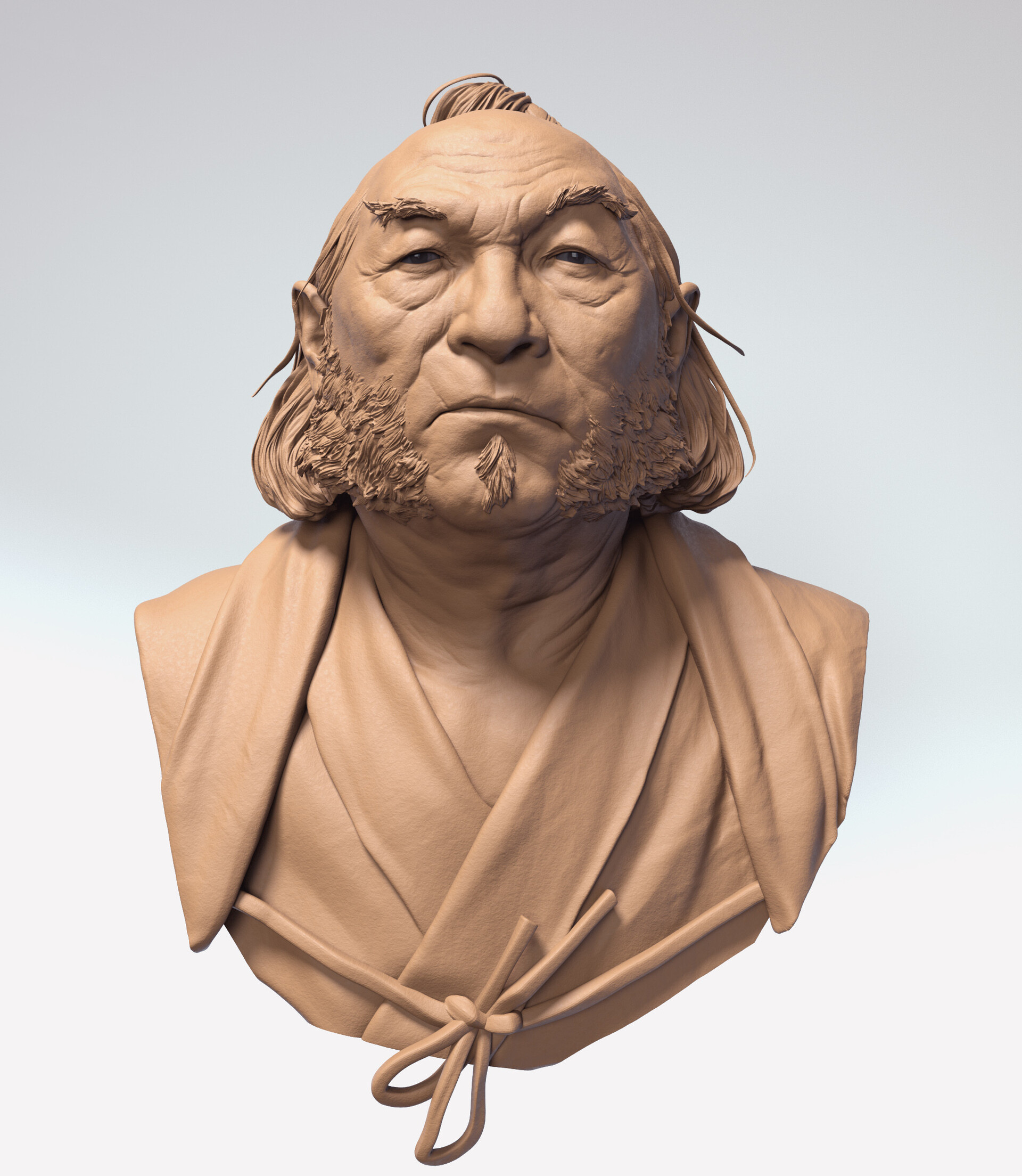
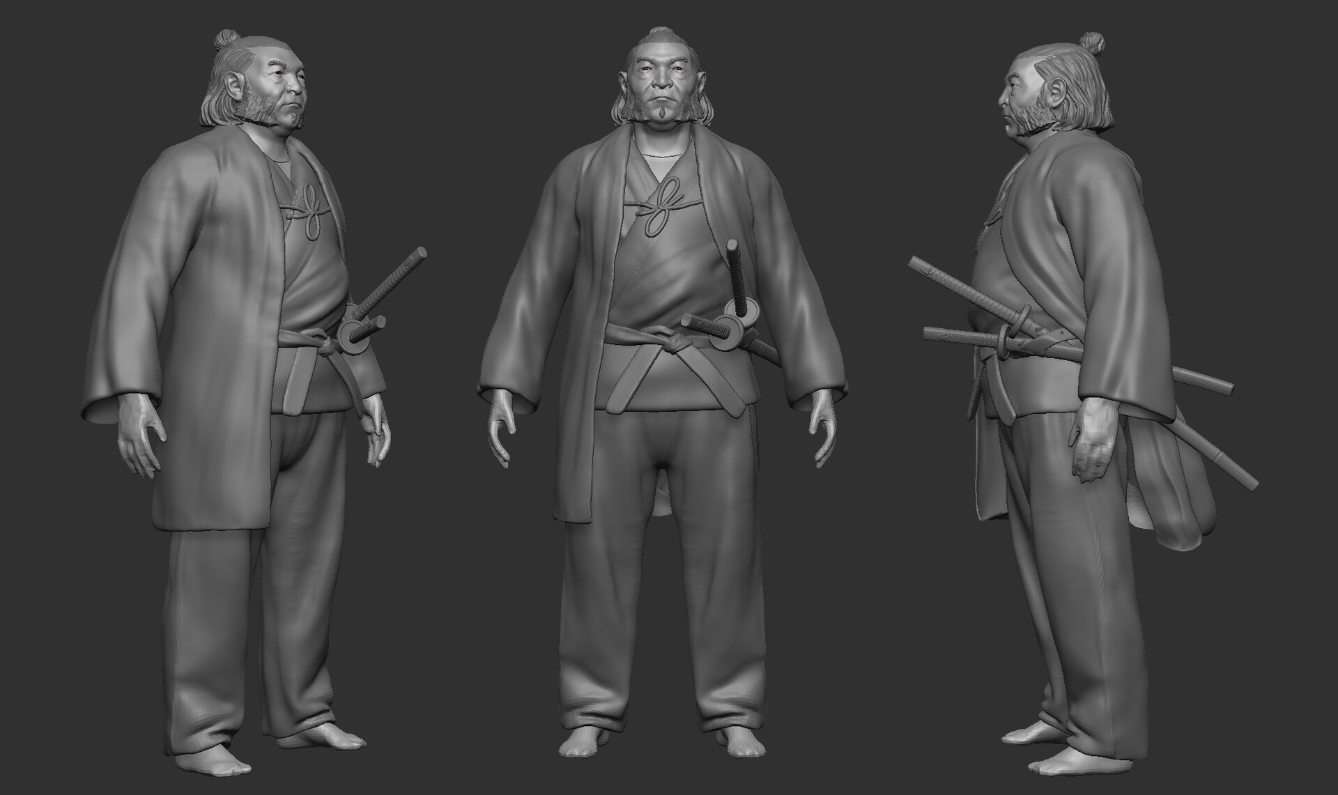
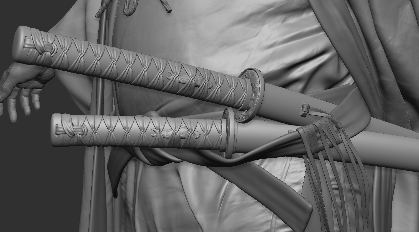
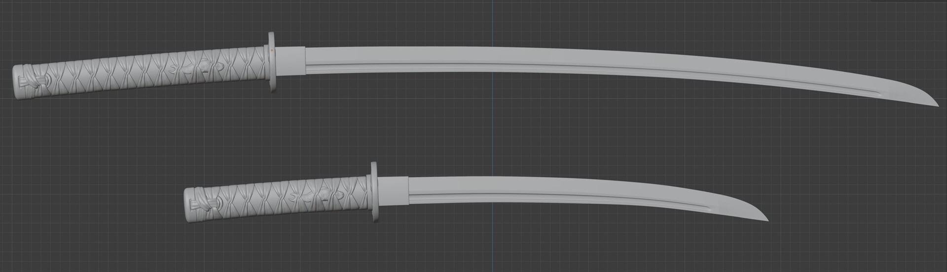
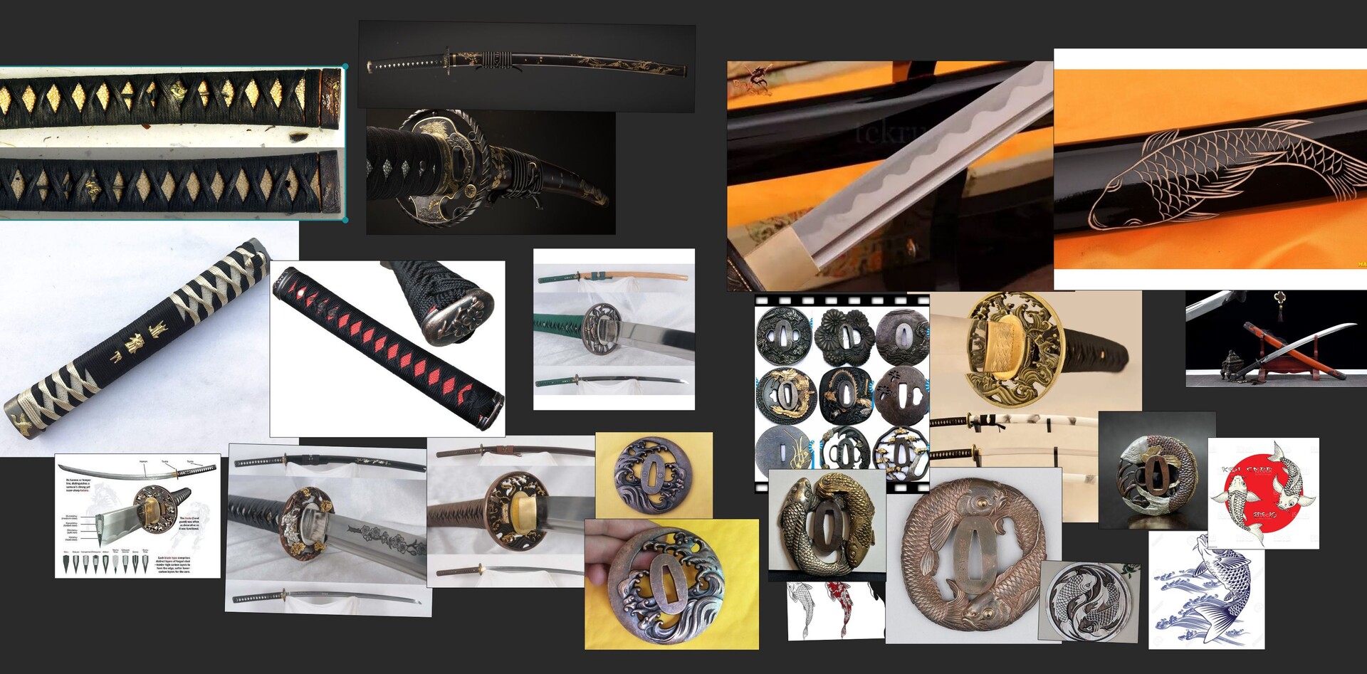
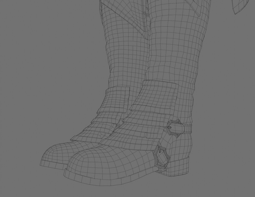
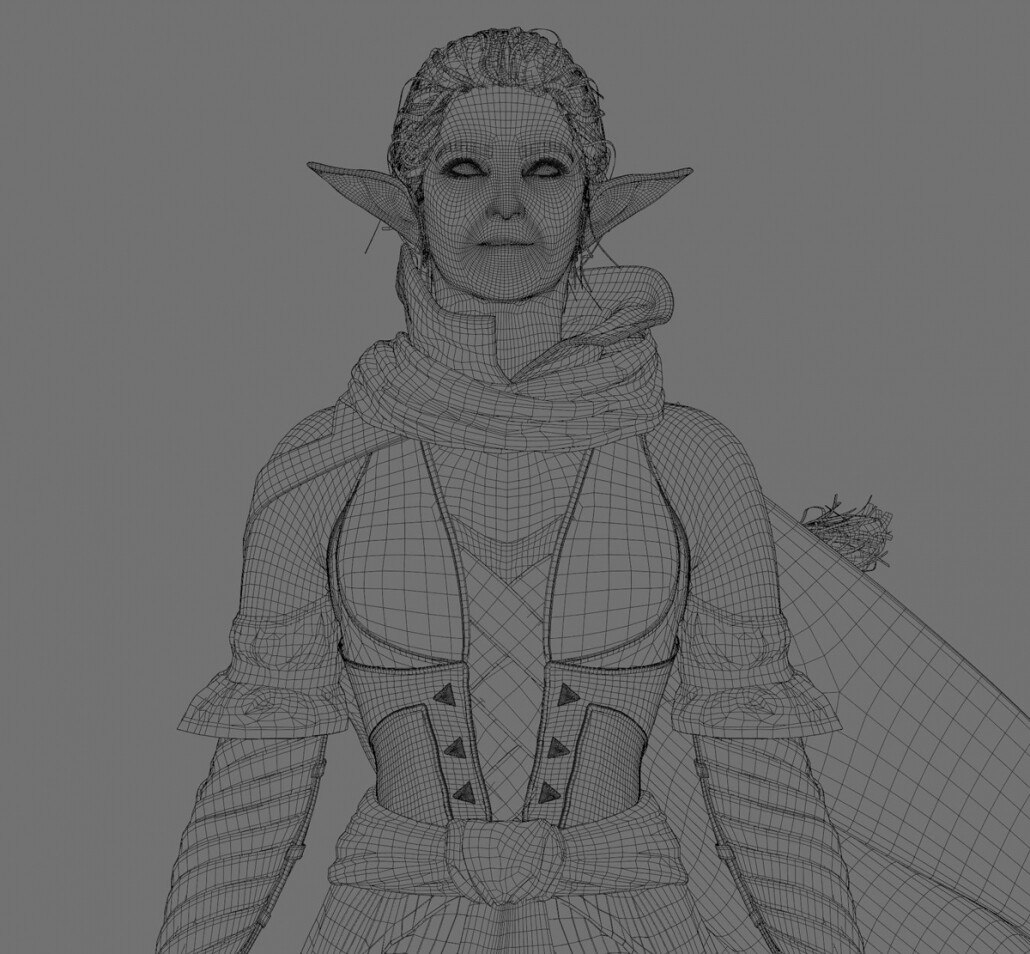
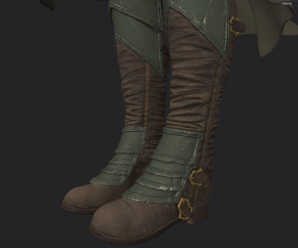
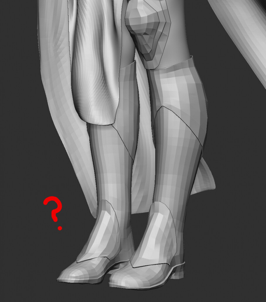
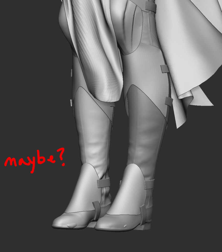
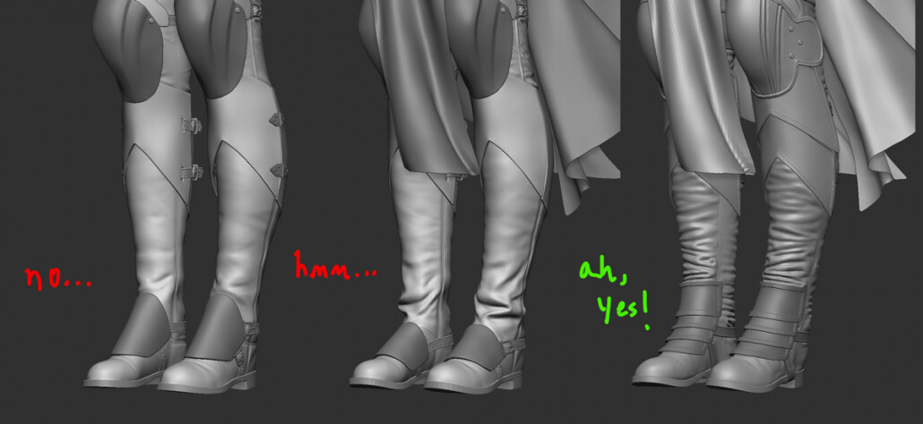
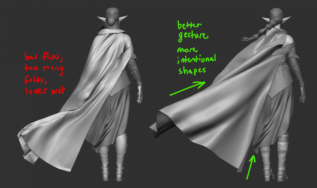
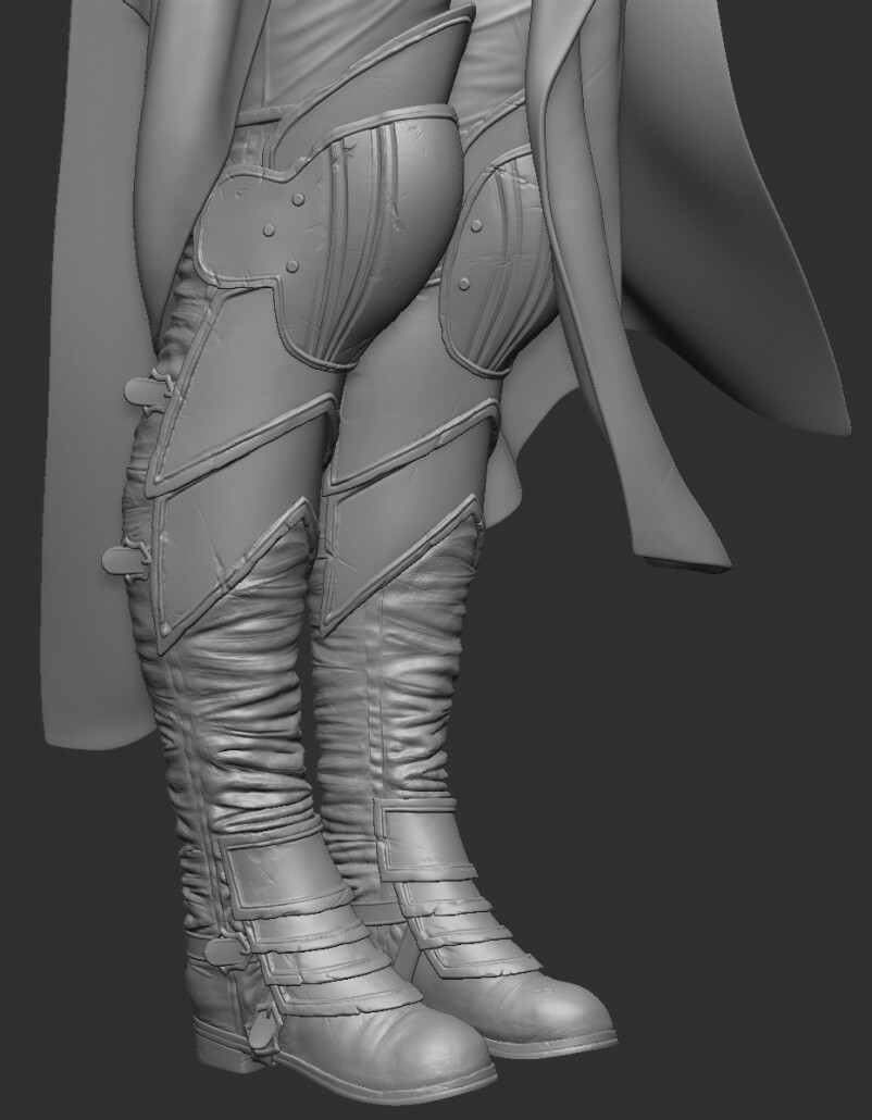
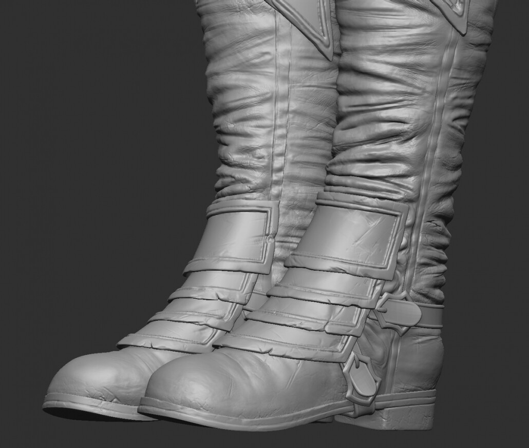
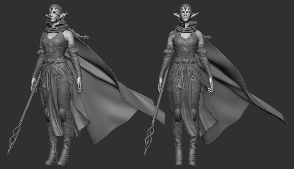
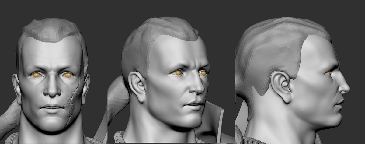
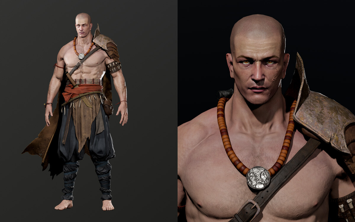
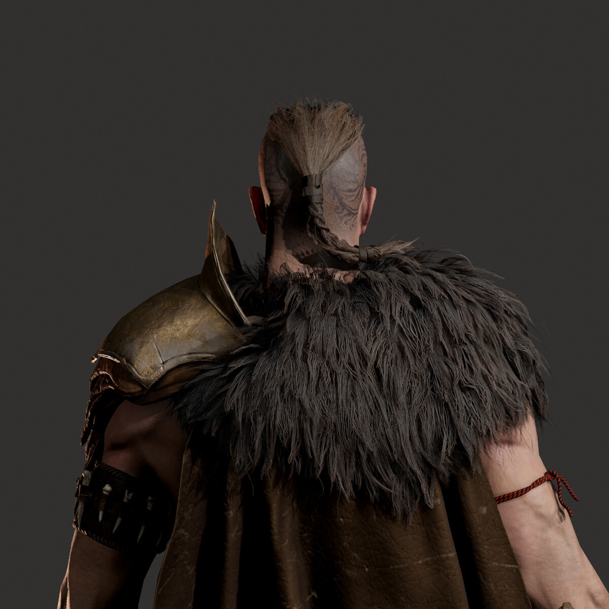
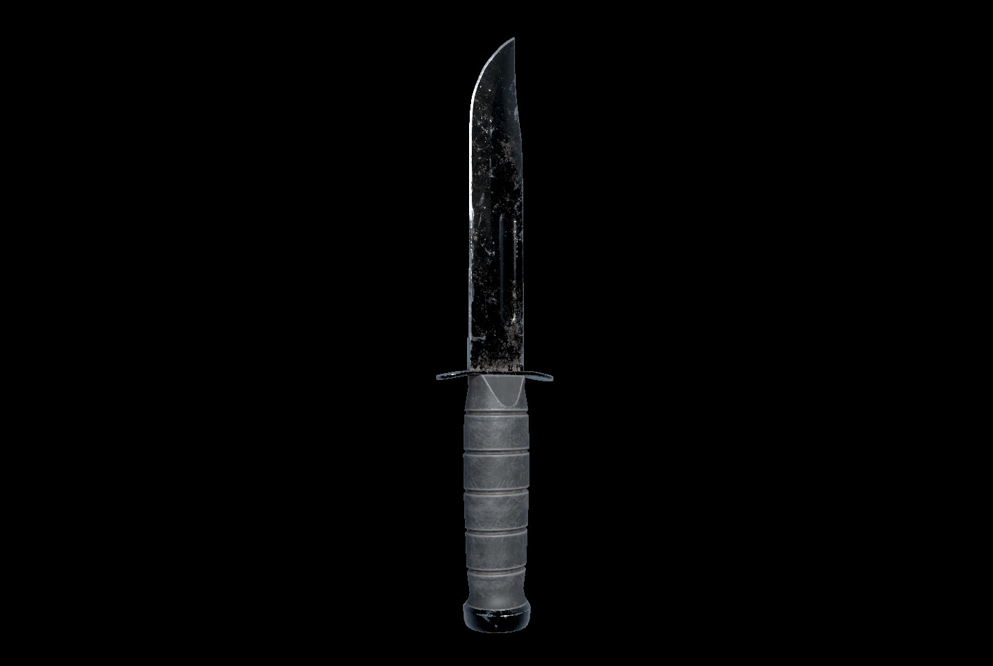
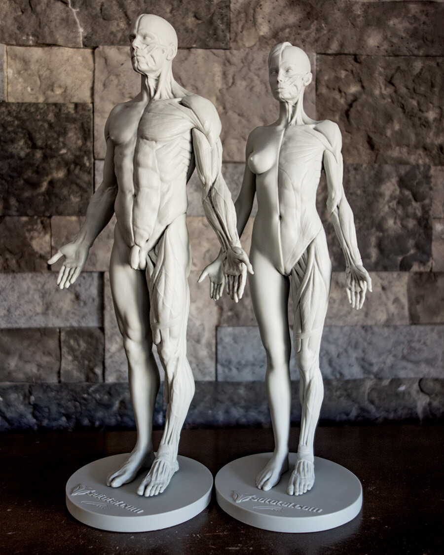
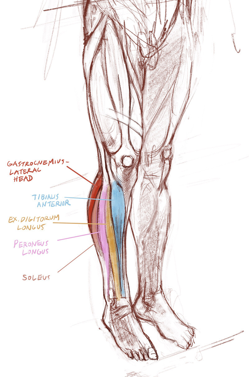
Having labored under lower poly count considerations before, retopologizing Nissa felt like abundant luxury at times. I didn’t count triangles but instead focused on overall silhouette. With the boots I kept the lobster plates as separate meshes so the shadows cast by them would distinctly show the change in the surface. Yes, I totally could have merged them together with the boot and relied on a normal map for optimization purposes. But they just wouldn’t look as good up close. It was these up close shots that I wanted the details to really shine!

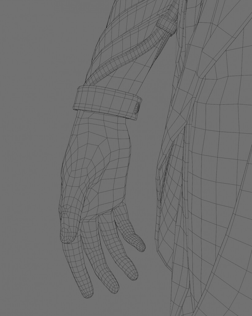
I was a little worried about the characters wrap-around leather sleeves. The sleeve straps follow a sharp 60 degree angle that goes against the natural loops of the arm. I thought a lot about whether I should optimize the straps and the arm into a single mesh with horizontal loops, but in the end decided against it. They still have clean quads so they should be able to deform with the bend of the arm. Later, when posing in ZBrush I found this to be the case. They worked out fine, with some of them compressing together in the innermost joints. But an actual leather wrap would do that in real life too, squishing and stretching, so I found the results to be pretty much lifelike.

To be honest, it was a relief to be able to work in this manner. Just by focusing on overall silhouette and capturing the details I wanted made the retopology process feel much more enjoyable than it has in the past. Like many others, I’ve run into the wall of focusing on a beautiful high poly model that is very difficult to translate into low poly. As the artist, you can start to fight yourself and it can be really frustrating. What’s important here is intention. Nissa is intended to be a next-gen character and we still don’t really know what’s possible. No games have been developed in UE5… yet. I’m learning and experimenting along with everyone else so I just wanted to reach a little higher – just a bit – and see what I could come up with!

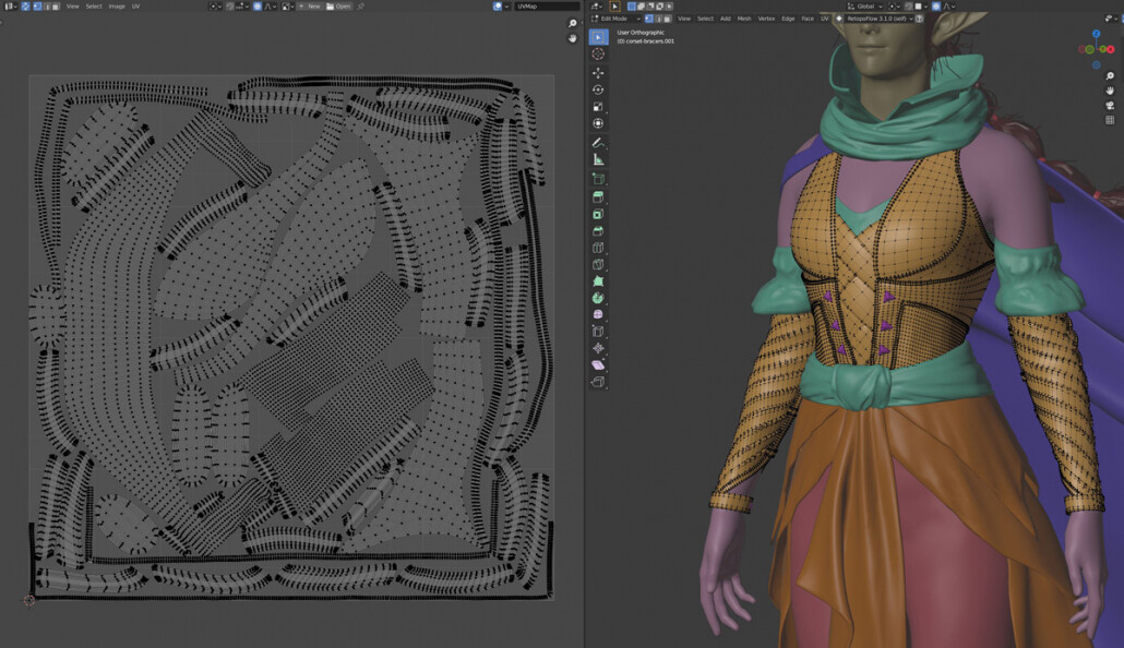
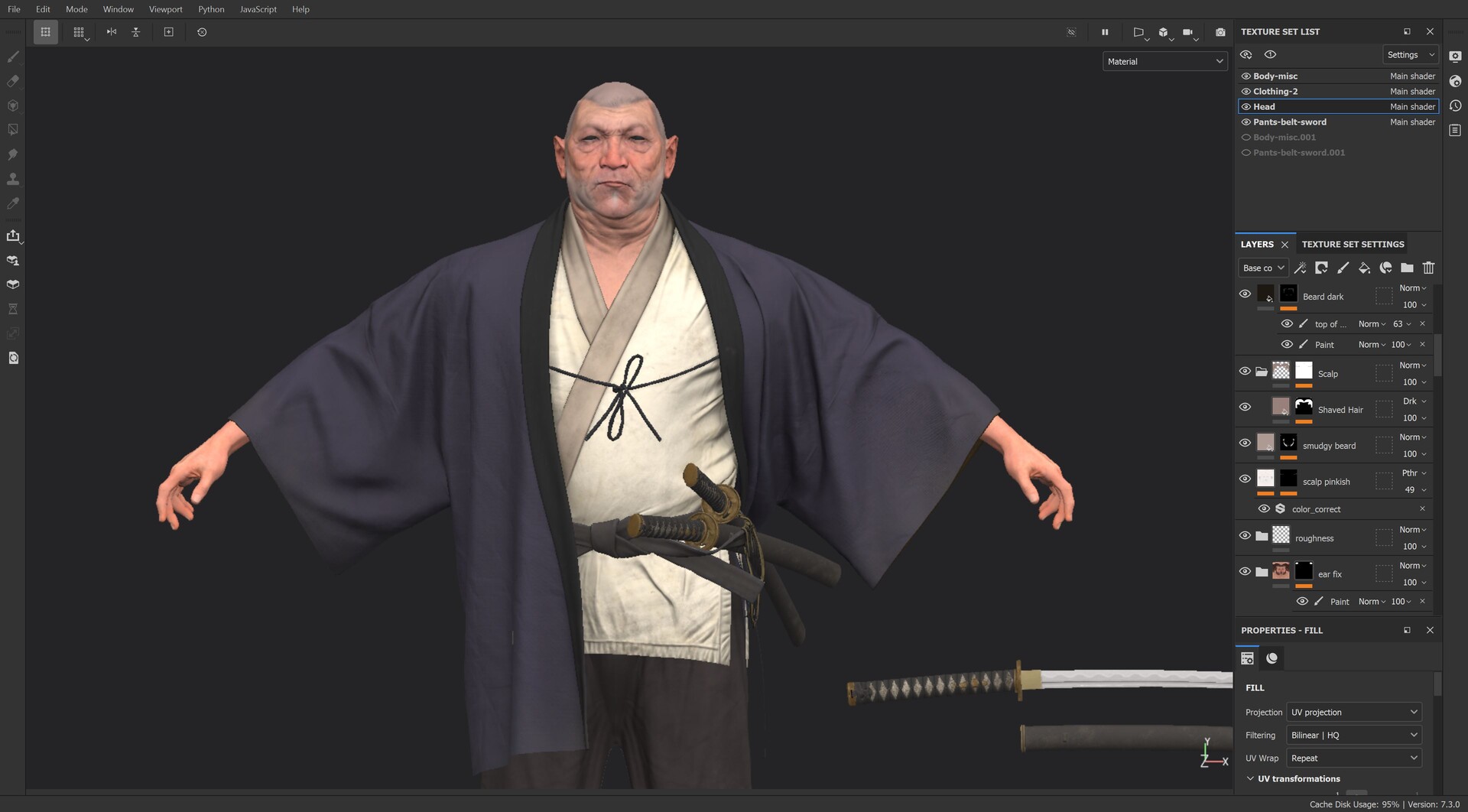
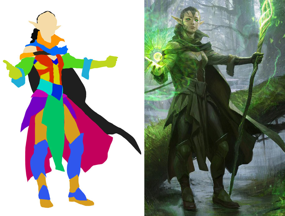
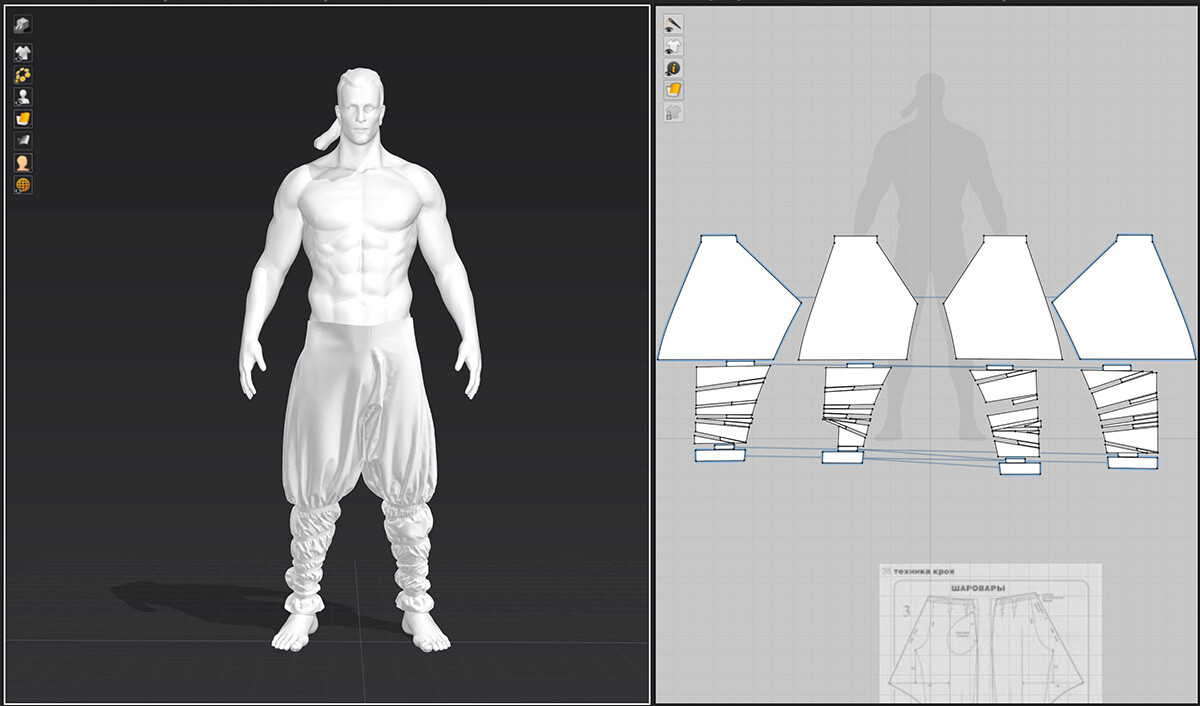
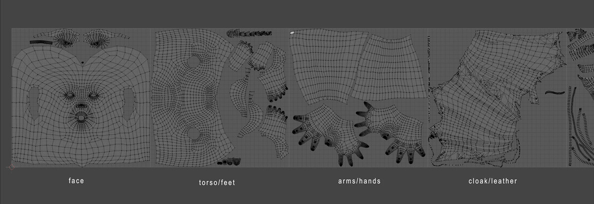
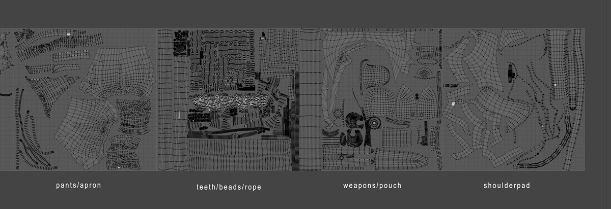
My UV process was straightforward. I assign materials to my texture sets and give them each a different viewport color in Blender so I can keep everything organized. As always, I make seams on the back side side of meshes as much possible (or in actual seams, as in the case of clothing) and group textures together by proximity and/or material, depending on what works best.

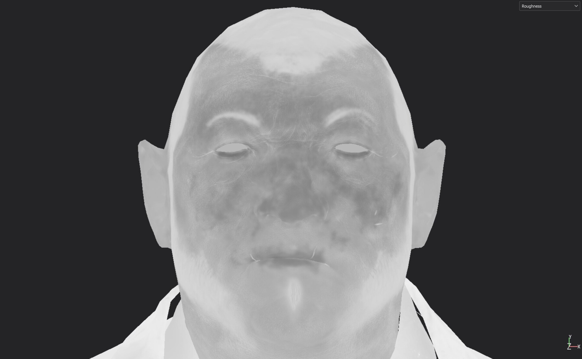
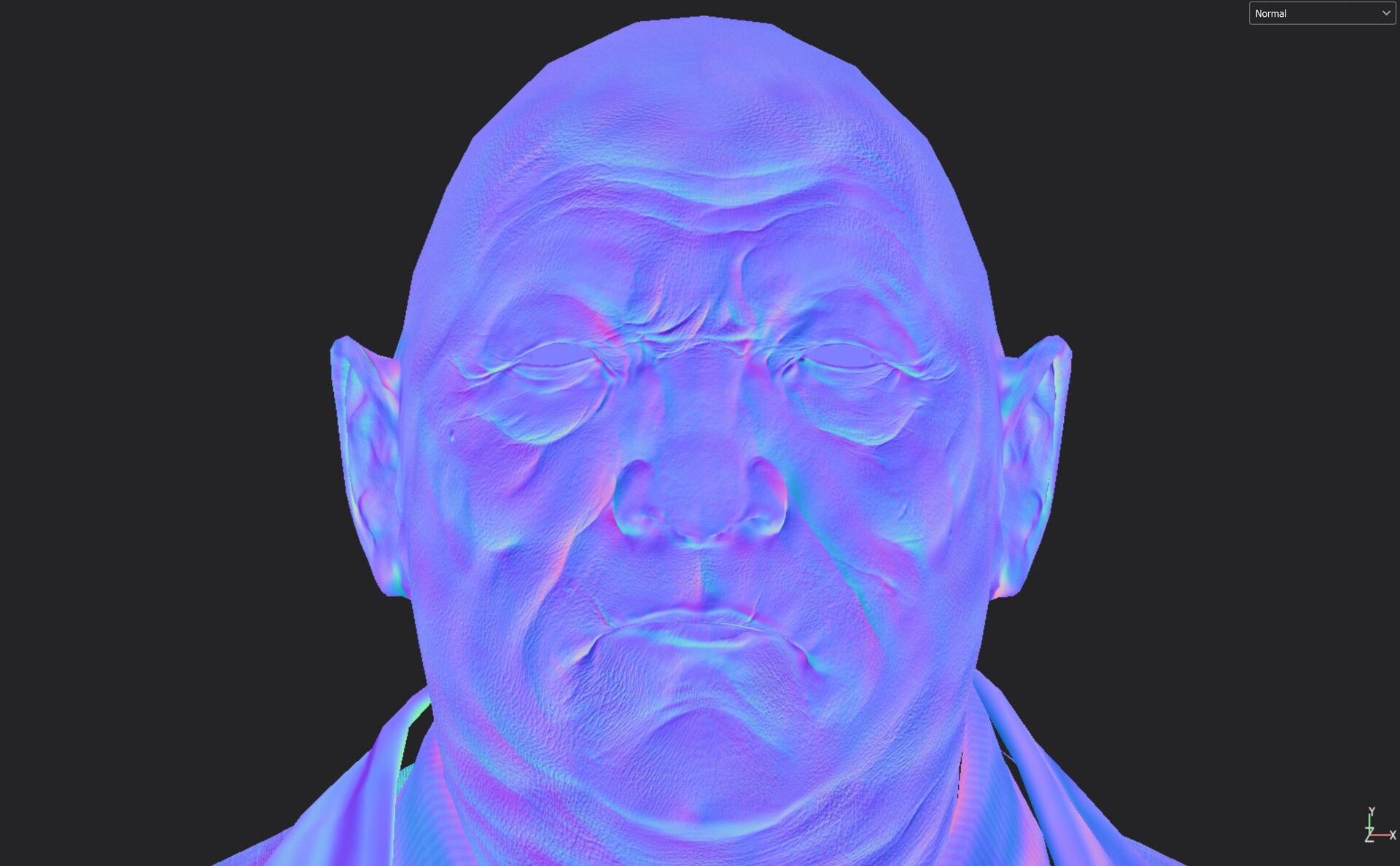
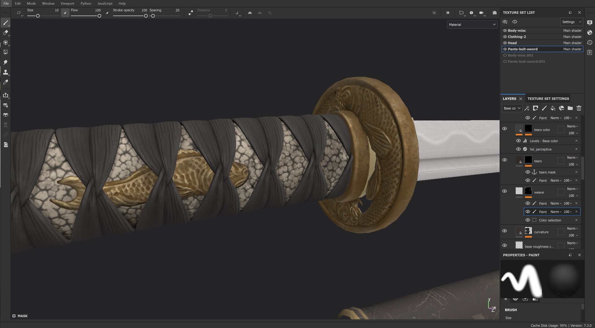
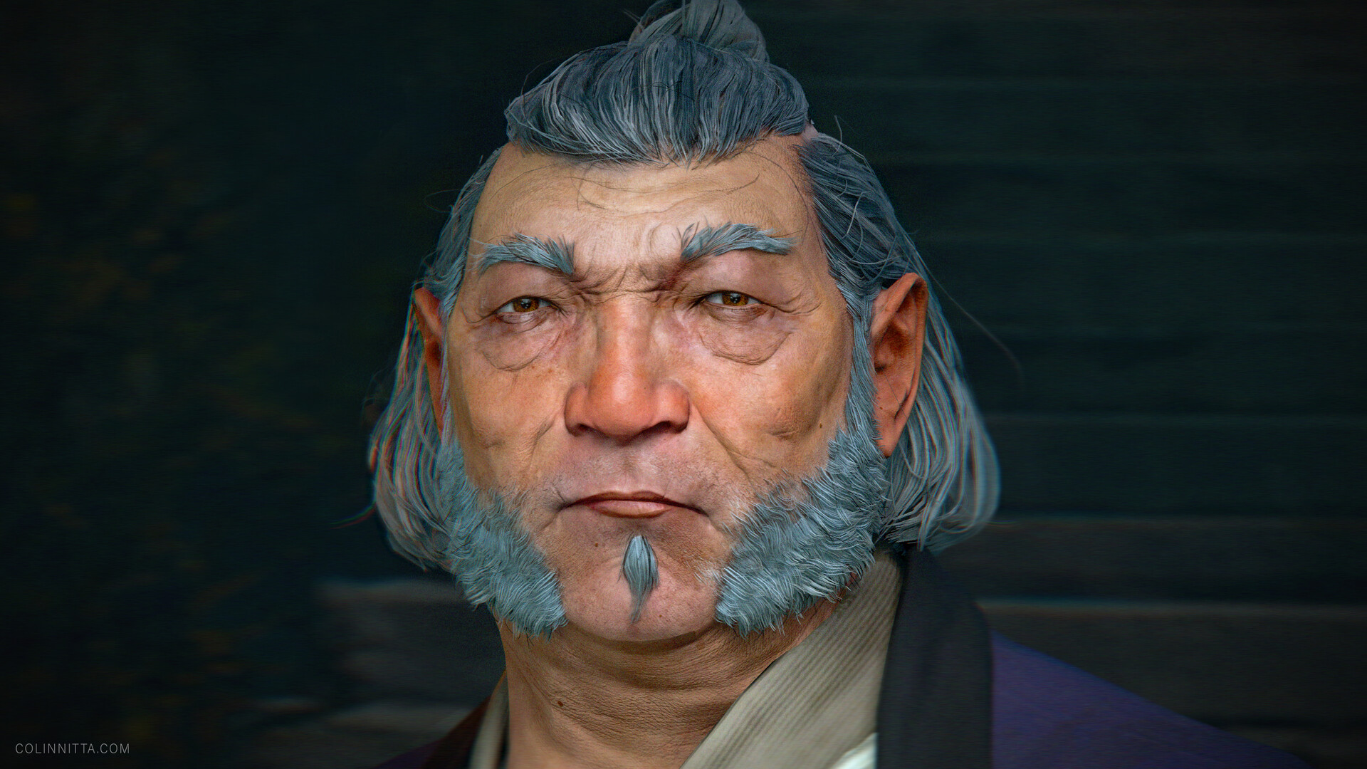
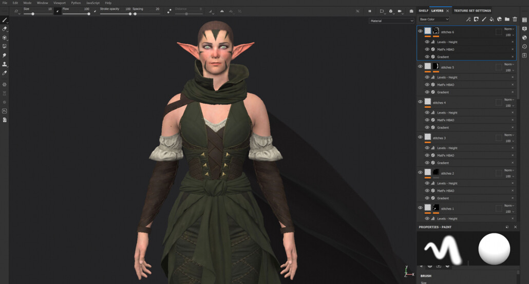
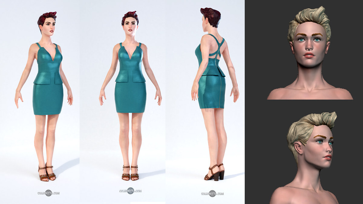
Finally, texture painting! When I first started working in 3D, I had a lot of doubts about whether this industry was right for me. But when I first started using Substance Painter, it all changed for me. I’ve been painting with traditional media since I was in high school and have been digitally painting since 2017, so the process just felt like home. I love watching the model get life breathed into it once normals are baked and color starts getting laid down. There’s nothing like it

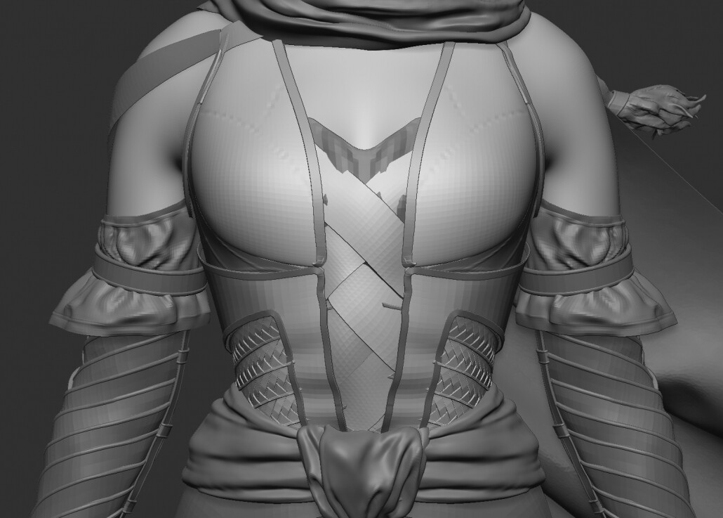
One of the reasons I left these tiny overlapping straps devoid of manual detail in ZBrush is because I knew they’d get a lot more love in Substance Painter. I used a technique for stitches developed by Safwen Laabidi that allows for painting them on directly, complete with normal, basecolor and AO details. I was first introduced to this method via Ackeem Durant’s character course at The Vertex School. Such a great way to work and really fun too.

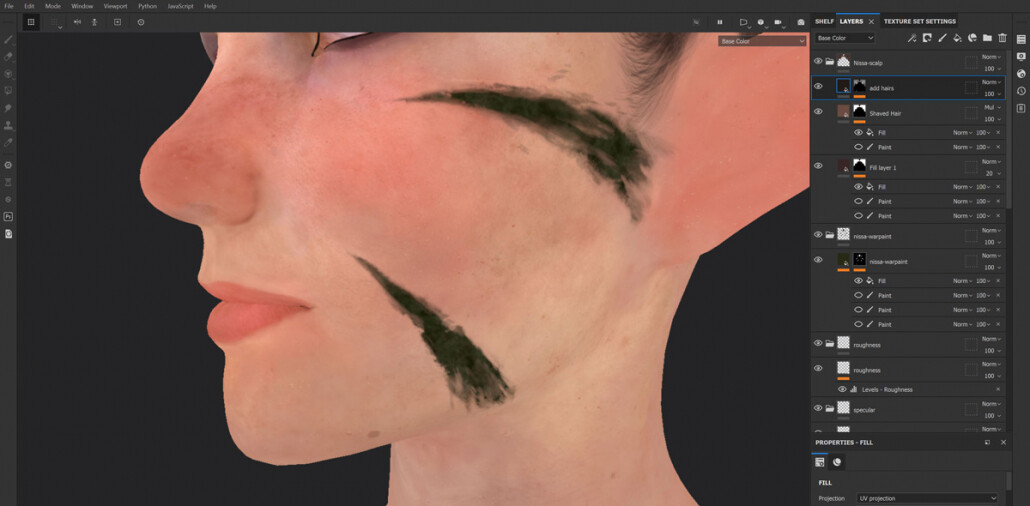
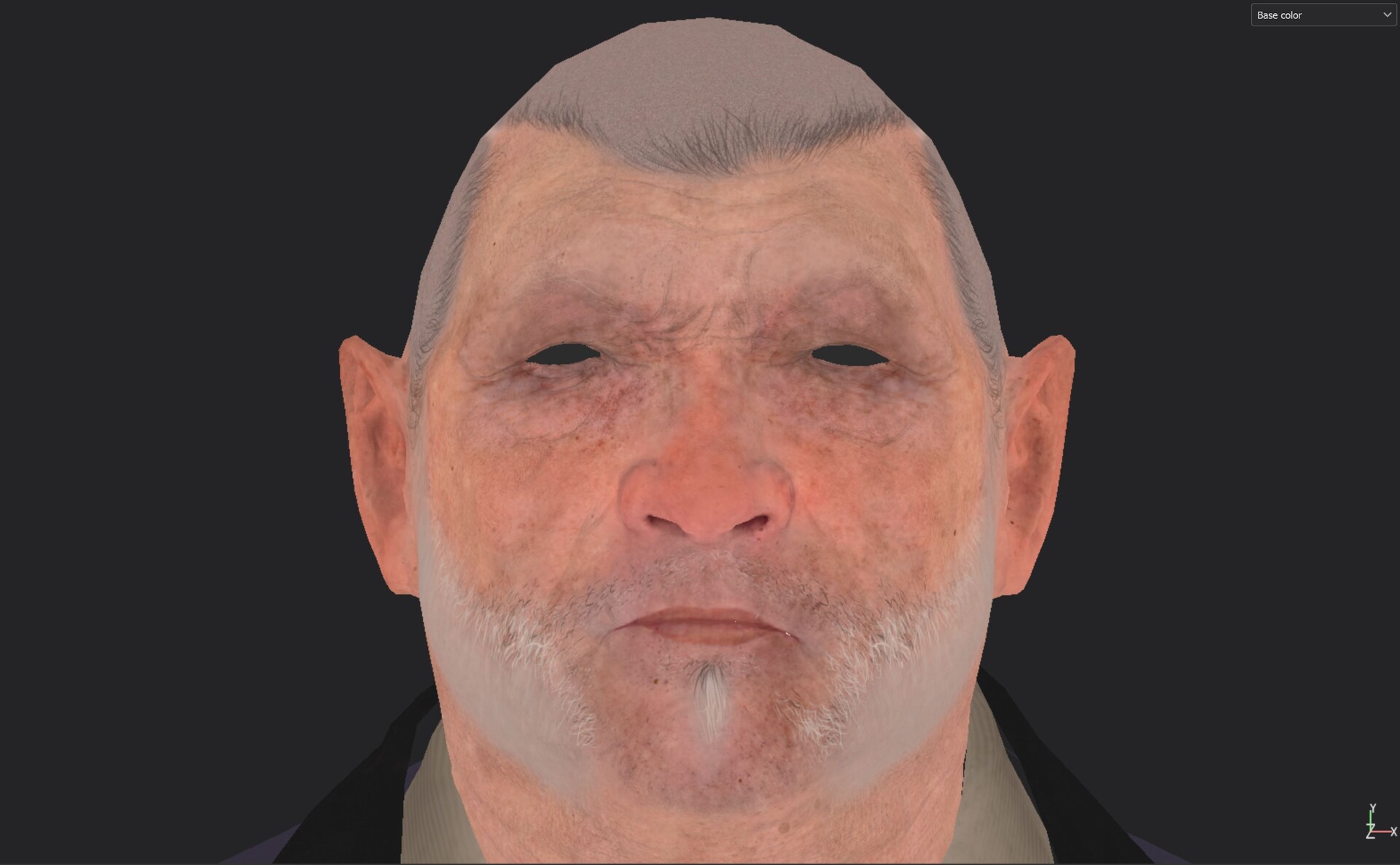
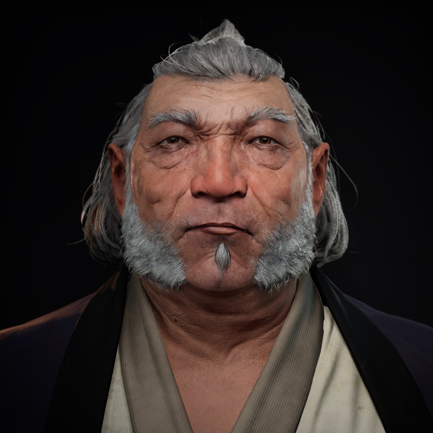
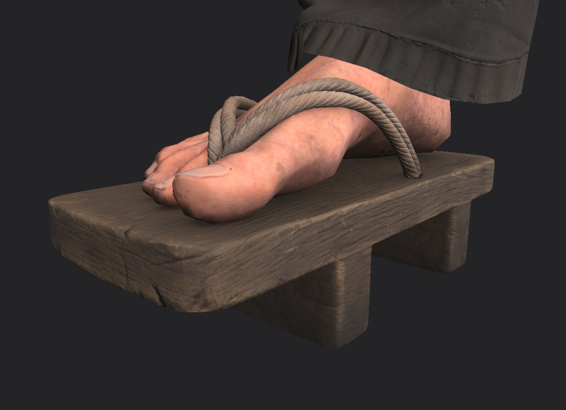
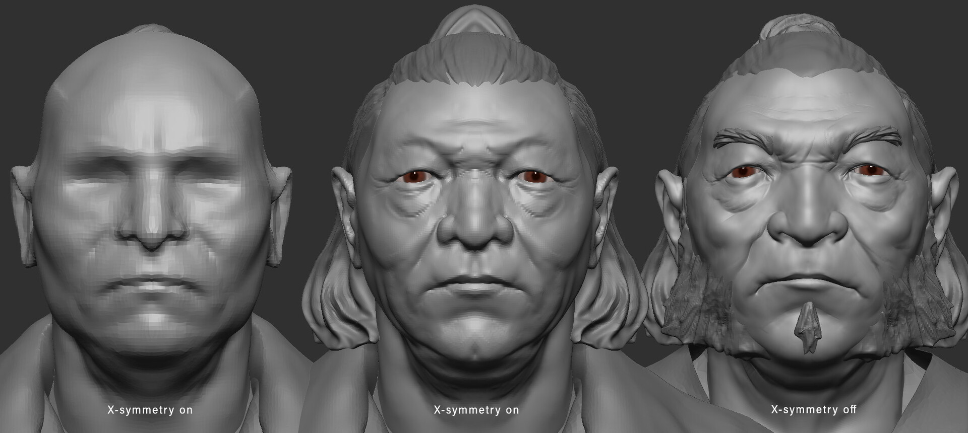
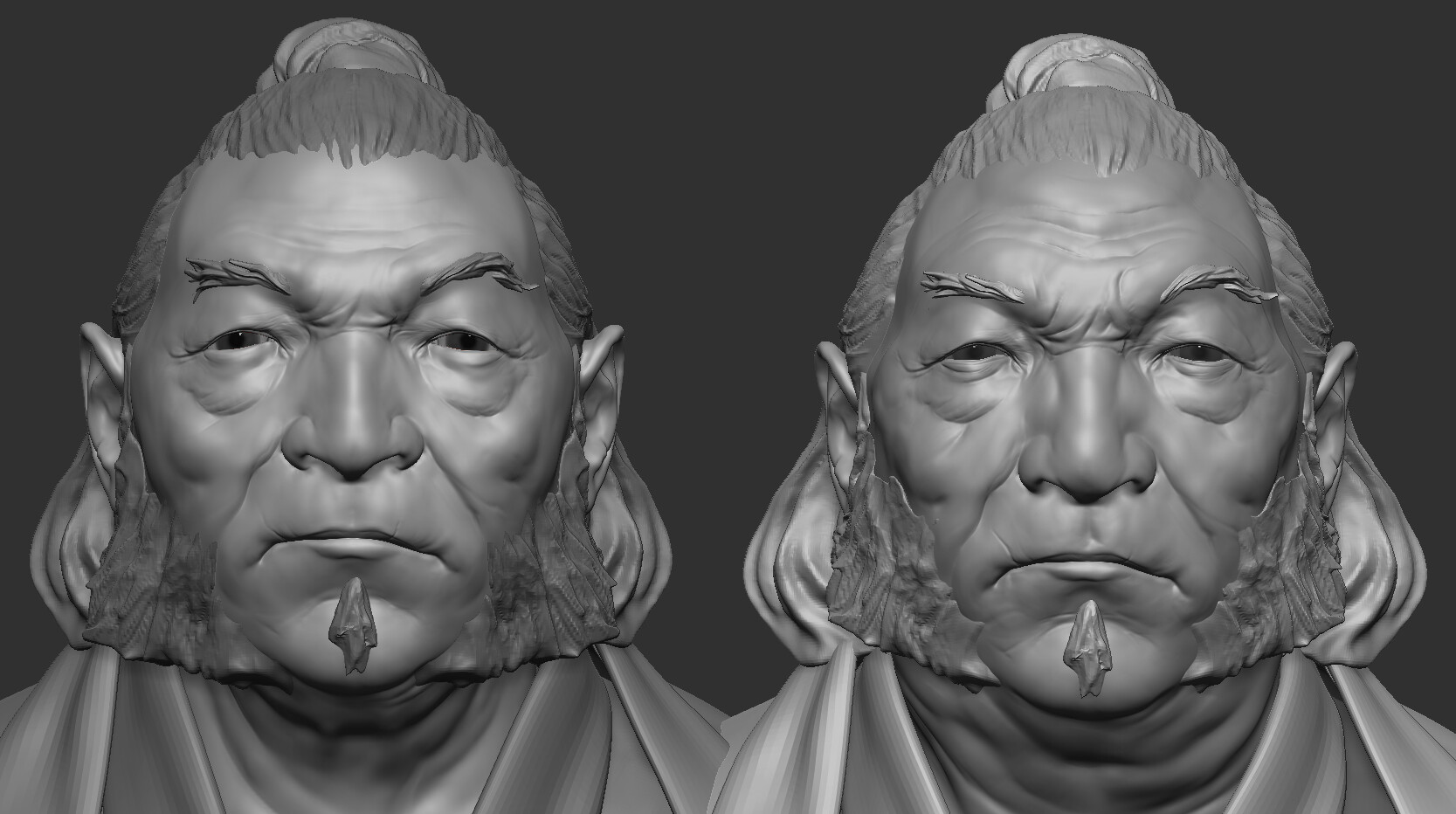
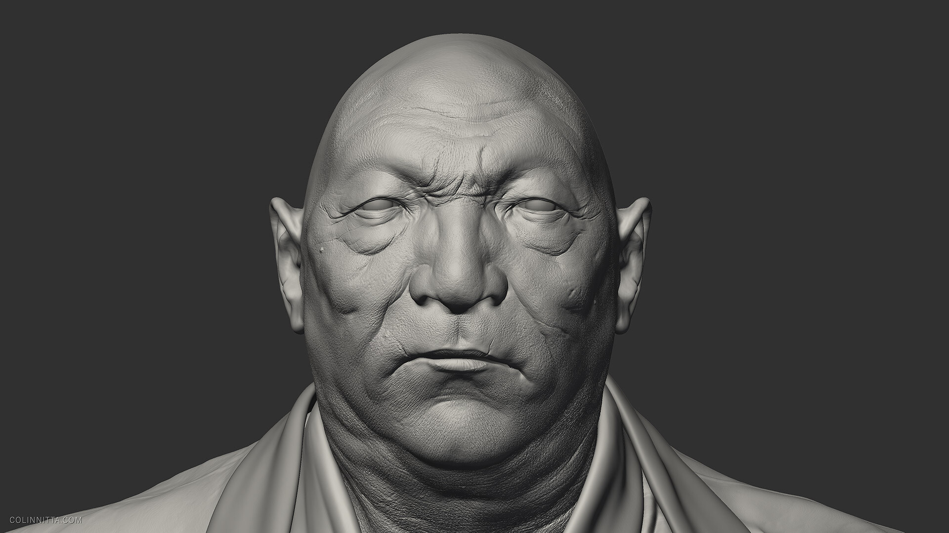
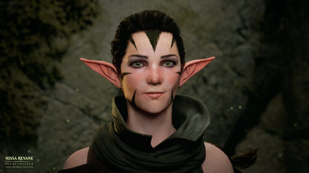
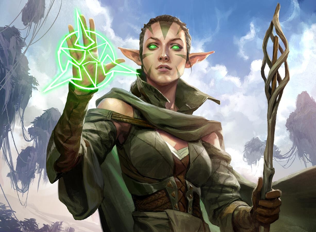
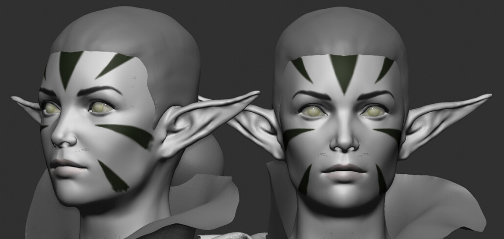
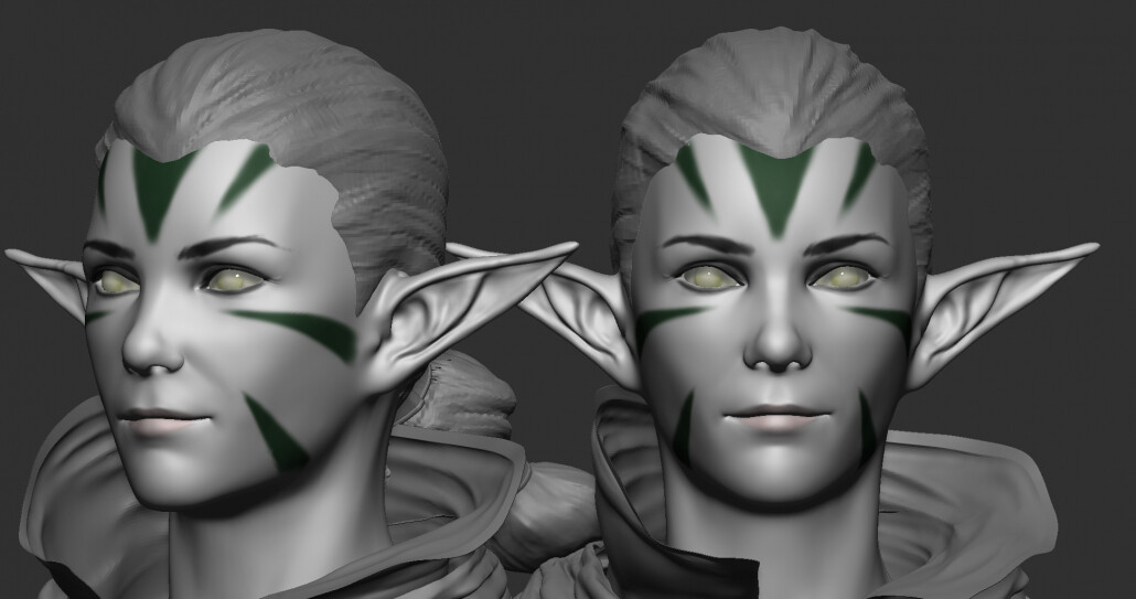
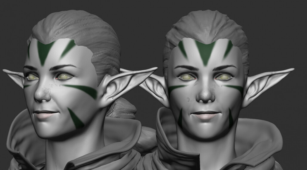
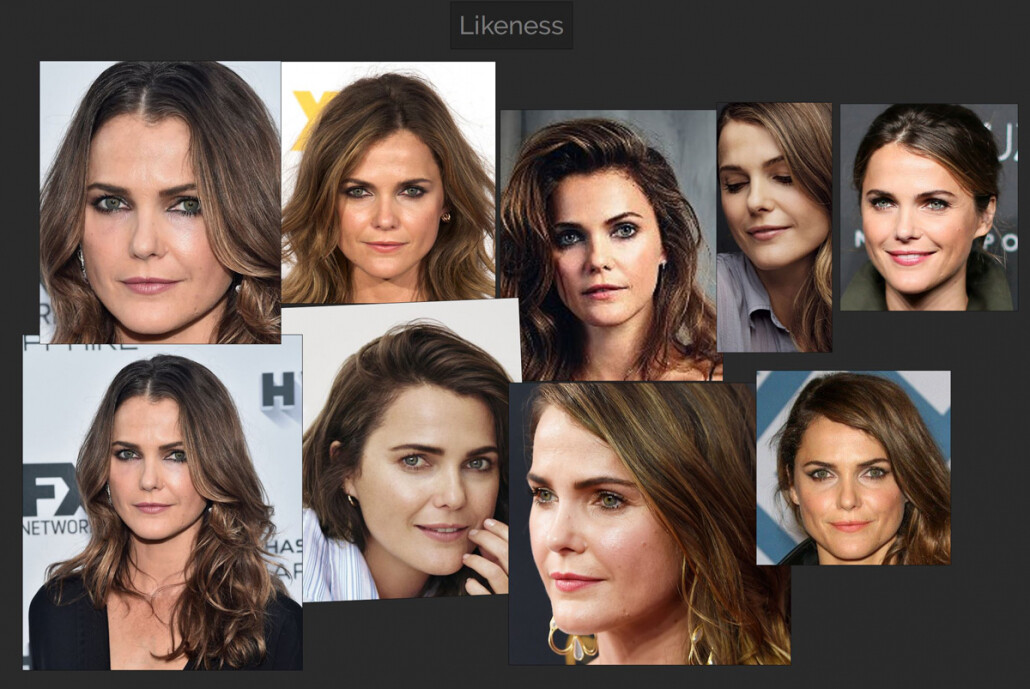
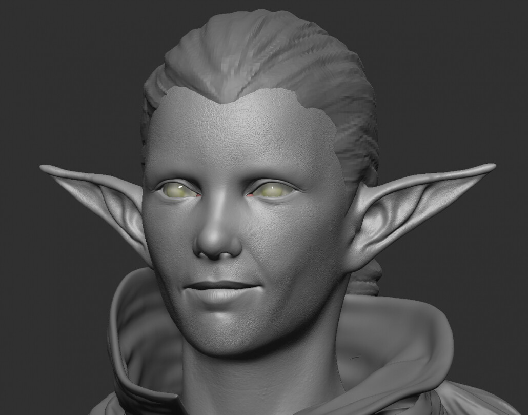
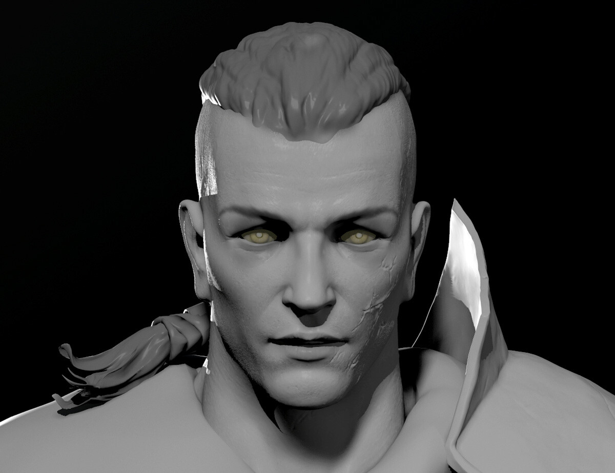
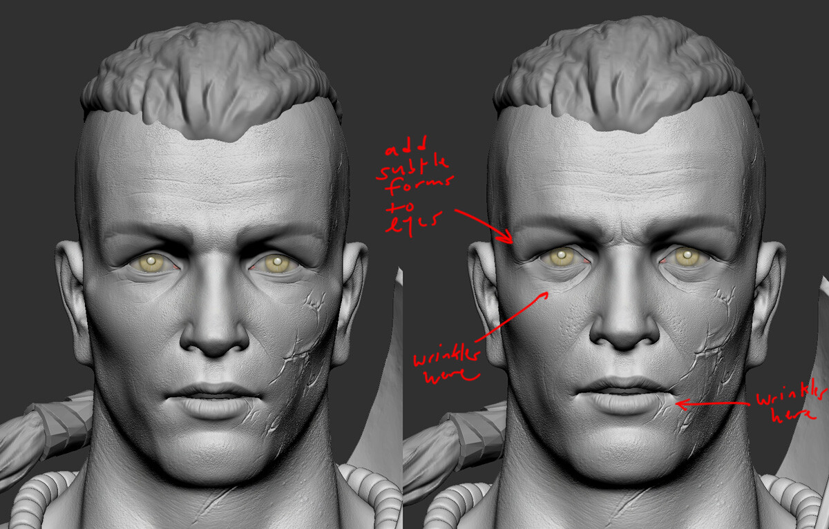
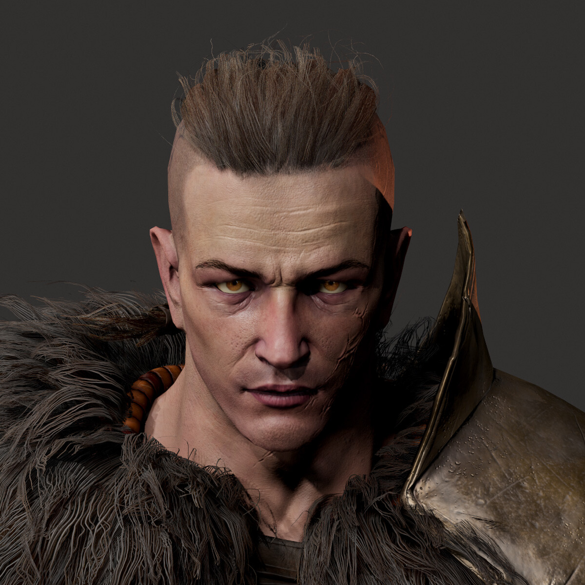
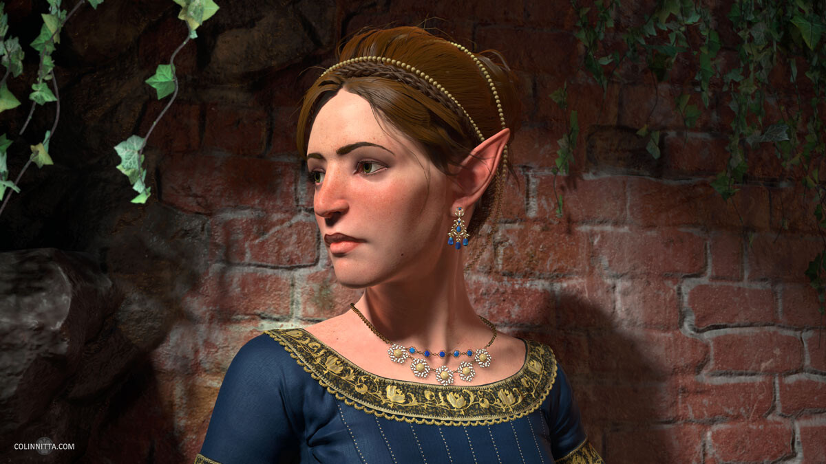
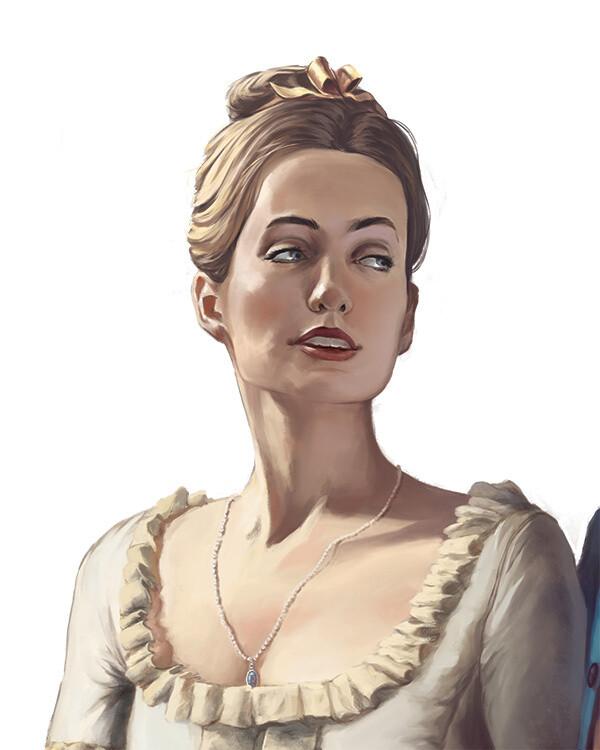
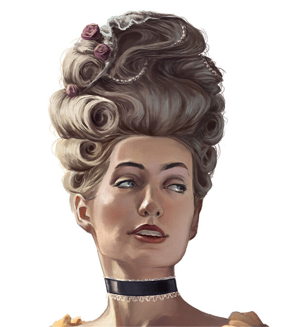
Here is the base color channel for the face. I started with a cross-polarized photograph of my wife’s face and quickly projected it on the low poly model in Mari. I then brought it over in Substance Painter and layer up organic details until I have something that feels right. Overall, I wanted a natural feel that felt in tune with the character. I especially enjoyed painting Nissa’s warpaint. I imagined her streaking on these marks on her face preparing for battle, and over the day, her sweat streaks into them, causing them to become a bit grimy. Ah, grime – the one thing we are all trying to capture in texture painting

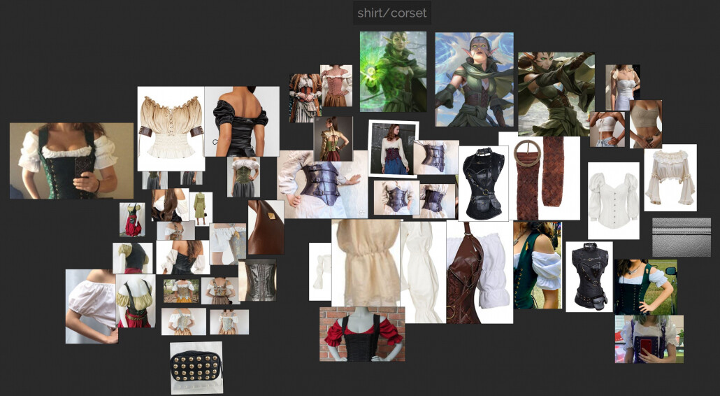
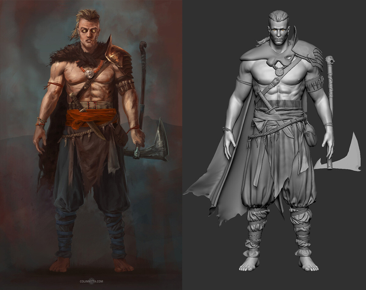
The armor proved to be a little tricky at first. In the concept art, it is a shiny green surface that is rather vague. I decided that it was steel painted green like the Green Knight from Arthurian lore. Over time this green paint would have been scratched, buffed and chipped away, especially on corners and edges, revealing the reflective metal beneath. Corroded brass buckles tied the green and brown aesthetic together nicely.

Another area that I really enjoyed was adding thread damage to the fabrics. I used the Anchor Point system in Substance Painter to mask in spots where I wanted damage to occur. I then dynamically adjusted the amount of threads that would appear in the damages areas with Anisotropic Noise patterns. So fun! I could tinker with this stuff for hours.

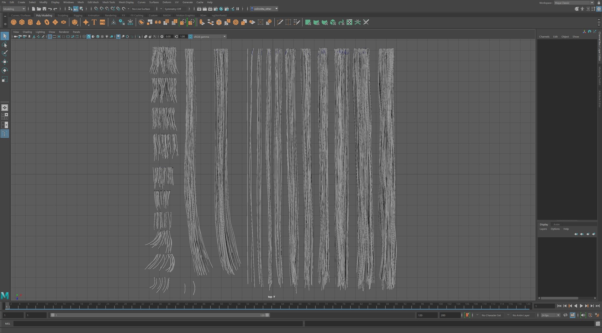
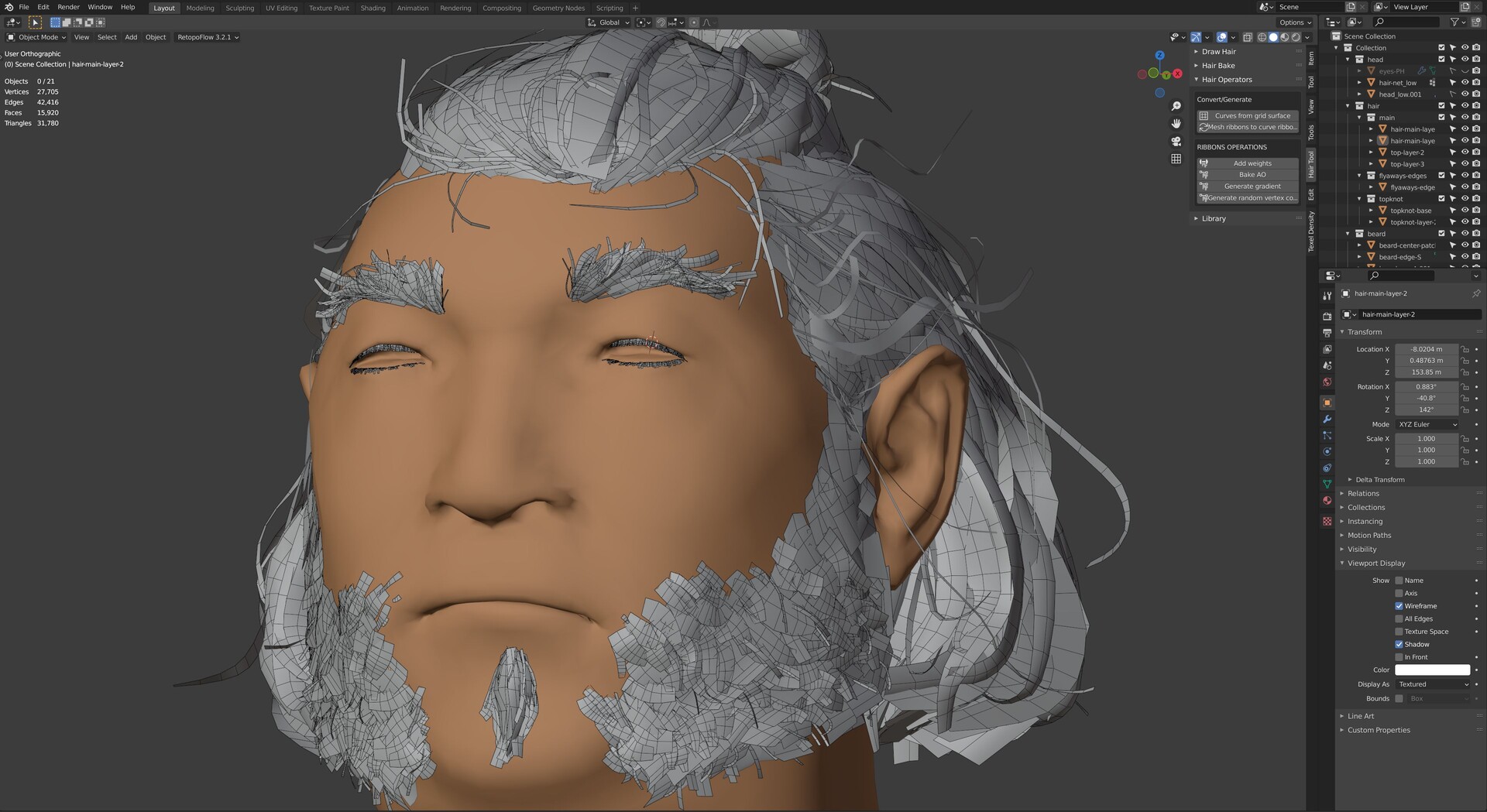
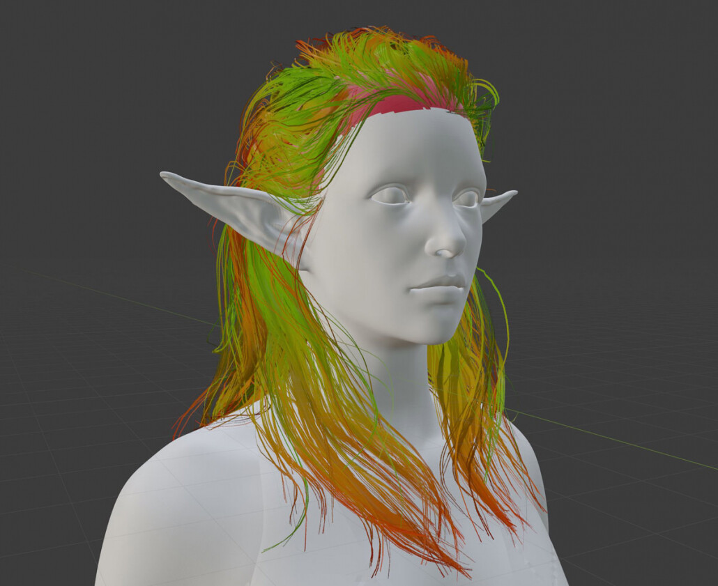
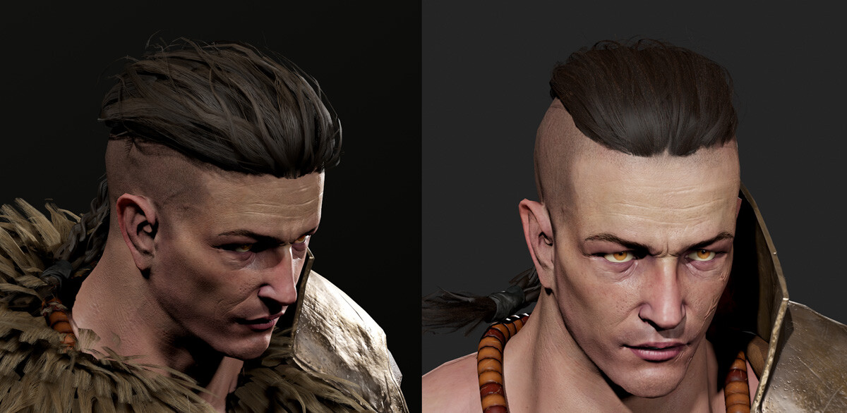
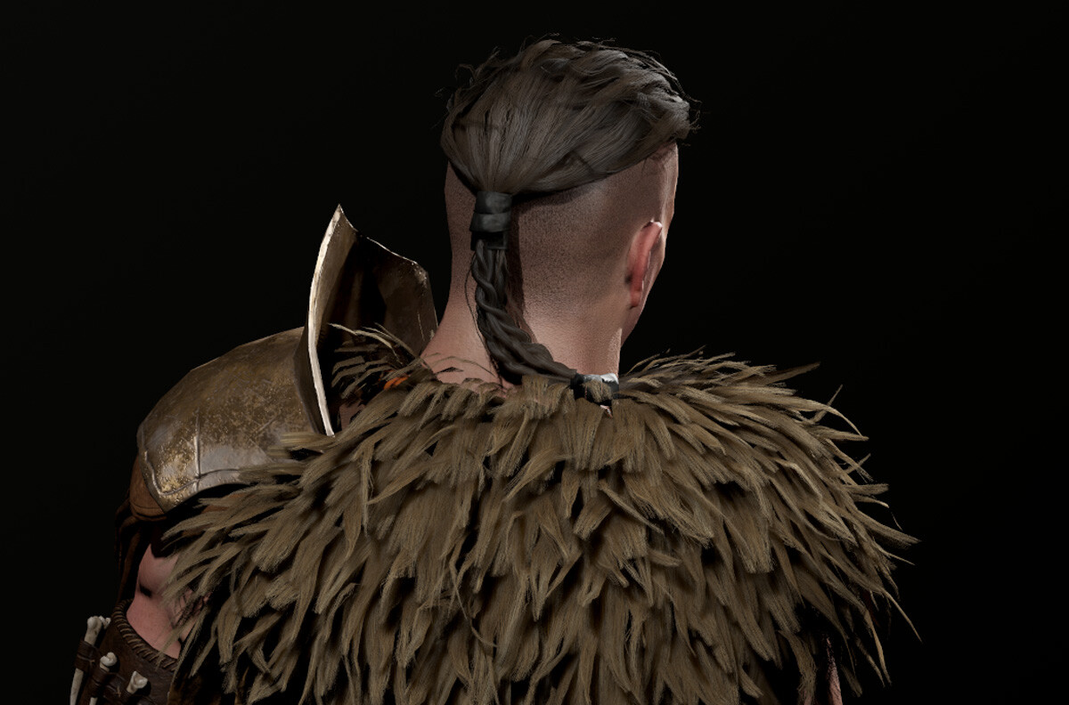
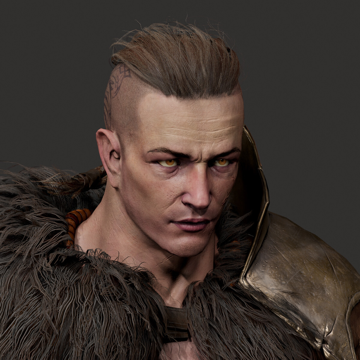
After texturing, I had one last demon to slay: hair. Hair is one of these topics where I feel I can prove to people that becoming a 3D artist is not really about talent. If there is talent involved, then it’s not that important. Not so long ago, I had zero capability when it came to creating real time hair or even how to get started. I have another blog post series about learning 3D where you can see the evidence: https://colinnitta.com/from-donuts-to-barbarians-my-year-of-3d-education-part-1/

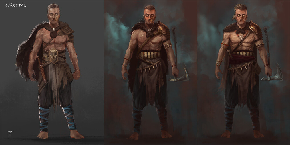
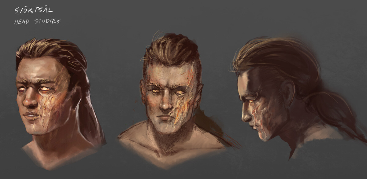
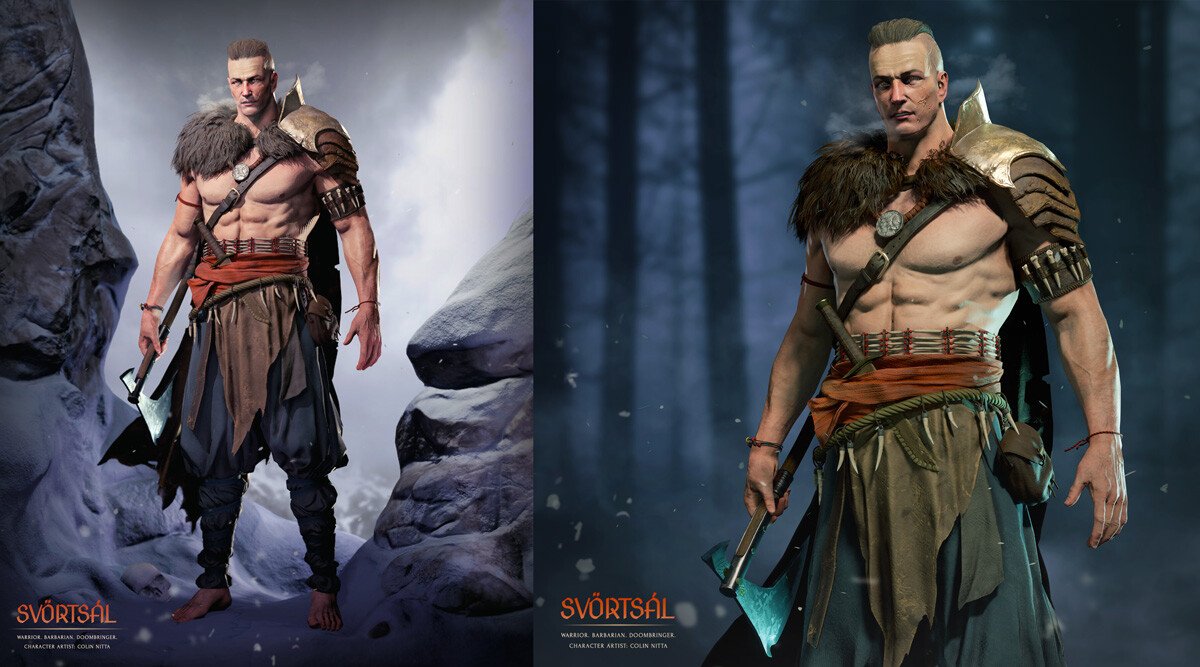
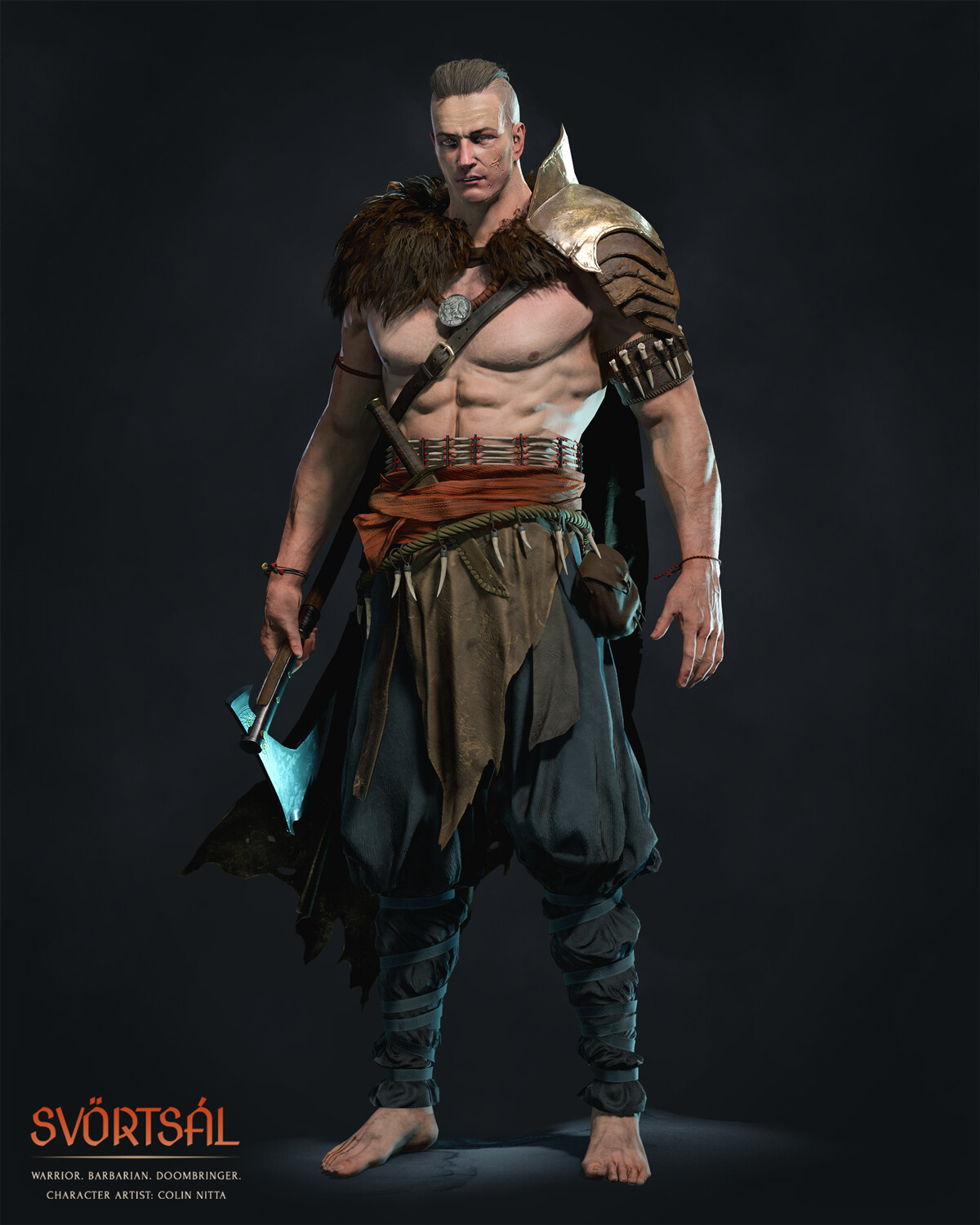
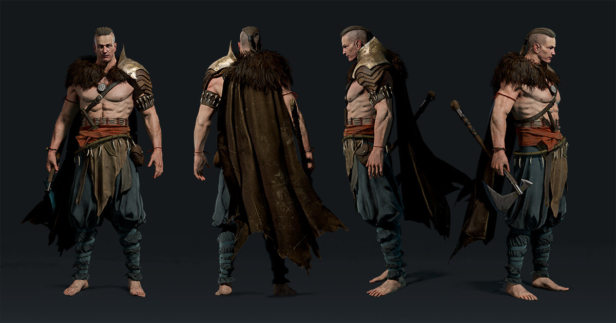
Before I even began Nissa I knew I wanted her hair to be much better than my previous attempts. In my barbarian project Svörtsál, I spent two whole weeks struggling and failing to capture the hair and fur of the concept. It was so painful that I wanted to quit then and there. This is what I mean when I say there are no natural abilities at play here: only the stubborn refusal to quit.

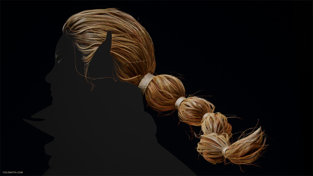
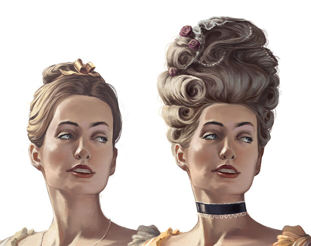
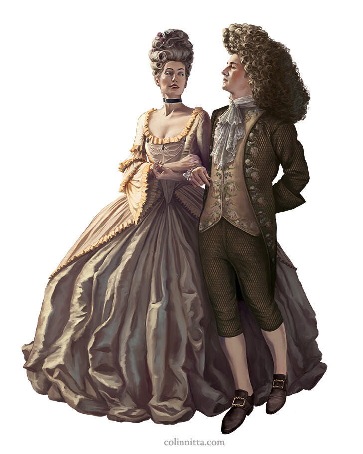
Another look for Nissa’s hair. Developed by watching a video tutorial by Johan Lithvall, produced in conjunction with the Vertex School

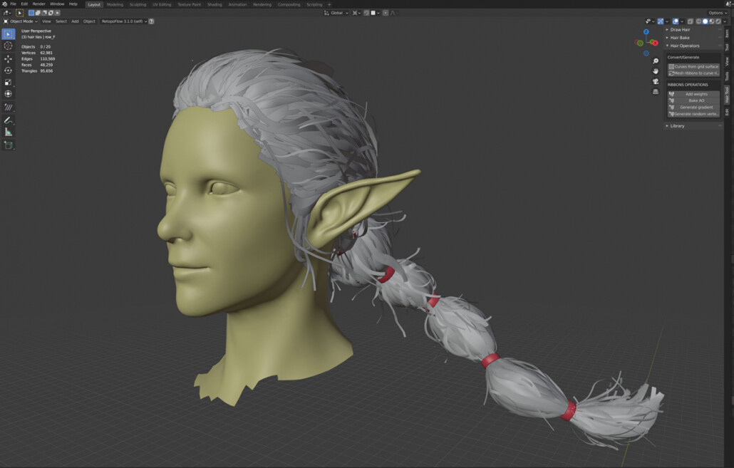
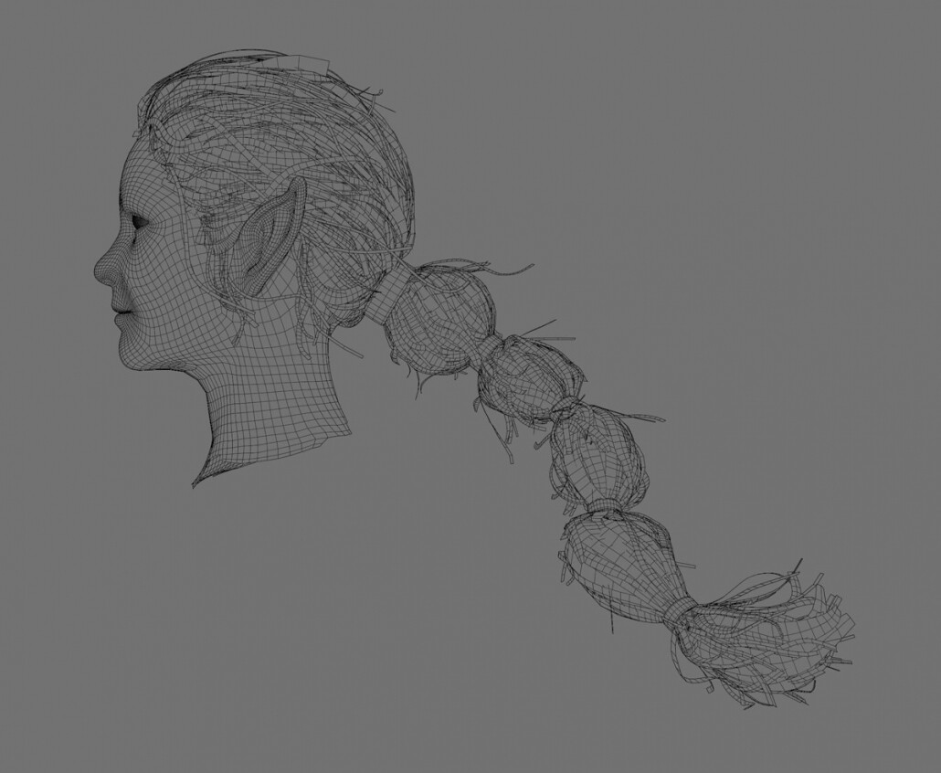
In the early stages of modeling Nissa, I actually took a two week break to go through a hair tutorial by Johan Lithvall in order to level up my skills in this department. I originally thought it could be an alternate look for the character, or perhaps another project exploring hair. I went through the entire tutorial and learned a tremendous amount, following Johan’s project as closely as I could (including his specific hairstyle) to understand his workflow. He was using Maya and deformer modifiers to adjust the hair meshes, while I was using Blender and the plugin Hair Tool by Bartosz Styperek. Despite this difference, I was able to mimic his techniques very closely. I encountered some difficulties at the end in which Johan uses a very specific shader from Unreal that was out of date. I couldn’t find this darn shader anywhere! But, I felt like a learned a lot anyway and decided to come back to the shader problem when I did Nissa’s actual hair.

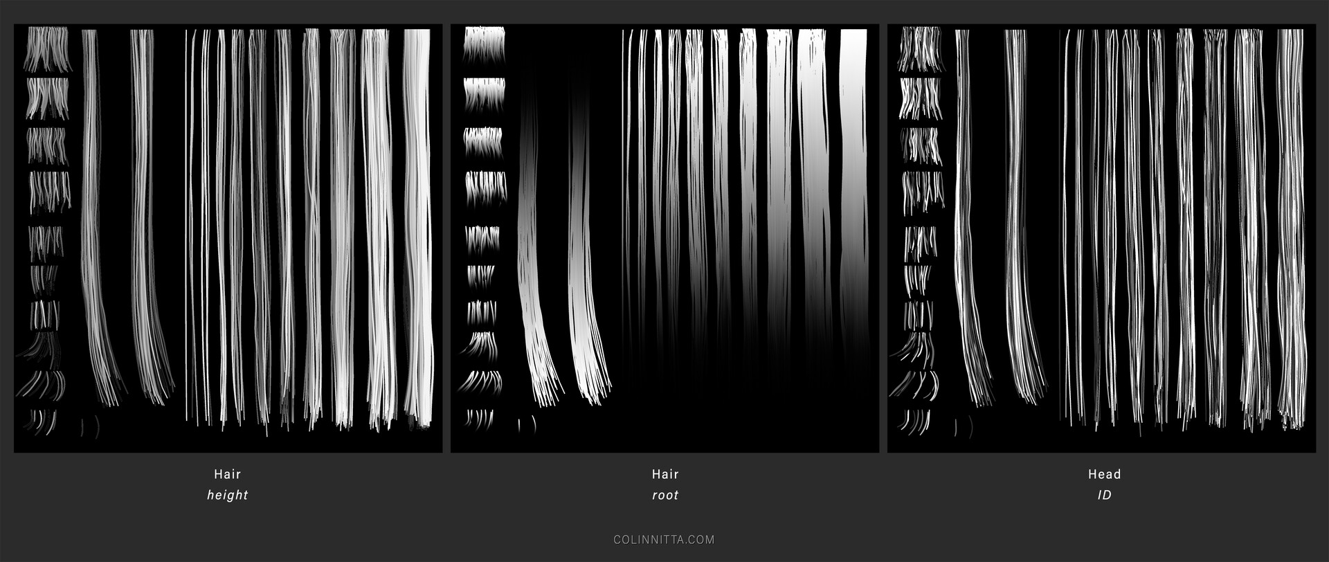
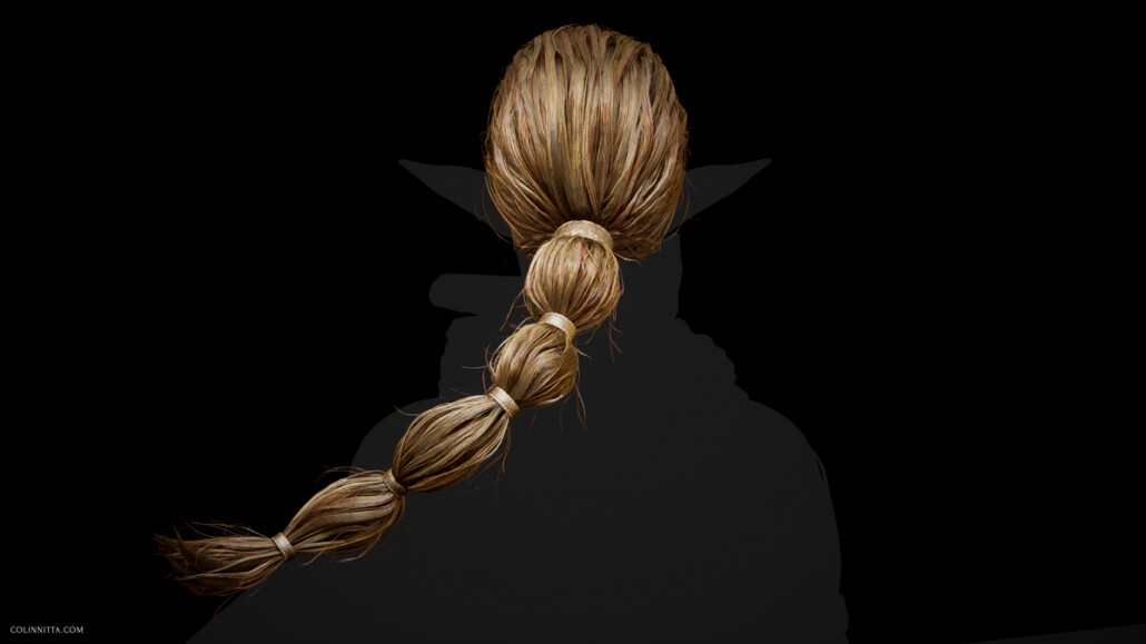
Because of this additional training, when it came time to do Nissa’s long flowing ponytail, I felt like I had laid enough technical groundwork to tackle it. Since my practice with the tutorial, I came up with a pretty good workflow for incorporating the Hair Tool plugin into a Johan Lithvall style workflow. Hair Tool is fantastic because it uses Blender’s curve system to build out the hair cards, which is extremely flexible. You can specify curve points that will perfectly bend the cards, as well as an XY resolution for each curve. It also has an awesome UV feature that allows for changing UV’s of hair cards on the fly, which I use constantly. Hair Tool does not do everything for me, though: there is always a final step in which I convert the curves to meshes and make tweaks, using Lattice Deforms to change the big shapes, going in and adding extra loops to specific curves, etc., but I find overall it saves me a ton of time and effort.

If you’re a Blender user like myself I highly recommend checking out the developer, Bartosz Styperek (AKA username JoseConseco). He has a Gumroad with several other really handy plugins as well as a Discord server with tons of good info.

Covering all the details of how I built the hair would require another series of blog posts, which I am considering writing when I have the time. But in short, much experimentation and tinkering was required before I finally got the results I was looking for. Hair cards are so non-intuitive that in my opinion they are one of the weirdest challenges in character art. I have read many articles on the subject and every single one has wildly different strategies for the problem. Turns out, there’s no silver bullet: just the individual method that works to obtain the desired result.

Oh, and that hair shader problem I mentioned? Turns out the code for this shader was hiding in the Unreal Engine 4 content examples project, a thing I just didn’t know about. I looked in just about every other place trying to find it, but for some reason all the Unreal documentation I was reading up on was outdated and didn’t say it had been moved there.

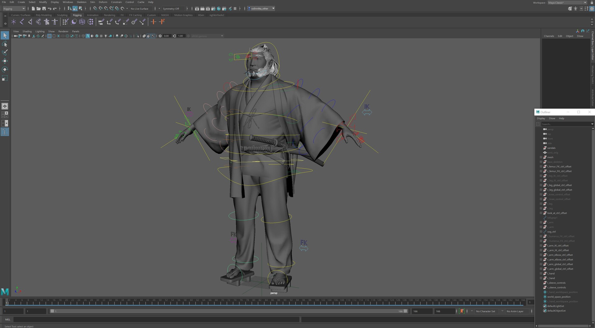
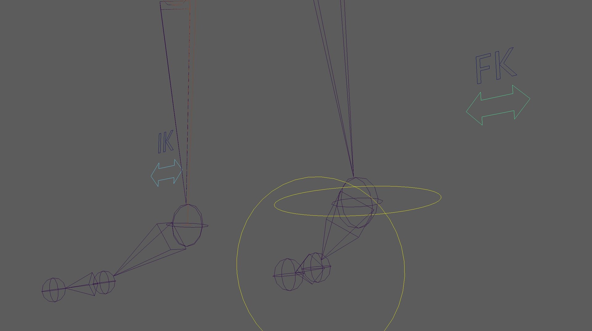
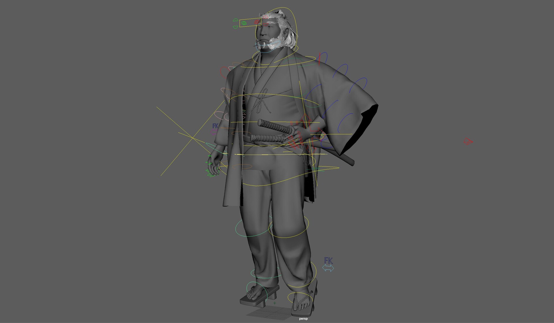
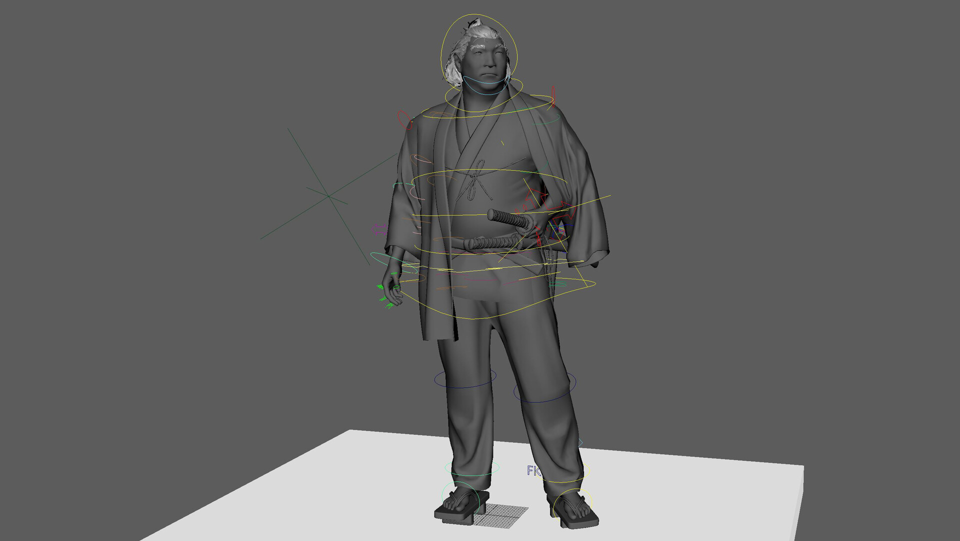
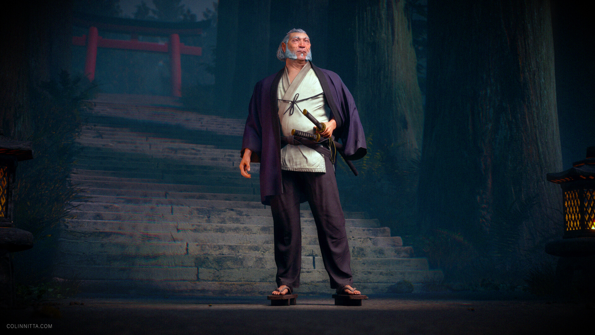
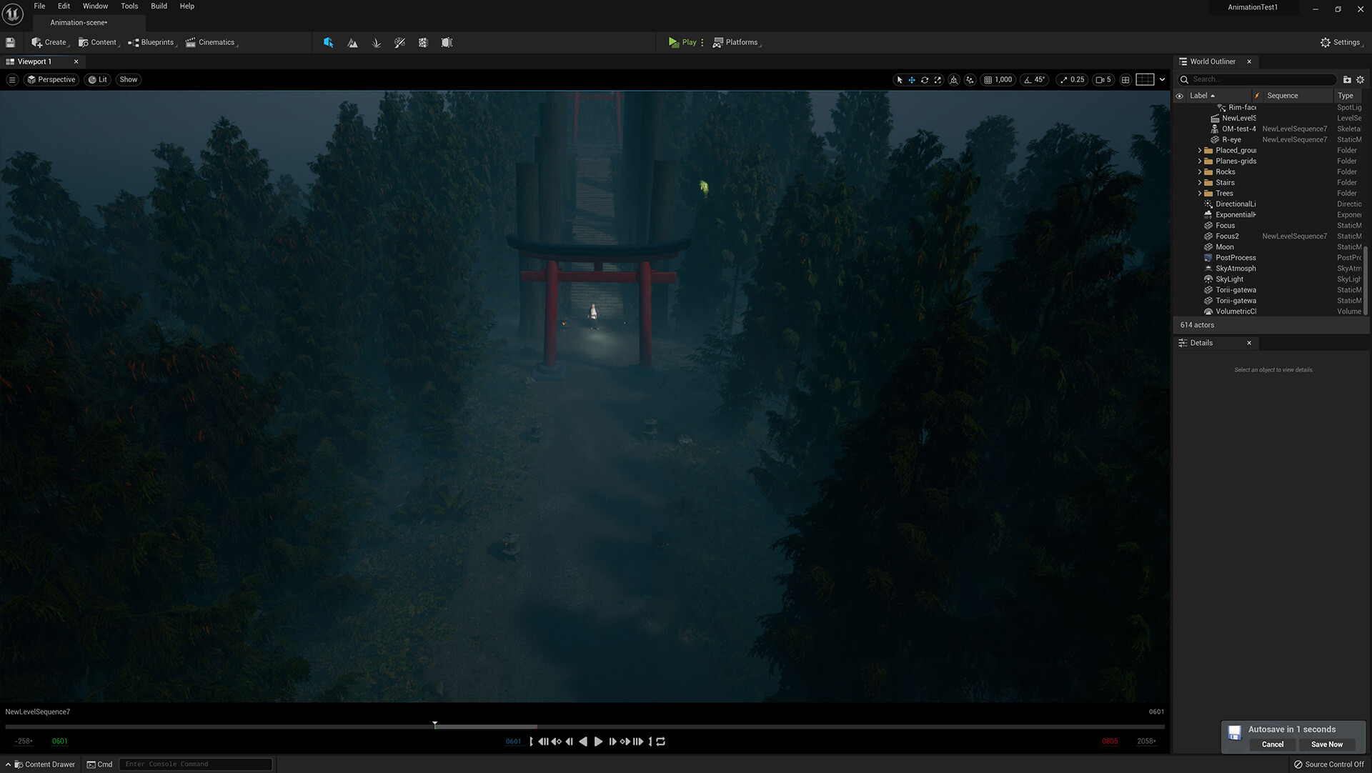
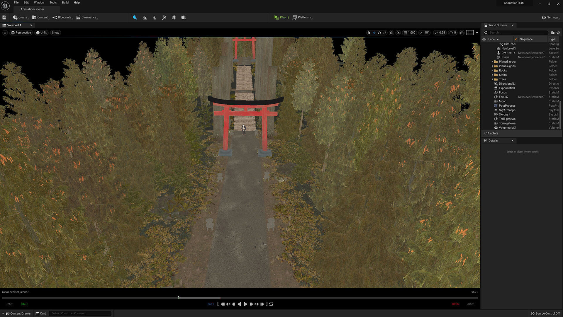
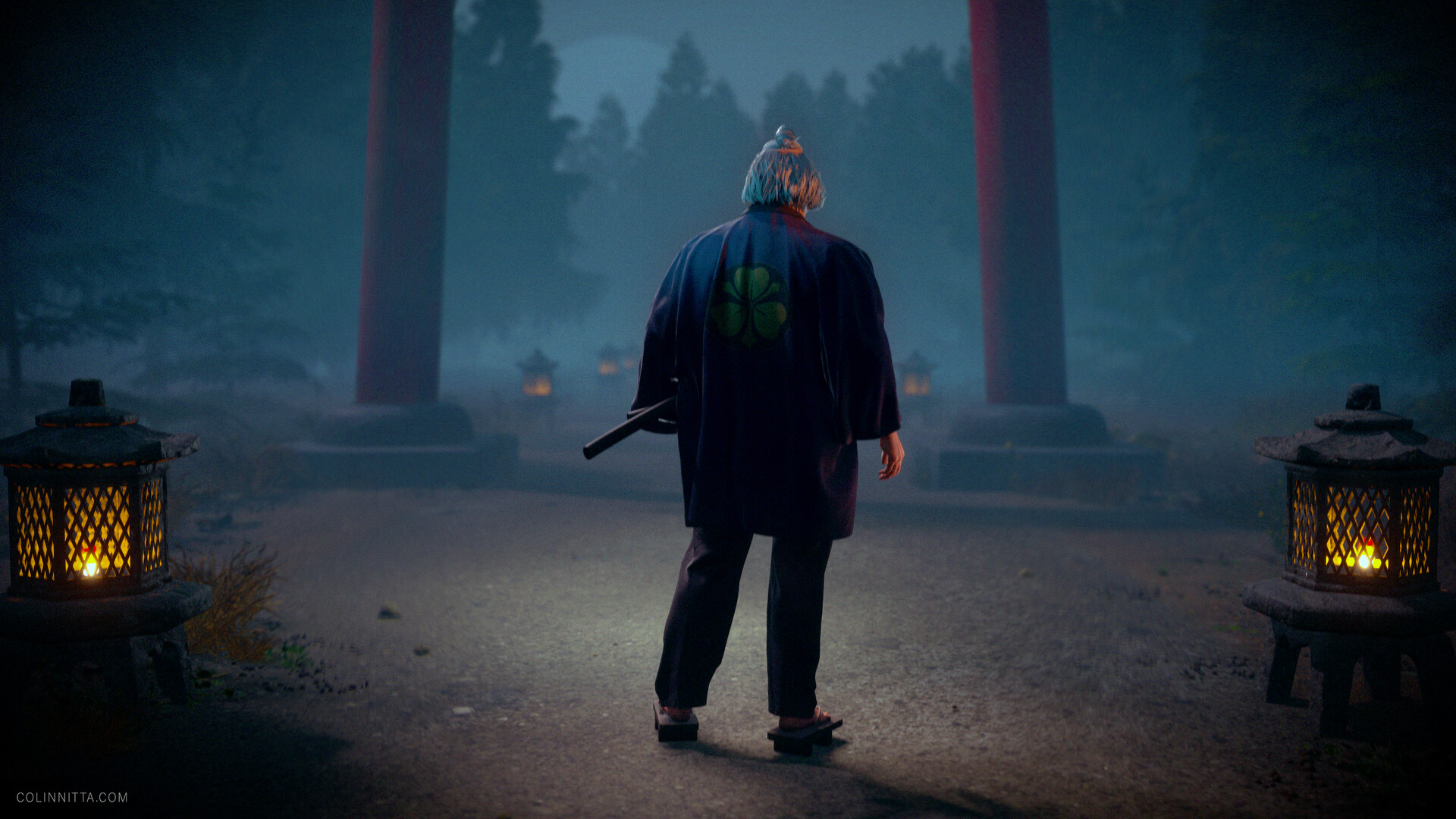
After finally completing my hairstyle, I arrived at the very last stage: UE5. Taking on learning this massive game engine at the end of this project was intense. Adding to my challenge was that UE5 is still a developer release with bugs sprinkled throughout waiting to trip me up. Don’t get me wrong: it’s incredible to have access to this tool, free of charge. Praise be to the brilliant developers at Epic Games. But using a developer release is like test-driving a new vehicle at the bleeding edge: you don’t really know how it’s going to perform or what problems you’ll encounter.

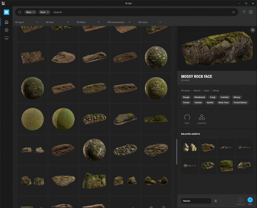
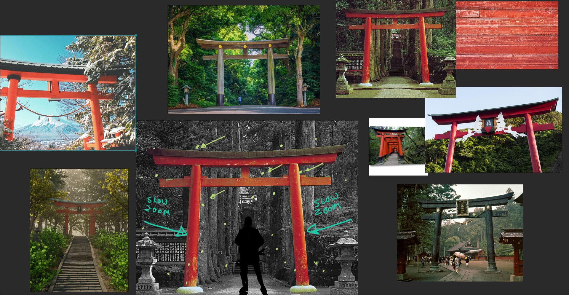
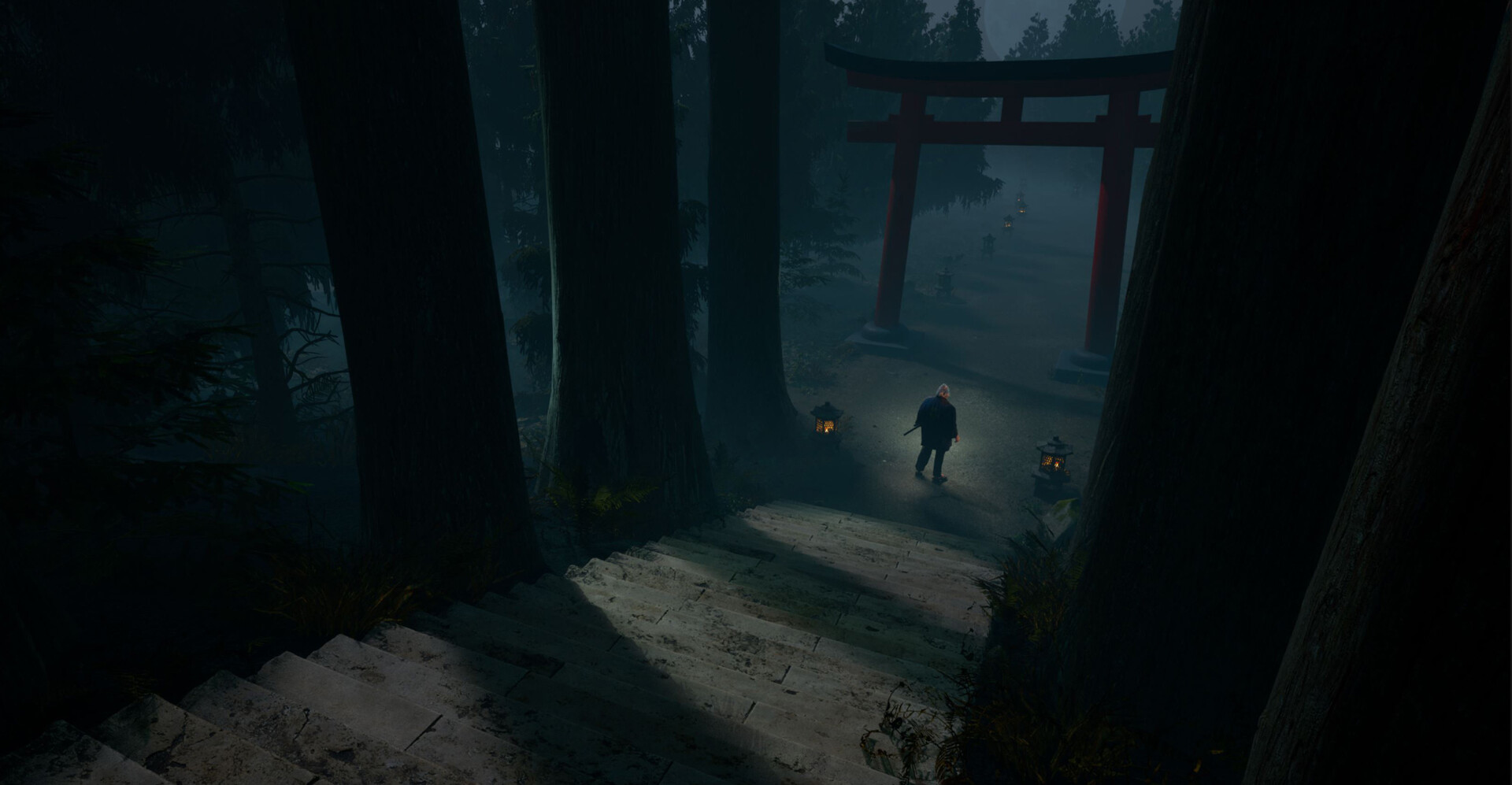
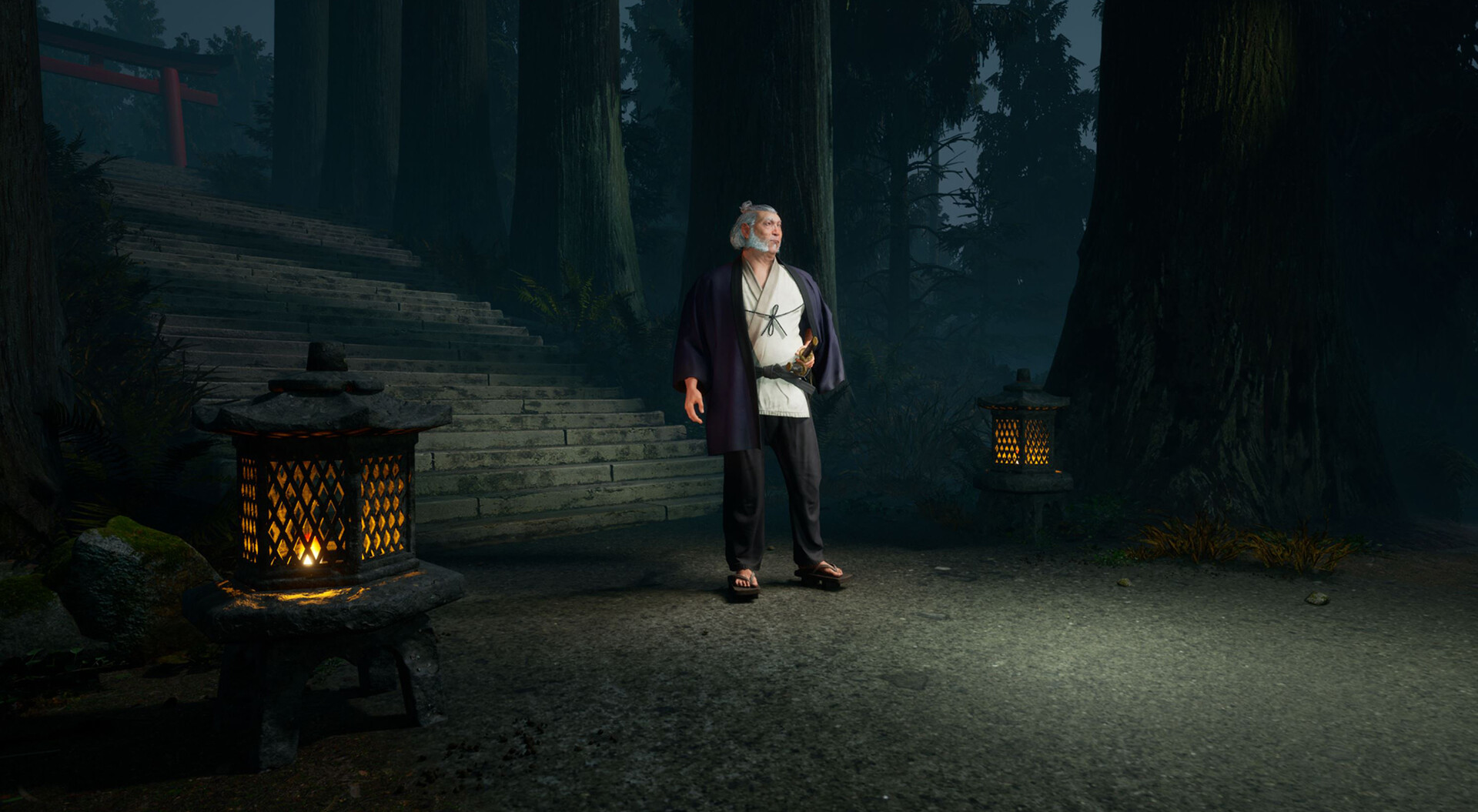
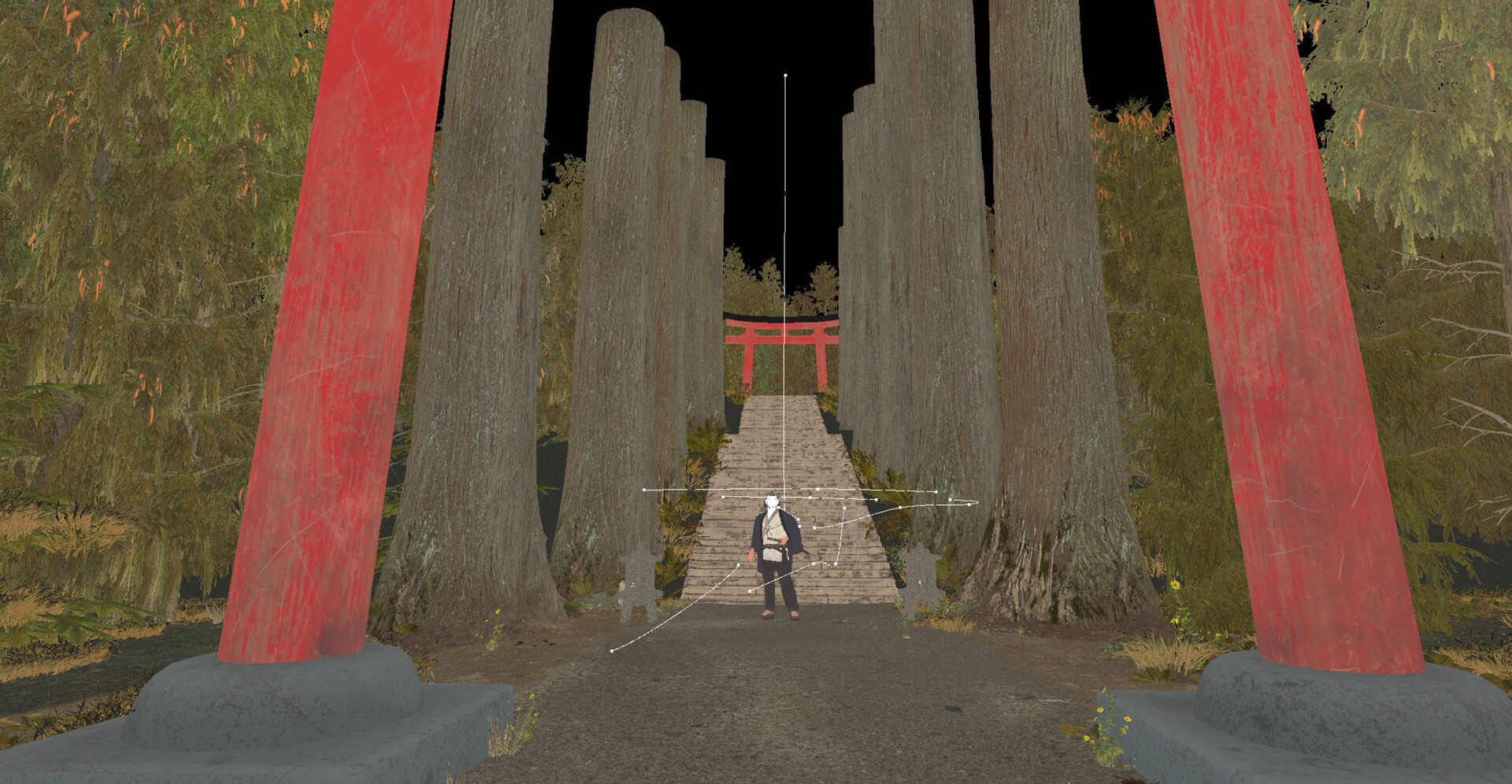
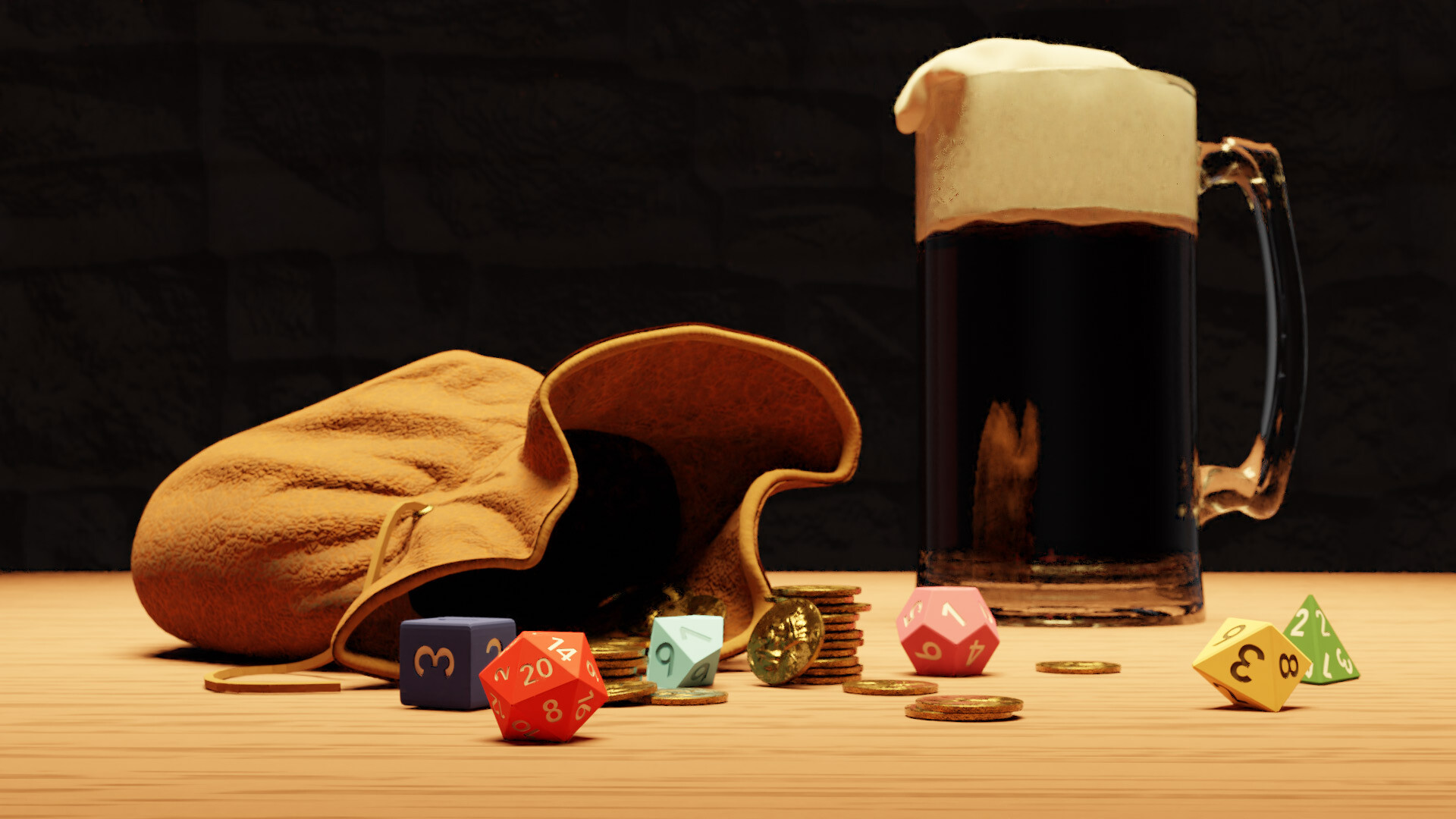
It was especially fun to browse the Quixel Megascan library and choose some lovely rocks, ferns and groundcover assets. My goal was to situate my character in an actual game environment – no photos or 2D backgrounds – so having these beautifully detailed, nanite enabled meshes ready to drop in was fantastic. There’s so much to play with here that I decided to only use some big mossy rocks for a backdrop and a scattering of ferns and groundcover for the base. I was feeling rather worn out by this point so I was happy to keep things simple, and in the end it was exactly what was needed.

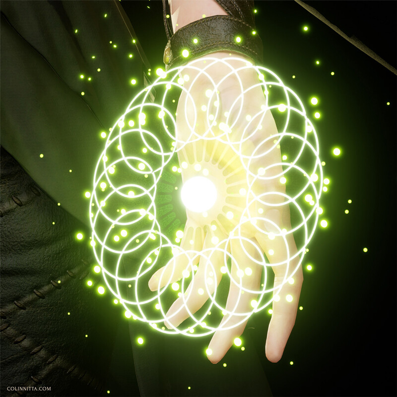
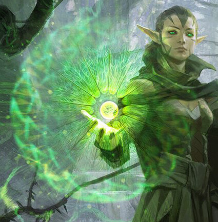
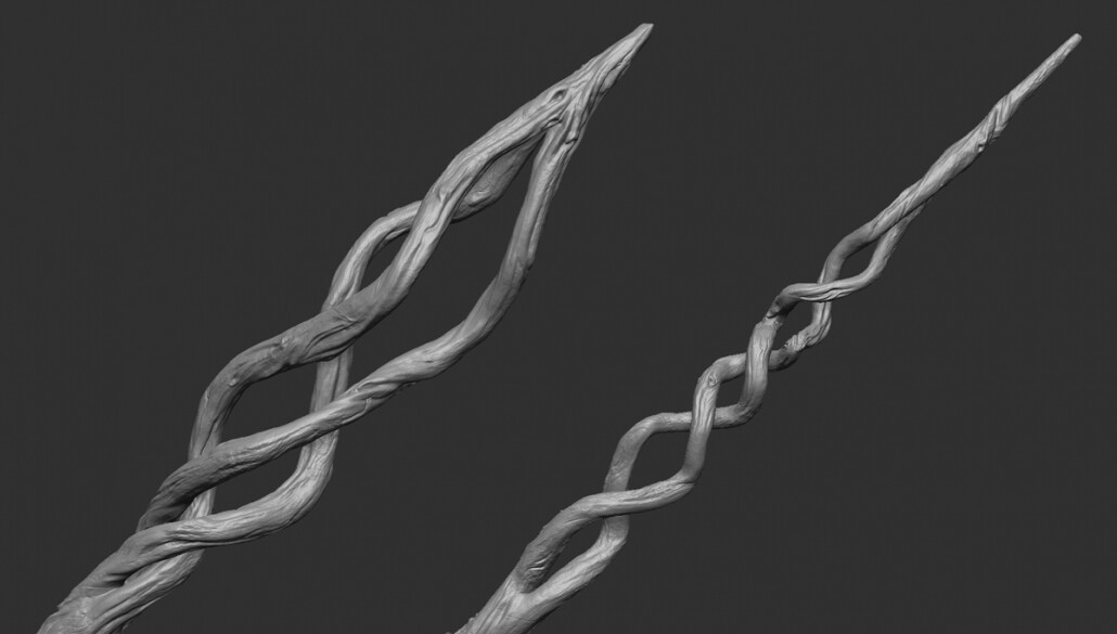
A final asset that I created was the magic effect in Nissa’s left hand. Wesley Burt’s illustration had this radiating spirograph pattern and I wanted to emulate it.

I could have just Photoshopped this into my render after the fact but that wouldn’t have been any fun. So, I decided I wanted to get this effect in 3D using emissive materials. To my relief, it actually wasn’t hard at all.

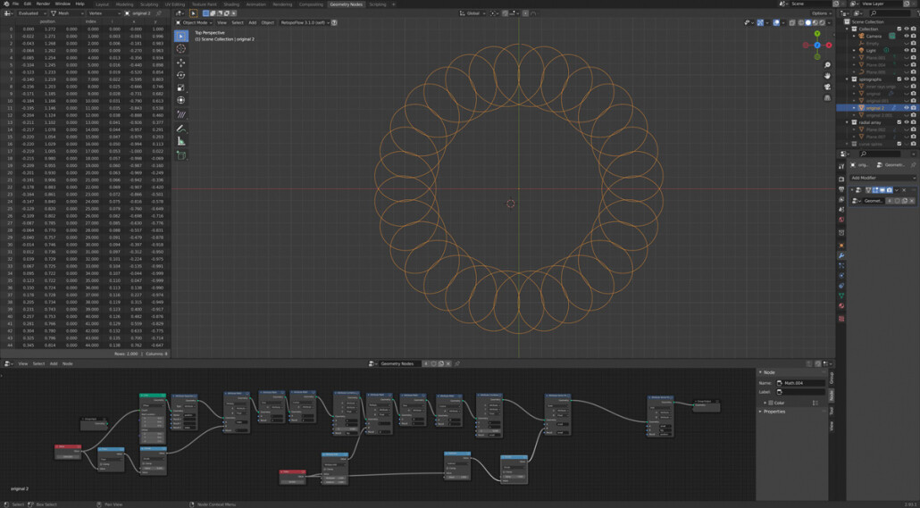
Key to the spirograph mesh was a tutorial I had come across by the artist Erindale that uses Blender’s geometry nodes to create a mathematical spirograph creator and this seemed like the perfect opportunity to put it into action. Just have to say it: Blender is so amazing, I love this program! I spent a little while tweaking the math and coming up with some really wild designs, layering them on top of each other to make some patterns straight out of Burning Man. But it was too much for a subtle effect and I didn’t want to distract from the character, so I ended up keeping my spirograph simple. I converted it into a card (which was actually the hardest part, but after some tinkering I figured it out), put a subtle leaf vein pattern on top, added some floating particles and called it good.

As far as lighting with lumen is concerned, there really wasn’t much to it other than turning it on and enjoying how well it worked. Lighting always takes a ton of time, there’s no real surefire way to speed up the process other than positioning and testing lights over and over until I get something I like. The process is much the same with lumen only that it feels easier. Completely automatic global illumination means that lights behave the way you’d expect and there’s not as much guesswork. I still struggle with a mountain of self doubt and anxiety at this stage – but not for technical reasons.

I have a feeling at the end of a big project that is a lot like an exercise regime I have. It’s very simple: running up a steep hill on a ridge behind my house four times in a row. After the first couple of laps, I start to get winded though I’m still keeping a good pace. But by the beginning of the fourth lap, the pain really starts to flare up in my thighs and calves. I’m not even looking at the top of the hill because when I do, it looks impossibly far away. All along, there is a sweet seductive voice gently advising me, “Stop, you’ve done enough. It’s okay…” I have to grit my teeth and push, ignoring the temptation to walk it off, go easy, take a breather. And by the time I finally reach the peak for the fourth time, my chest is heaving and sweat is pouring down my face, but the pain has almost completely vanished with only a vague soreness in its place. In fact, I have a hard time remembering this fleeting phantom sensation. And the seductive voice that went along with it.

Every stage of this model was like a lap up the hill. That fourth lap – it is killer. All artists deal with the fourth lap in one way or another. Just get through it! You’ll be happy you did.

The Making of Nissa Revane, Part 1

General / 19 July 2021

This is the breakdown of my project, Nissa Revane: Planeswalker. Check out the project on ArtStation here.

Every time I start a new character project I have this idea in my head that I will be using the same process as I have in the past with some slight refinements. But in truth it is always a different journey. I’ve heard graphic novelists say the same thing: by the time you’ve finished the graphic novel, you are a different artist. Modeling real time characters is roughly similar in that the process is incredibly laborious, with each phase of the project breaking down into individual challenges that have to be tackled one at at time. As a result, my methods are always shifting as I pick up new techniques, rework old ones and get better. I actually think this is a good thing, especially when it comes to personal work. After all, I’m doing this to improve, right? Out with the old and in with the new!

Nissa, Sage Animist – art for Magic the Gathering by Wesley Burt

As always, I started this project by looking at lots of reference images and inspiration. An unexpected challenge regarding a character like Nissa Revane is that she has been depicted by multiple artists over time. A big part of the lore in Magic is that there is a multiverse where powerful wizards called Planeswalkers travel to different worlds, going on adventures and fighting evil, etc. Each set of Magic cards takes place in a new world, but these Planeswalkers remain consistent. Just imagine a fantasy version of Michael J. Fox’s character Marty McFly from Back to the Future and you get the idea.

These are all the illustrations of Nissa I could find when I started (I actually missed a few). From what I’ve heard, the parent company of Magic, Wizards of the Coast has a somewhat lenient approach with their illustrators. They use a style guide but artists are allowed to make personal decisions. As a result Nissa is depicted in quite a range, especially when it comes to her costume. Her sleeves and skirts in particular have been treated wildly different by all these artists. Sometimes her garments are loose and flowing like silk, and in other treatments she has more leather and wool fabrics that hang heavy and close to the body. And, no one really seems to know what to do with her boots, which are often left in shadow or just kind of painted without definition.

Oath of Nissa – art for Magic the Gathering by Wesley Burt

I had to choose one of these interpretations and in the end I decided to go with Wesley Burt’s depiction because, well I just liked it the best. I love his handling of the fabrics and the wild energy behind the character. He also dealt with the vagaries of the costume better than most of the others.

One of the first things I did was break down the costume with a color key. Planning is so important at this stage and I wanted to know how many different assets would be needed. I also wanted to figure out how pieces were overlapping and just how this thing was constructed. One of my pet peeves are costumes in 3D that just don’t look convincing, and I think some of this stems from vague concept art that hasn’t been properly understood.

After making my game plan I dove into sculpting the rough block-in. This stage is very much about loose problem solving for me. I work at the lowest resolution possible, just moving big shapes around and focusing on proportions and gesture without worrying about details. A problem that immediately arose was her skirts, loincloth and cloak. They were quickly becoming way too busy and distracting. The trick was to make them fluid. I knew the best way to handle them was likely Marvelous Designer where I could experiment quickly with different kinds of fabric weights and cuts, but the block-in would at least provide a rough sketch for that process.

As I kept refining my block in, a tricky obstacle became the boots. I stared at all the concept art for these and couldn’t find a good solution. Her boots were covered with some kind of metal armor, similar to a spat. What I couldn’t figure out was she could walk with that on top of her foot right where the ankle needs to bend.

I kept refining the boots and experimenting with different ideas. I tried making the armor pads more ovoid, but then that made for a really weird read, almost hoof-like, and they still didn’t look like they could be walked in. Bleh. Throw it out and try something else.

Sometimes the bad ideas come in spades. I tinkered with several variations until I finally thought about lobster style armor for the boots. I liked this solution because the armor is actually articulated and allows for mobility. I then imagined the leather boots as being made from a pliable animal skin, something that’s been worn into permanent deep wrinkles by years of hard wear, and the concept came together. Yes, it is a departure from the original art, but the boots were never well defined anyway. Magic primarily uses horizontal art… feet get left out a lot of the time, I get it. It turned out that the boots were a wonderful place for me to insert my own design aesthetic, and in the end they were one of the assets I had the most fun with

While I was making refinements to the boots I kept working on other assets, taking care not to spent too long in any one area. By this point I had gone into Marvelous Designer to build out the skirts and get the cloak in. The skirts were surprisingly easy to do while the cloak took a lot of experimentation to get right. It kept getting way too many folds and I did the thing in Marvelous Designer where you continually pull at the clothing trying to make the flow better and it just keeps looking worse the more you do it.

Something that helped a lot in this process was using Marvelous’ wind tool which I didn’t know about before. Instead of the grab tool which just yanks at one point in the cloth, the Wind tool does, well, exactly what you’d think. While I never use Marvelous meshes straight from the program and always I sculpt in more detail afterwards, having a good base to work from makes a huge difference. Besides, I knew the cloak was going to be a big basic shape in the background. I didn’t want to spend time getting perfect folds there that would never be seen.

Similar to the cloak, the wrap around cowl was tricky to nail down in a way that felt convincing. I spent a lot of time messing around. The great strength of Marvelous Designer is that you can play with options quite easily, but it can feel like spinning your wheels while trying out dozens of variations that don’t jive. Wrapped garments in particular are hard because you have to get the simulation to hold the folds against each other with pins or seams. My strategy is not to get it perfect, but get it good enough that I can take it out of Marvelous Designer and into ZBrush where I have much more sculpting control.

Back in ZBrush, I used the Move brush to smoosh the mesh into place but one issue was that the topology was hell: all the different layers from the simulation in Marvelous Designer were intersecting. Intersection = grumpy times ahead! So, I took a little time to retopologize it manually in Blender, brought it back into ZBrush again and finally finessed some higher level details in. Hard won, but it was worth it.

I kept returning to the corset, shirt and gloves during this process. While they were some of the most detailed portions of the costume they were also the most clearly spelled out in the concept art so it was more a matter of time and attention to detail. After I knew what I wanted to do here, I retopologized assets with ZRemesher and also sometimes in Blender to get nice clean geometry, then returned to ZBrush, subdivided and sculpted in more layers of detail. Wash, rinse repeat.


Throughout this process the Pureref board on my second monitor continually grows. I find sites like Pinterest and Etsy to be fantastic for things like period clothing. I have these memories of wandering into the fashion studio back in art school and the one thing I remember is how much felt like construction. Even the most diaphanous garment has to be built and designed to handle the stress and friction of real life. I like to inject this handmade feeling into my 3D work. It just becomes more interesting for me that way.

Sometimes Nissa was depicted with full length gloves, and sometimes not. I decided to eschew them and go barehanded as gloves felt too disconnected from the natural feeling I wanted. Now I had the classic challenge of making straight-up hands, but they are really just a matter of effort and I actually find them quite relaxing to sculpt. I give myself the simple goal to make every hand a little better than the last. I looked at classical sculpture for help in getting a nice gesture here and it was a pleasure to return to the works of the old masters for inspiration.

And the face… the hardest part of every model, every time. Doesn’t matter how much I practice faces, they are ALWAYS tough and require my A-game. I like to model the forms very slowly, toggling polypaint data on and off that helps to visualize eyebrows and makeup (very important for female characters). This was my first attempt and after getting it to a reasonable place I let it sit and marinate for a time while I worked on other parts. I like to do this because a face is so critical that it can’t really be knocked out in one sitting. It has to sit there until you’ve gained enough perspective to judge it correctly.

After staring at it for some time I decided it was time to start fresh. The first face just looked off. It looked too young and had a strange, barbie-doll like sharpness to the features. The first reference model I used had these qualities as well so it wasn’t surprising that they came through. With this in mind I re-sculpted a new likeness that I was much happier with.

This was actually followed by a third phase in which I attempted to nail a slight smile as an expression on the character (something odd was happening with my polypaint data on the mesh at this point which is causing those strange marks on her nose). This was tough! So many muscles are involved in a smile, even one that is comparatively small. In some ways, it is more difficult that a full, open smile with teeth because all the movements are much more subtle. One thing that cause me some grief are the thinness of the lips when they are pursed together in a closed mouth smile. It is so easy for them to appear withered or aged. My solution was to sculpt them thicker and plumper than I wanted, then when I posed the low poly model I curled them in slightly to show the way the flesh would compress and tighten in that area. It was an unusual method but it worked well enough.

I decided to go with the actress Keri Russel as my new model. You can see that pursed lip smile she has right here. My wife and I watched all six seasons of The Americans recently and it is hands-down my favorite TV series ever. Keri Russel delivers a fantastic performance as a Russian sleeper agent in 1980’s Washington D.C. Throughout the show you spend all this time staring at her features, watching these complex emotions flash across her face and you have to wonder what she’s thinking. Also, it just felt right for Nissa to be slightly older. After all, in Magic lore, Planeswalkers are these incredibly powerful wizards that make epic journeys across time and space. It makes no sense for a fresh faced 18-year-old to be doing that!

After much of the problem solving stage in the high poly, it is all refinements and detailing. I decided to really go for it with the boots and they kind of ended up being stars of the show in their own right. There is this boot project by artist Safwen Laabidi that is sort of famous in ZBrush circles – I’ve seen multiple references to it as a pinnacle of mid poly detailing. I really liked how aged and distressed those boots looked and how much detail the artist got in with his high poly in ZBrush. It takes so much patience to do this and you have to resist the urge to just skip this step and instead slap on some procedural textures in Substance Painter. Problem is, they never look as intentional that way, at least when it comes to lifelike distresses, cracks and weathering on organic surfaces. Safwen also has a brilliant technique for stitches that I used (more on that later) as well. So much good stuff from one pair of boots!

All the other assets get a final pass as well. The fabrics get subtle memory folds and I sculpted in compression folds into the sewn leather panels of the pants. I used hand textures from a scan model that I purchased from 3dscanstore.com and reworked them into alphas that I then projected onto the hands. I had a hard time finding reasonable hand textures elsewhere and it only took a slight bit of tinkering to get it to work.

I really enjoyed hand sculpting the blouse sleeves from the block-in all the way to their finished state. I probably could have done them in Marvelous Designer but I wanted the challenge. You’ll notice that some parts of the leather, like the glove sleeves and the bottom portion of the corset are quite smooth and without texturing here. I could have hand sculpted textures on to those leather bits… but I was worried it would take like a year to finish. Every single overlapping piece would have needed to be finessed… my eyes start to hurt just thinking about it. I decided to leave that level of detail up to Substance Painter later. Pick your battles, right?

One happy day was spent just texturing the staff. Pure meditation here, just getting lovely wood grooves, aged knots and cracks and organic textures to flow along the surface.

And the face gets final texturing treatment as well, using skin alphas from texturing.xyz. I prefer to simply drag them one at a time with the Standard Brush and DragRect, using the Morph brush to clean up any mistakes. I’ve gotten fairly quick at doing this – there’s not too much fuss and I don’t have to jump into another piece of software this way. The simpler I can make my process, the better.

And here’s the final high poly model at this stage of the project. I return to it as needed, but for all intents and purposes it’s checked off as a giant task that has reached completion. I’m still relatively new to 3D so this is actually the most detailed high poly I’ve ever made! Wow, bit of a milestone. As expected, I enjoyed the high level detailing, especially in the boots. But the hard work is always in the problem solving and the design challenges and in that sense, this high poly is very similar to all the to others I have made.

Next up: Part 2 – Retopology, UV’s, Texturing… and Unreal Engine 5!


From Donuts to Barbarians: My Year of 3D Education, Part 2

General / 24 March 2021

If you haven’t read Part 1, check it out here. If you’re just interested in seeing my latest project, feel free to check it out at my artstation here.

Around the time when I was working on my portrait studies, my mentor suggested to me that I look into education with The Vertex School. I was considering a more intensive course for some time but wasn’t sure where to go. And to be honest, I needed a push. I had learned so much on my own that I was unaware of how helpful a teacher could be.
I decided to enroll in a Character Art for Games course taught by artist Ackeem Durant. The program was taught through video content, designed for a ten week course with weekly meetups for discussion and critique. It felt like the perfect time as I really wanted to push myself to model a proper games character and see what I could do in an environment of like minded students.


For two weeks prior to the course I worked up this concept of a barbarian character with a friend that supplied the narrative concept. It was a return to 2D challenges and I worked through a lot of bad ideas until I finally found something I liked.

Week 1: Block In
After being delayed for a week, the class finally got started. I could hardly wait! After working for 7 months in isolation, I could share my progress week by week and compare myself to others at a similar level. It was a burst of energy and I wanted it to sustain me. A last minute change led to the founder of Vertex School, Ryan Kingslien, to take over for Ackeem and he ended up being our instructor for the majority of the class. While somewhat disappointed by this (I really liked Ackeem’s work, he was the main reason for selecting this course), I decided to try my best regardless and I’m glad I did.


Week 2: Refinement, Marvelous Designer
Ryan told me that my character would live or die depending on how well I could execute the anatomy. Challenge accepted! I knew Ryan was a respected anatomist and took it on knowing he would point out the flaws in my work and push me to be better.

This part of the course also covered Marvelous Designer which really leveled up what I could do with cloth. The pants in particular really benefited from this!


Week 3: Refinement, Marmoset Toolbag
Watching the videos by Ackeem and listening to Ryan’s feedback each week gave me the feeling I had two teachers instead of one. This was good and bad. On one hand, I got different perspectives from each instructor, which was an added benefit. But Ryan didn’t know the exact nature of the content Ackeem had recorded. So sometimes, I felt like we had specific questions that were only halfway addressed.
Regardless, I was keeping up each week, spending a ton of time watching and re-watching the videos to make sure I understood the content. So much of it was totally new to me which was surprising. I had many gaps in my personal knowledge, especially regarding ZBrush. And I had never previewed my model in Marmoset toolbag as part of the process, which I now do EVERY time. Such a critical step and I wasn’t aware of it before!


Week 4: Final High Poly
Taking all my assets to a polished high poly stage was very informative. It made me realize just how much effort this takes and how it all needs to pay off properly once a bake is executed. Skin texturing in particular was really interesting as we were learning how to work with assets from Texturingxyz. I had learned some of this methodology already but Ackeem explained it in a way that just fit nicely into the overall workflow and stressed style over pure realism. I think it’s easy to forget with something like skin pores that you only need as much detail as will benefit the final render. Not everything has to be 100% photoreal.

Week 5: Low Poly
Low poly turned out to be a really substantive challenge. I had always struggled with polycount but the issue remained abstract in my mind. Now I was aiming for roughly 100,000 triangles and suddenly it seemed very pertinent. Ackeem’s lectures were very good but he was working completely in Maya. I knew from experience that Blender could handle the low poly process with just as much efficiency so I opted to work in that instead. I hope in the future that more educators choose Blender for the base 3D program. It’s open source and I think now, more and more people getting started in 3D are choosing Blender.
In any case, the software really wasn’t the problem here, it was how I chose to spend polys! The bone girdle around my character’s waist turned out to be horrendously expensive, something I wasn’t anticipating at all. Every single little cylinder is very costly, and when there is a hundred of them… well you end up realizing that like 25% of your character’s poly count is in a tiny area on the waist. I ended up reducing them a lot but it resulted in a lot of head scratching as I struggled with optimization. And those pants… god those pants were tough, I actually restarted them at a certain point when I knew they were becoming too dense. Another hard lesson!


Week 6: UV’s
Whereas I struggled with the low poly step, I enjoyed UV’s. They are meditative in their way and so much less stressful. I finally learned how to enlarge the face to give it more topological space and answered a question I’d had for a long time: how do artists separate out their UV sheets? Turns out its not that complicated and more a matter of practical organization.
I also made some very subtle edits to the face, making minute changes in the eye and lip regions.


Week 7: Bake and Textures
I had finally reached my favorite phase: texturing! This is when I would say the class really turned a corner for me. We learned techniques for projecting skin textures with Mari and I saw just how effective albedo skin from photography can be. I actually own some cross-polarization photography equipment so I used my own skin tone – it ended up working pretty well!
All my previous struggles with texturing ended up helping me a lot in this phase. Much of the content was still new but I could add my previous experience to it, helping to overcome some predictable road blocks in the process.


Week 8: Hair
I was riding high… that is, until the hair portion of the class. The above hair images are just a few of my mistakes – there are many more! This was so frustrating after I felt like I was doing really well in the texturing phase. Although only one week was allotted for hair, I spent roughly three weeks, making a TON of mistakes, throwing out my results and starting over.


I got these results only after a really deep period of struggle. Even now I see some issues. The hair roots need to be better defined and the fur is a bit messy. But it was a massive learning process, and all the mistakes truly made me humble – hair is a beast all on its own!

Week 9: Final Render – First Pass
Ackeem mentioned that finishing a piece is typically the hardest part. So true! By the time it came to setup my final scene in Marmoset I felt like I was going to nail this thing once and for all. But getting it just right remained elusive. I had this whole idea that my character would be in a snowy landscape, facing some unseen enemy. Its a nice idea, but snow is incredibly hard to pull off.

I tried out all kinds of scenes with him in the woods but in the end nothing felt right. They are interesting sketches for a potential future scene but the brightness of the snow was not playing nicely with my dark moody barbarian and it had to be scrapped.


Week 10: Final Render – Final Pass

In the end I dropped out all my snowy landscape except for a little island at his feet and that just made everything else a simpler problem to solve. I have this issue where I always choose the most ambitious goals for myself. I see complexity and I want to chase after it. But complexity is not always the best solution!

For more views of the final, check out the project here. Overall I would say the education I received from Vertex School was very good. Every education program will have its strengths and weaknesses but on the whole I gained so much from my experience there and I would not be at the level I am today without it!

So that’s my year of 3D education. I feel exhausted just writing about this year. We all know what also makes this year exhausting to write about: the pandemic, the election, the entire world. My cat died. It was a lot. If there’s one thing I’ve really learned through the entire experience, it’s this:

Do not try to avoid mistakes. Mistakes are the route to betterment. Take every mistake like a badge of honor, wear it proudly, look at it as a battle scar. I can’t tell you how many videos on youtube flashed up while I was studying with a click bait title like “Top Ten Mistakes All Artists Make.” What are you supposed to do, watch this and then cleverly avoid them? Such thinking is futile and only holds us back. Make those mistakes, then join a critique group or find a mentor and show them your mistakes, and build off them. That’s my credo and I’m sticking to it!

From Donuts to Barbarians: My Year of 3D Education, Part 1

General / 24 March 2021

This is a long post in a two part series – if you’re just interested in seeing my latest project, feel free to check it out at my artstation here.

Since April of 2020, I have been educating myself in 3D. It’s been a long journey, and while I’ve spoke often about my experience, I’ve never actually put the entirety of what I’ve learned into one post. I was recently reading a blog post by influential Blender educator Andrew Price about his 2 year development in drawing and painting. It occurred to me that I’ve been doing much the same, but in the opposite direction – moving from 2D to 3D. Since we are both self taught, the journeys are remarkably similar: a lot of personal struggle on what can sometimes feel like an endlessly meandering path in the dark. And since April of 2021 will soon be here, it will nearly be a year since I started, a benchmark for what has been one of my biggest years of growth as an artist. Maybe it will inspire other 2D artists who are considering dipping a toe into the 3D realm like I was. Well, it was a toe at first, but then I took the complete plunge!

And here it is, my very first baby render. Back in April of 2020, I was considering how best to get started in 3D and was most attracted to the open source software Blender. I had opened the program before, but never managed to achieve much beyond a cube or cylinder. Going through Andrew Price’s famous Donut Tutorial opened my eyes. Looking at it now, I laugh to myself because it is so simple, but I learned a tremendous amount from this experience at the time. I remember following every video exactly, duplicating his instructions in Blender and being surprised at the results I was able to achieve. This experience has become so quintessential to many 3D beginners that it’s a bit cliche to talk about The Blender Donut now, but I would still recommend it to just about anyone looking to get started as an absolute beginner.

Having no idea what to do next, I decided to take another spin on Andrew’s tutorial series – the Anvil. The donut was satisfying but the anvil just felt more useful. It had hard surfaces, texture, and more complicated modeling and geometry than the donut. Also, this one was marked as “intermediate,” which I felt like I was ready for
It was more than intermediate at the time, it was infuriating! Somewhere in the middle Andrew throws in normal baking for adding textural information without geometry, and my mind struggled with the concept. Every bake I attempted looked off and I didn’t understand why. I was missing some key education here – the entire concept of what normals are, what image maps are, and how UV’s work. Andrew’s videos were giving me hints but I did not get the entire picture or how they related to each other. Regardless, I finished the anvil because I was determined to overcome it.

After the anvil I felt like I was ready to take the training wheels off and model my own object, so I chose something way too hard: a knight’s helmet. I remember trying to translate Andrew’s subsurface techniques to this and just banging my head against the proverbial wall over and over, wondering why it didn’t look right. At one point I needed to make a hole in the mesh where a screw holds the visor on, and I just spent hours trying to cut that hole without weird shading errors cropping up. My limited knowledge kept putting up restrictions on what I could achieve.
I began to research 3D outside of the Andrew Price method at this point. I learned that there was more than one way to model based on what the aim of the project is. Visual effects for film will have a different technique from modeling for video games, which is different from modeling for a 3D print, etc. This is so elementary, but being self taught, I actually didn’t know it at the time. I think this is one danger of learning via Youtube and other online sources. You get a very detailed education from one person’s point of view, and if you aren’t careful you will end up with gaping blind spots.

I returned to the safety of tutorials with this sculpted dinosaur by artist Zacharias Reinhardt. During my fledgling research I learned that Blender had sculpting tools and this approach immediately appealed to me. I had heard of digital sculpting in the program ZBrush but I wasn’t ready to plunk down the money for that program just yet, being such a beginner. I was still feeling the burn from the frustrations from the helmet attempt and if I could try sculpting – for free – why not give it a go?
I ended up having a lot more fun and I felt like the experience was more similar to drawing – a safe place for me as a 2D artist – and by the end I was really pleased with the result. I began to think more about characters and where sculpting could take me.

Following the dino, I started to experiment with the human form… and this is where things get immediately weird. A strange aspect of 3D is that a total beginner can, with guidance, model something like a glass of water and get a photorealistic render. The high level results are rather deceiving and can lend a false sense of proficiency. But modeling anything organic, especially people – a challenge like this causes the skill gap to become immediately apparent.
Being startled by this was a wake up call. But I decided to plow forward, recognizing that the problems in my sculpting were much more akin to problems in drawing – in other words, problems I have been encountering my entire life as an artist. I jumped back into tutorial mode with this video by Nikolay Naydenov on youtube and found his guidance very helpful, although he was in ZBrush and I was in Blender. The difference in software was adding difficulty to my learning. If I was to do it over again I would have bought ZBrush at this point, but I still didn’t feel ready for that step.


Following my failure with the human figure, I decided to return to objects again. They felt safe and like a place where I could break down my learning into smaller challenges. I attempted a still life and some more medieval objects.
I hit a wall after this batch of work. I was happy with some aspects but was confused by others. I still didn’t understand the proper method for applying texture to objects, despite having read a lot of theory. I reached out to a friend in the industry to get his honest feedback… and WOW, I truly learned how much I didn’t know.
He told me some things I should have probably covered at the start, and showed me how important a proper education in normals, UV mapping and texturing is for a video game artist. He also showed me just how bad some of my topology was and why that was important.

I began to read many more articles. Some days I spent just reading and watching videos without modeling at all. It felt like I was in a dark land with a tiny, weak flashlight, but at least I had this crummy map with me, the kind you have in a video game when you’ve just started to explore a giant world. The map might be woefully incomplete, but little by little I was slowly filling it in.

The conversation with my tutor made me realize that I knew almost nothing about the texturing process. I learned that although Blender is a fantastic all-around 3D tool, it wasn’t great at texture painting. I branched out to my first alternative 3D software, Substance Painter. I started with a texturing tutorial from Allegorithmic and learned a surprising amount! Putting my creative desires to make something new aside and just learning about texturing allowed me to really just dig into the texturing process.
At this point, several things started to become clear to me. I realized that the Physically Based Rendering (PBR) workflow was something that REALLY appealed to me. I’m a realist in my 2D work so it came as no surprise that I enjoyed realism in 3D as well. Before the lantern, I really only knew how to apply procedural shading in Blender and felt very limited by that tool. But PBR was an eye opener!

I thought I had figured out the texturing process, so I went back and tried a human again. Whew, this was just awful. Sculpting issues aside, my skin shader was so weird that I had to just quit at a certain point when I knew I had completely lost control of this model. There were too many problems to name and I didn’t understand SSS at all, not to mention hair and eyes. I was staring at a seemingly impossible goal, the creation of a human face in 3D, and I knew I wasn’t ready yet.

Having failed yet again, I decided to get back to basics. I turned my gaze towards another issue that I still didn’t fully understand: normals. I spent more days scouring articles and forums and I felt like I just didn’t get it. Even now when I try to explain normal maps to friends and family I come up short because the concept is just so foreign if you don’t experience it directly.
I experienced another revelation when I came across this knife game asset tutorial by Chris Plush at CGMasters. It immediately appealed to me because I could model the knife in Blender, a program I was already familiar with, and then texture it in Substance Painter. And all along I would be using a video game workflow! Chris finally explained surface normals to me in a way that actually made sense and it was like a big part of my map suddenly became bright and clear.

I immediately wanted to learn more from Chris so I spent money on my first paid tutorial, Master Car Creation in Blender. This… was intense. I spent more time than I’d ever spent on a model before, roughly two and a half weeks, following all thirty odd hours of Chris’ tutorial series on the Corvette Stingray. It was back to subsurface modeling techniques like Andrew Price, but explained differently and more in-depth. More than anything, it forced me to go really deep with Blender and get a hang of the modifier system and also understand some hard surface modeling fundamentals. The final results were a big confidence boost and I proudly shared my renders on social media

I wanted to execute what I learned so I practiced on some more objects, utilizing my hard surface skills in Blender and texturing in Substance Painter. I continued to push my renders, going for a look of an object in a real scene, playing with lighting and contrast. More steps along the path, and evidence for myself that I could do it without a tutorial.

My spirits lifted, I decided to return to my old nemesis, the human figure. This time I decided to just purchase ZBrush. The $800 price tag finally felt like I could justify it. I knew sculpting would be my happy place and after reading tons of articles, I realized that ZBrush was still the industry standard, despite Blender’s forays into the space. After installation, I immediately dived into a female anatomy course by Nikolay Naydenov.
For learning anatomy and sculpting, this course was great for me. I learned a ton. But I failed when it came to retopology, low poly and texturing. Darn, another blank spot on my map! I didn’t understand how poly count is distributed and why an area of focus like the face might have more polys than other places. My final result was incredibly low res because I just didn’t understand to retopologize correctly.

It was around this same time that I was learning ZBrush that I worked up this skull study and got some really interesting results just by experimentation. I was seeking a better final result in my renders and realized just how effective good lighting can be. Again, my skull was really low res – suffering from the same bad topology as the female study – but somehow it worked better here. In some cases, lighting can make a model look better than it really should, which is what happened with my skull. Another discovery!

I spoke to another mentor on what I could improve upon and how to increase my learning. He told me about the philosophy behind poly count in games and why it matters. Poly count can be a really confusing topic, so he helped to dispel some of my misconceptions in this area. After this conversation I decided to just focus on a portrait and see how I could improve my lighting and also tackle human skin. I picked up another program, Marmoset Toolbag, to improve my final renders and again eagerly jumped in.

And I met another wall. I must have tweaked this guys skin for over a week without success. It was deeply frustrating to feel like I had learned so much, only to have it all fall apart with a broken skin shader.

I went back to articles and tutorials, this time focusing on skin, eyes and hair.
 A marmoset post on skin
and another one on peachfuzz, eyes and hair helped me tremendously here as I began to really get in the weeds on some complex shading issues. This was an attempt to wrap all that learning together. I can see where I’m really pushing – for example, with her hair – but it isn’t quite working with the overall flatness of its shape and the lack of textural variation in color and specularity. The skin is also too warm and the eyes lack life. But I was learning some deep core lessons all the same. The question was, where to go from here?

Next – From Donuts to Barbarians: My Year of 3D Education, Part 2

The Making of You Missed a Spot

General / 09 October 2020

I had a super fun assignment recently: my first movie poster!

Last month, Liam Walsh, director of “You Missed a Spot,” a student film in association with the University of Southern California, reached out to me for his poster needs. I’ve been approached for posters before but usually shy away from these projects – they can be really time consuming, complex, and painful if the creative process ends up going sideways. But after seeing his film, I have to admit it: I was hooked. Featuring an all clown cast with classic horror tropes, You Missed a Spot encapsulated so many horror films I made as a youngster in my backyard alongside my older brothers and their friends. The difference though, is that You Missed a Spot actually had a great plot, fantastic sets and lighting and excellent casting. So, in a way it was like all the low-budget horror films of my youth, but grown-up.

The first step of a project like this is coming to an understanding with the client in regards to theme and direction. Movie posters have a long and storied history and everyone has a different idea of what a poster should communicate. The above image is a visual board that I created inspired by horror posters of the 80’s, our main genre inspiration for the illustration. I spent a good chunk of time just discussing the overall approach with Liam before diving in to details to makes sure we were on the same page. Time well spent!

After we settled on a visual look, I set down to make sketches and came up with the above two to present to the client. A key consideration of any poster layout is room for typography. I knew I wanted to have a good amount of dark space where type could be laid in and placing it into my sketch ensured that space would be available.

I spend a lot of time at the sketch stage – more than I used to. So many important decisions get made here that have big consequences later on. Liam selected the first sketch, and luckily that was my choice as well

Here’s an early WIP shot, around day 1 of painting. I like to work all over the image, roughing in each character so that I have a feel for the entire piece as I move around. One of the things I had to struggle with initially was the main character’s makeup. My first painting of him ended up looking like a member of the band KISS. Very bad! I went back to the drawing board and made his mime makeup much more subtle – which is how they did in the film too – and that was a big improvement.

I’ve mostly got the main mime character in which was my first priority. I tend to turn the title type on and off throughout this process so that I can see how it looks with type and without. Since the client is likely to change the type, I plan on sending him a layered file, which means my illustration has to look good even if no type is applied at all.

My next task was painting the love interest of the film behind the main character. Her face is almost on a level with his, which means she’s going to get a lot of attention from the viewer. I spend a lot of time making sure her face is looking good before proceeding on to other details of her costume, the logo on her shirt, etc.

And now that she’s in, I can concentrate on the other tertiary elements.

Things go pretty quickly from this point on. Painting the bottom two characters is actually pretty easy because I have figured out how to do the painted clown makeup at this point. I actually spend more time fiddling with the background ambiance. I really wanted a creepy mist to be enveloping the main character but it was tricky to do without it looking too ham-fisted.

It ended up looking a lot better when I used more broken up patterns in my paint strokes along with weird scanned textures from my texture archive. A big help in this stage are the Concept Art brushes from Kyle T Webster’s photoshop brush pack. While I don’t use these kinds of specialized brushes often, they work wonders for this kind of ambient fog/mist effect that kind be really hard to get otherwise.

And, here’s the final poster with type from the client! They ended up loving the retro look and even added some faux folding marks to the image. So fun!

This project was a blast to work on and I couldn’t have asked for a better collaboration. From what I hear, the film is making independent circuit right now. Hopefully it will be available to public audiences soon, I highly recommend it!

Pushing Concepts Further: How To Make Characters Shine

General / 09 October 2020

I was talking to my friend Galen a few days ago regarding the visual development for “Go For Baroque.” As the game designer on the project, he’s more into the nuts and bolts of how the mechanics are designed, but I like to keep him informed on the visuals so he can know where the look and feel of the game is headed. We got to chatting about creative projects in general and and he asked me a question that I get all of the time: how do you know when a piece is done?

It is a question that bedevils every artist I know. The long and short of it is that you can’t ever really know for sure when something is done. In the end it is a gut feeling: it just has to feel right, or if it doesn’t feel right yet, then a deadline will make it imperative that it feels right soon. With something as open ended as a board game, the difficulties involved in “getting it right” are multiplied, so I knew from the start that creating visual concepts for Go For Baroque wouldn’t be easy.

I decided to start by painting two characters of a high class background that players are attempting to woo and secure art commissions from. The above painting is my first try at this pair. One thing that I quickly discovered while diving into Baroque art is that it is a massive cultural period, spanning from roughly 1600-1750. Think about how much has changed since 150 years ago – since 1869? Now just rewind and try to imagine 1600-1750. It’s really difficult because we don’t have as good of a reference on time periods from that far back.

I started by setting up a reference shoot with my wife Laima and myself. I took around 20 shots and decided I liked this one best. Laima is wearing a Victorian dress and I have on a 18th century style jacket, a loose pirate shirt type garment, some riding pants and dress shoes. It’s definitely not perfect, and that’s OK! 95% of the time, I don’t have exact costume reference. I instead go for a “base” to build off of: simple garments that have the rough cut and drape of what I need.

Working completely in Photoshop, I start by drawing the basic forms and layering up from there (a timelapse of this is coming soon!). As usual, much of time gets spent in the drawing phase, getting anatomy and proportion right and understanding the relationship between the two characters in space. Ironically, that technical stuff was the easiest part of the image. Getting the style right was what turned out to be the most tricky!

I shared the first version of these characters with some fellow artists for feedback. On the whole, everyone enjoyed the painting itself, but no one really understood that these people were nobility. I realized I hadn’t sold the characters themselves quite enough. When I showed it to Laima, she told me that the female character appeared as though she had borrowed that dress and was going to a ball for the first time. She didn’t look like she “owned” the outfit. So… back to the drawing board I went!

I remade my inspiration board and really, really started digging into Baroque fashions. I realized that I had been too influenced by modern trends, and so I decided to drill down to a specific time period of around 1700-1720. Clothing was quite possibly even more important to the people of this time than it is for us. After all, our clothes are now mass produced and very cheap, while the suits and dresses of this time were handmade – and must have cost a fortune by comparison.

I then created a quick series of rough costume redevelopments in Photoshop using the Artboards feature. This is really great when you want to see a bunch of small changes side by side and is a common technique in the concept art world. As I dug deeper into the historical inspiration, I found that the dress shape and size was constantly changing according to the fashions of the day. In particular, a large, teacup like shape was what turned out to be very iconic for the style I wanted, so I decided to go with number 8.

That’s what I’m talking about! Now they look like they are playing the part. Costume can do so much for telling a story about characters and imparting to the viewer what it is they are all about. I now feel that these two are going to be excellent mascots for “Go For Baroque,” summing up the grandiose, bordering on the edge of crazy, dramatic flair that was all over this artistic movement.

I had so much fun painting this crazy hair! You could put all sorts of things into that massive up do. Coming soon: the aformentioned timelapse of this piece from start to finish, and a few more technical notes on how to transform a basic piece of reference material into something much

Dive Deeper Into Anatomy: Écorché Models

General / 09 October 2020

I recently invested in two écorché models from the company 3Dtotal based in the UK. There’s always this long period of analysis that I go through before I invest in a new tool and I thought about these models for a while before plunking down my dollars. And I have to say they were well worth the cost!

My only regret is that I didn’t buy these models sooner. They are half and half models, meaning that half the model is a realistic skin base, while the other is an écorché, revealing the muscle beneath. Having both sides is incredibly useful. A constant challenge of anatomy is that so much of the structure is hidden when observing a live human form due to the layering of skin and fat. Unless looking at a very athletic or thin person, it can be difficult to discern those muscles that were are so much clearer in an anatomical diagram.

I originally thought I would mostly be drawing the models themselves. But I’ve found them to be even more useful as an additional reference while I am making other studies. For example, the above study was based off a book on weightlifting muscles that I have. I wanted more information on the upper body and on the feet, but the book has the models wearing shoes and tops. So, with the help of my écorché model, I filled in the gaps and learned even more!

The above study is based off a photograph from Sarah Simblet’s Anatomy for the Artist. This book has fantastic photographs, but the trouble is that the underlying structures can be difficult to see.

Female examples tend to have even more subtle musculature, making them a challenge. But, with the help of my  écorché model I was able to discern where the muscle groups are and understand the forms on a deeper level. My motto with studies from books and other sources is always to “observe and add.” I try not to simply copy what I see before me, but also add more knowledge with additional information and underlying structure. Anatomical study is all about piercing that veil of the exterior form and what one of my professor’s called, “the seduction of the outline.” There is so much happening beneath the skin and so much to be gained if we can start to grasp the mechanics of the body!

Sometimes I am just drawing the model and this is of course a useful exercise in  itself. A good challenge is drawing the skin side of the écorché but with the muscles revealed. It forces a deeper understanding, and you can constantly check your work by looking at the reverse side. I’ve also recently discovered color coding for memorizing muscle groups. Seems like a no-brainer, but it really helps to encode them in long term memory!

This purchase was totally worth my money. If you do buy them, I recommend also picking up some super glue. They are 3D printed, which I think help keeps the cost down – but some of the joined areas could use a tad bid more glue. My female model’s left arm fell off one day, a rather alarming event. I simply glued it back into place though and now it’s all good!

Endless Anatomy Quest: From Micro to Macro

General / 09 October 2020

The longer you continue to study something in detail, the more important it becomes to step back, take stock and analyze the big picture. I’ve been studying anatomy for an extended period at this point. I started with the skeleton last August and have been sticking with daily practice, albeit with a few breaks here and there for holidays and vacations.

For the past few months I’ve had a steady diet of highly detailed muscular breakdown drawings from books that I then try to recall with memory studies. I make a lot of notes as I move through these studies, with specific breakdowns of where each muscle originates and inserts and how they change through motion and stress. It’s an exhausting, yet fascinating subject!

Sometime in the beginning of my pursuits I started an anatomy specific sketchbook with the goal of filling it up completely. Having this sketchbook has been a great incentive to keep going and track my progress. You can see here that it’s getting halfway full, with all the pages I’ve drawn on looking considerably gnarlier as they are covered in graphite and workable fixative.

As I continued to study musculature this past March and April, I got around to covering all the major groups and the arms and legs from the major angles. There is so much to discover here and I found myself wanting to know more about the individual actions and movements of each distinct muscle and every time I did so, there was more to think about.

This is a great way to learn about specific details of human anatomy. But how does it apply to illustration and character design? What can we take from this micro study and apply to broad concepts?

To aid in answering this question, I’ve begun to take a closer look at one of the classic books on anatomy in illustration: Figure Drawing for All It’s Worth by Andrew Loomis.

It turns out that the best way to start applying these specific lessons is to turn to the most general of drawing ideas: the mannequin.

The mannequin is essentially a very stripped down version of the anatomical models I’ve been drawing this whole time. The general idea is that the mannequin allows a simplification of all the complexities that are happening in human anatomy and just covers the simple basics with a straightforward proportional scale.

I have seen this mannequin technique, but it never really gelled for me because I was unaware of the base structure that it is founded upon. Essentially, the mannequin draws upon the shape of the skeleton, but then extrapolates it out for movement, attitude and gesture.

I’ve done dozens of these skeletal studies at this point. When I came across the mannequin idea again in Loomis’ book, it finally clicked. I understood his overall proportional scale because I saw how it matched the actual skeleton.

This is what I mean when moving from “micro to macro” in terms of artistic anatomy. The micro level of detail, such as the relationship between the the deltoid, triceps and biceps – is just as important as the macro level, such as a basic mannequin that is used in establishing overall proportion and gesture.

This micro versus macro dichotomy is what makes anatomy such a tricky subject for so many artists. I hope to sharpen both points of view as I continue to make discoveries in my endless anatomy quest!