
I had a super fun assignment recently: my first movie poster!
Last month, Liam Walsh, director of “You Missed a Spot,” a student film in association with the University of Southern California, reached out to me for his poster needs. I’ve been approached for posters before but usually shy away from these projects – they can be really time consuming, complex, and painful if the creative process ends up going sideways. But after seeing his film, I have to admit it: I was hooked. Featuring an all clown cast with classic horror tropes, You Missed a Spot encapsulated so many horror films I made as a youngster in my backyard alongside my older brothers and their friends. The difference though, is that You Missed a Spot actually had a great plot, fantastic sets and lighting and excellent casting. So, in a way it was like all the low-budget horror films of my youth, but grown-up.
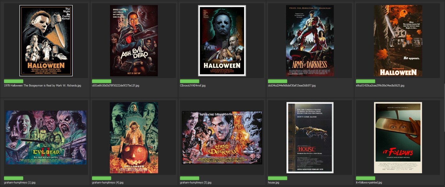
The first step of a project like this is coming to an understanding with the client in regards to theme and direction. Movie posters have a long and storied history and everyone has a different idea of what a poster should communicate. The above image is a visual board that I created inspired by horror posters of the 80’s, our main genre inspiration for the illustration. I spent a good chunk of time just discussing the overall approach with Liam before diving in to details to makes sure we were on the same page. Time well spent!
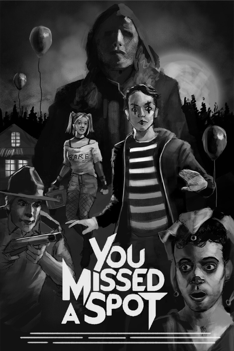
After we settled on a visual look, I set down to make sketches and came up with the above two to present to the client. A key consideration of any poster layout is room for typography. I knew I wanted to have a good amount of dark space where type could be laid in and placing it into my sketch ensured that space would be available.
I spend a lot of time at the sketch stage – more than I used to. So many important decisions get made here that have big consequences later on. Liam selected the first sketch, and luckily that was my choice as well
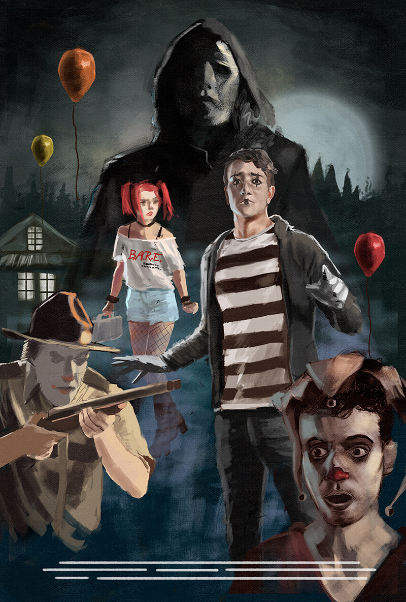
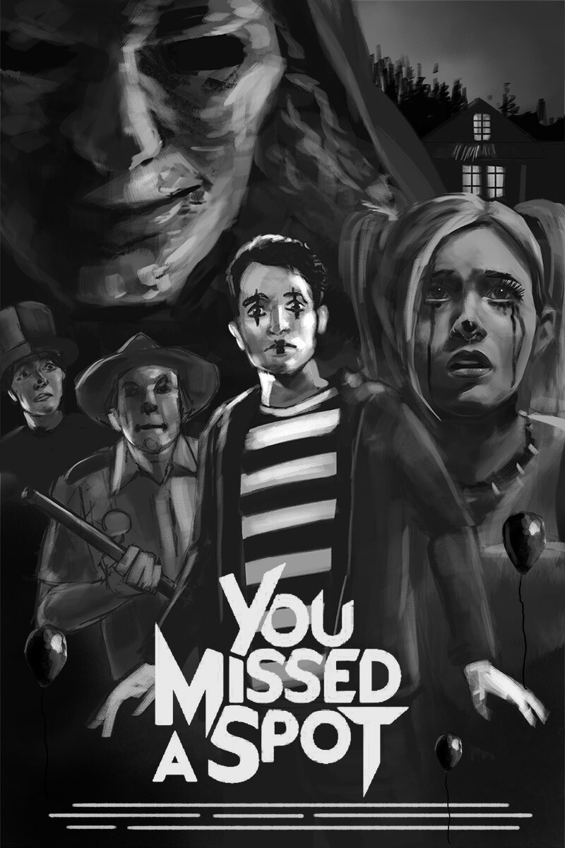
Here’s an early WIP shot, around day 1 of painting. I like to work all over the image, roughing in each character so that I have a feel for the entire piece as I move around. One of the things I had to struggle with initially was the main character’s makeup. My first painting of him ended up looking like a member of the band KISS. Very bad! I went back to the drawing board and made his mime makeup much more subtle – which is how they did in the film too – and that was a big improvement.
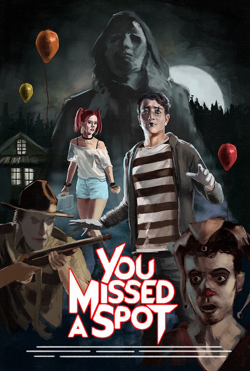
I’ve mostly got the main mime character in which was my first priority. I tend to turn the title type on and off throughout this process so that I can see how it looks with type and without. Since the client is likely to change the type, I plan on sending him a layered file, which means my illustration has to look good even if no type is applied at all.
My next task was painting the love interest of the film behind the main character. Her face is almost on a level with his, which means she’s going to get a lot of attention from the viewer. I spend a lot of time making sure her face is looking good before proceeding on to other details of her costume, the logo on her shirt, etc.
And now that she’s in, I can concentrate on the other tertiary elements.
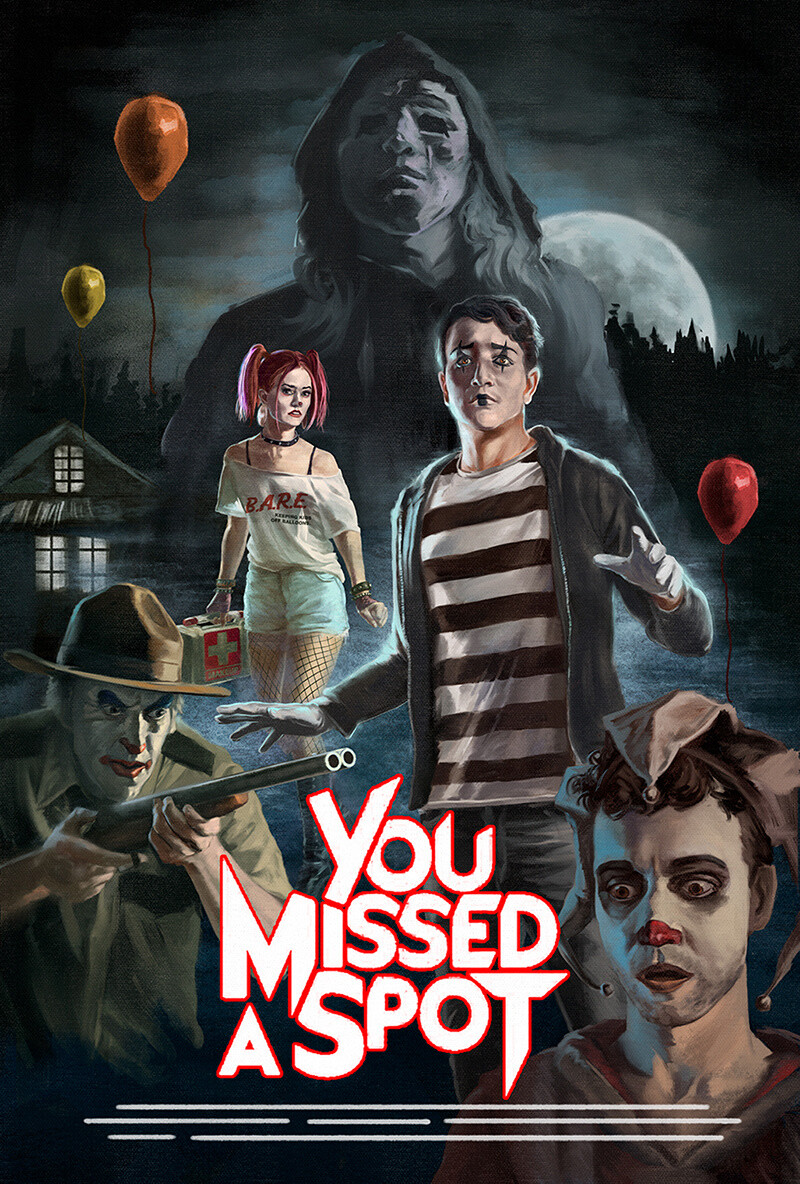
Things go pretty quickly from this point on. Painting the bottom two characters is actually pretty easy because I have figured out how to do the painted clown makeup at this point. I actually spend more time fiddling with the background ambiance. I really wanted a creepy mist to be enveloping the main character but it was tricky to do without it looking too ham-fisted.

It ended up looking a lot better when I used more broken up patterns in my paint strokes along with weird scanned textures from my texture archive. A big help in this stage are the Concept Art brushes from Kyle T Webster’s photoshop brush pack. While I don’t use these kinds of specialized brushes often, they work wonders for this kind of ambient fog/mist effect that kind be really hard to get otherwise.
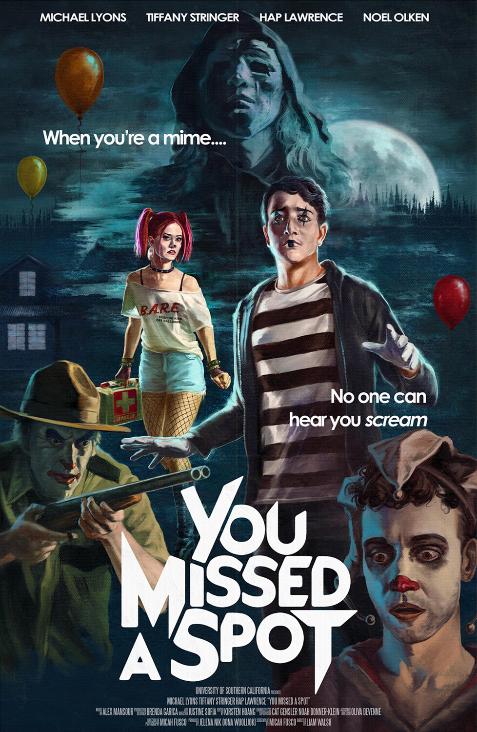
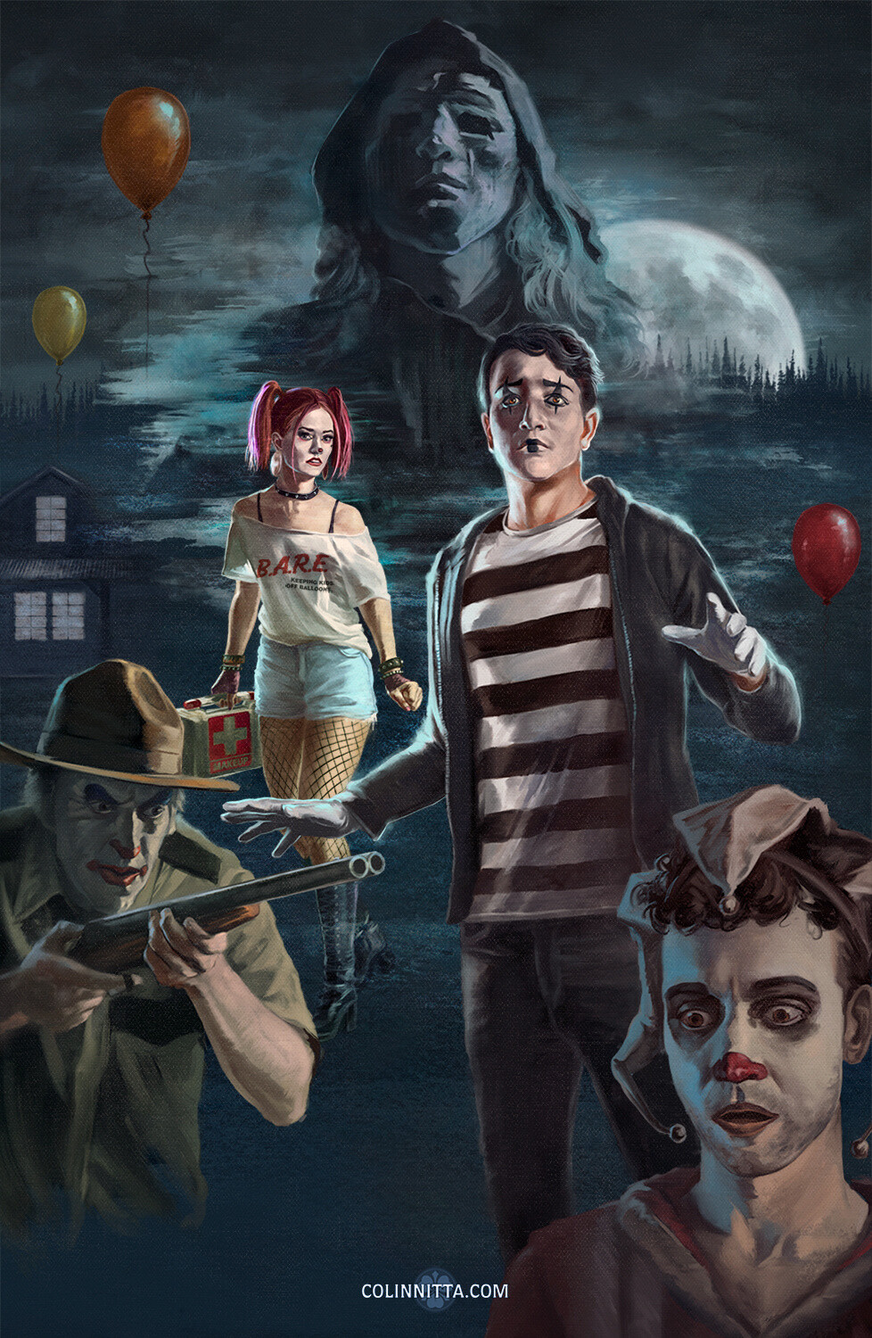
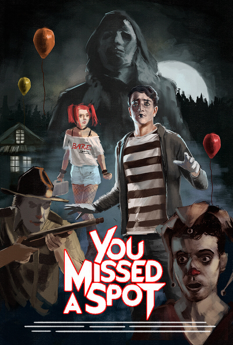
And, here’s the final poster with type from the client! They ended up loving the retro look and even added some faux folding marks to the image. So fun!
This project was a blast to work on and I couldn’t have asked for a better collaboration. From what I hear, the film is making independent circuit right now. Hopefully it will be available to public audiences soon, I highly recommend it!